Designing a Service System for a Live Yoga Practice
How I built the digital infrastructure for a real, running business — and what the decisions looked like in practice.
THE PROBLEM
A validated live yoga service with 15–20 students and strong retention, but zero scalable infrastructure — onboarding happened entirely via WhatsApp, every inquiry required 20+ minutes of manual explanation, and growth was capped by founder bandwidth.
MY APPROACH
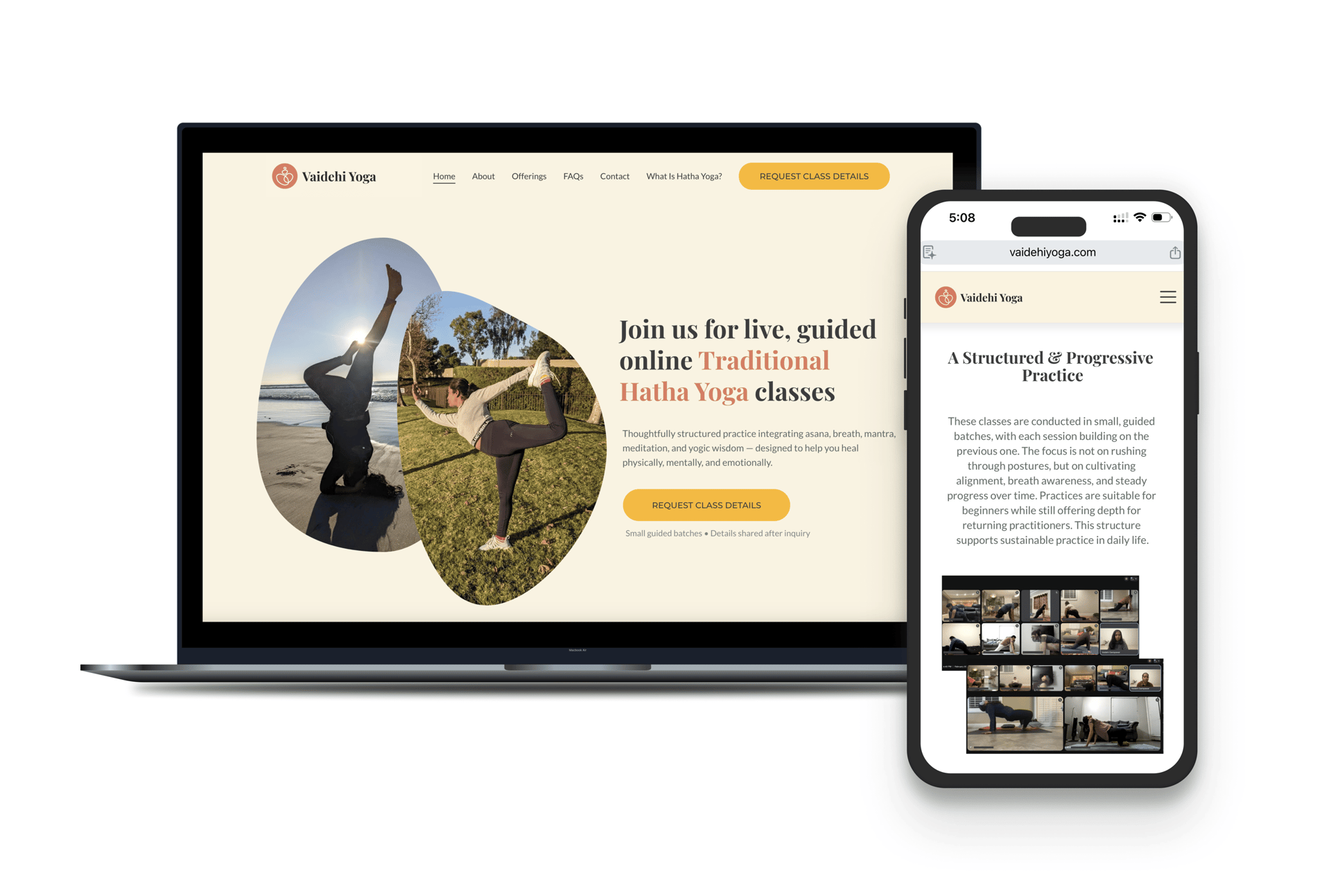
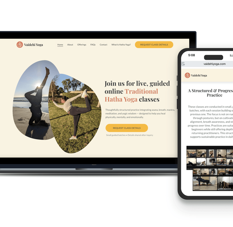
Reframe the website as service infrastructure — not a promotional page. Design a clarity-first digital system that filters, aligns, and prepares students before they send an inquiry.
THE OUTCOME
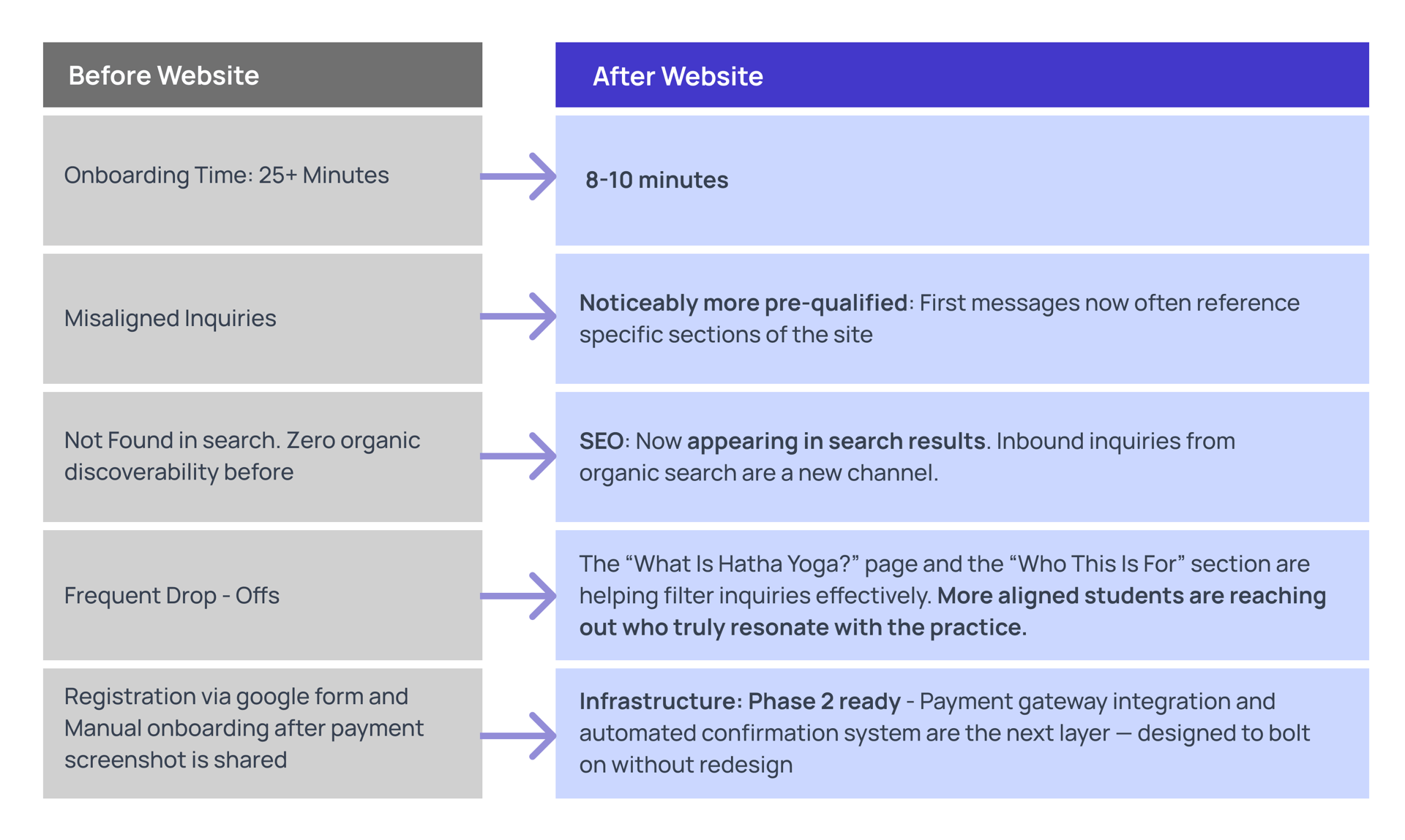
Operational onboarding time reduced by an estimated 50–60%. Inquiries now arrive pre-informed. SEO discoverability established from zero. Foundation built for automated enrollment in Phase 2.
I was the sole designer and founder. That means I owned the UX work entirely — problem framing, information architecture, content strategy, UI, and service flow. It also means I had direct exposure to every business constraint, every student conversation, and every operational failure that shaped the design decisions. I've tried to use that visibility to make this case study concrete rather than abstract.
Four lenses I applied to this project
Systems Thinking
I try to design with the product's future state in mind. On this project, that meant asking early: if inquiry volume doubles, does this hold? If I add a payment layer in Phase 2, does the current IA accommodate it without requiring a rebuild? Every page was designed as a component of a system, not a standalone asset.
Service Design

The website is one touchpoint in a longer arc. The real experience includes how a student first hears about the class - with a referral, a flyer, a search result, what they do after landing on the page, what the onboarding conversation feels like, and whether their first class meets what the site promised. I designed the full arc.
Business + UX Alignment
With an MBA background, I frame design decisions in business terms. For example, the choice to keep enrollment manual in Phase 1 wasn't aesthetic — it was a retention decision based on what I'd seen work with early students.
AI-Augmented Workflow
I used AI tools to accelerate content drafting, SEO structuring, and onboarding template creation. In each case, the AI produced a starting point, and I revised it against what I actually knew from real inquiry conversations. Critically, I kept all design decisions human-led — AI surfaced options, and I made choices.

These aren't positioning statements — they're descriptions of how I actually approached specific decisions. Each one shows up in the case study below.
The service worked. The system around it didn't.
Vaidehi Yoga grew through community referrals — no paid marketing, no formal funnel. Students found it, tried it, and stayed. Retention across the first batches was 5–6 months. That's meaningful for a small live service.
But everything operationally was held together by direct conversation. There was no website, no structured onboarding, and no single place where a potential student could understand what the service was before reaching out. Every inquiry started from zero.
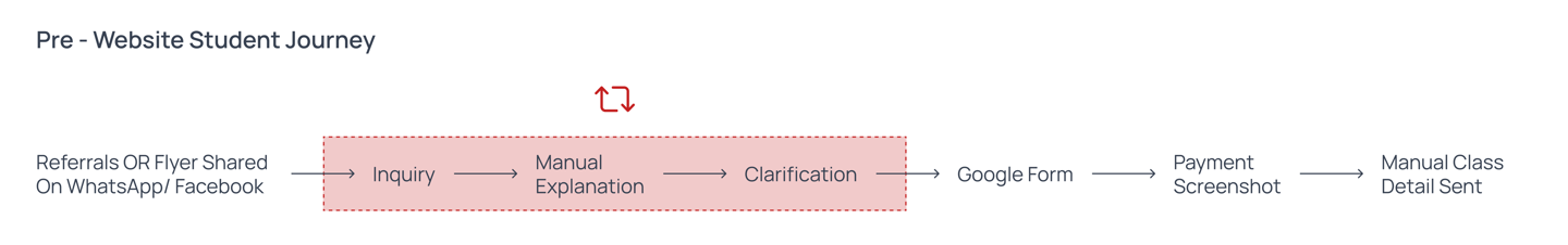
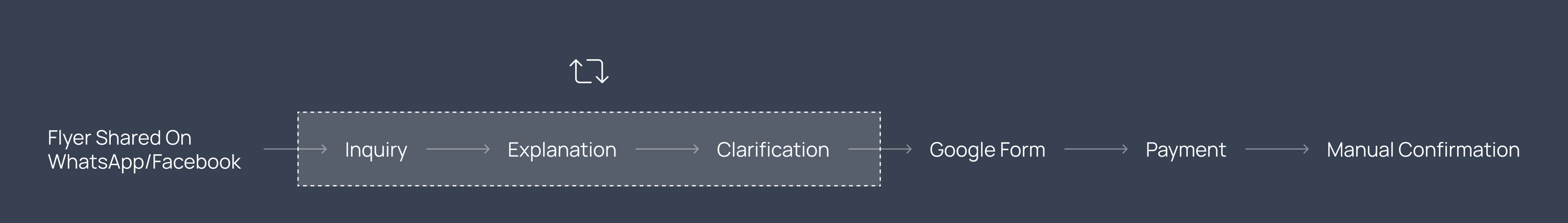
What onboarding actually looked like before the website
– A potential student sees a flyer or gets a referral
– They message me on WhatsApp
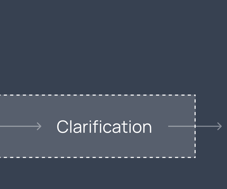
– I explain the structure, schedule, commitment, pedagogy, and pricing — every single time, from scratch
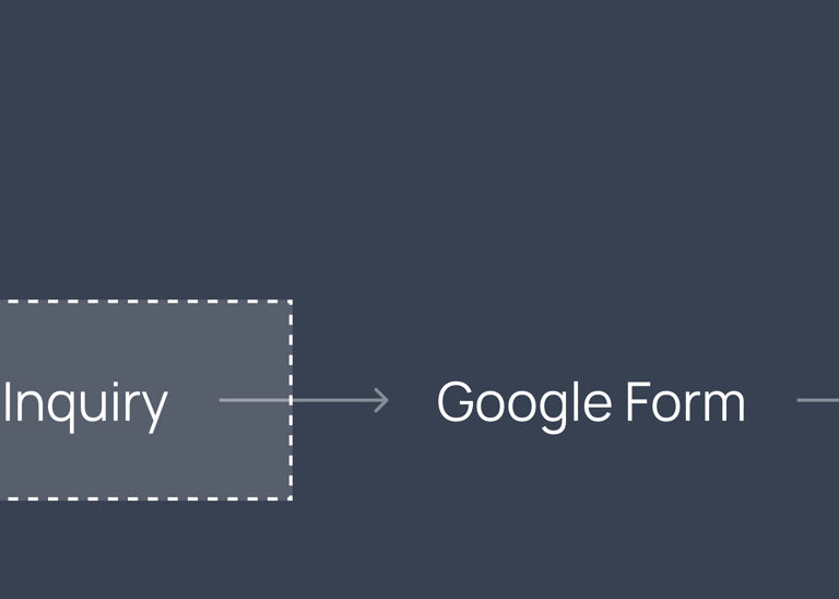
– They fill in a Google Form. I manually follow up.
– Payment happens via screenshot sharing
– I send class details manually via message
This process took 20–30 minutes of my time per inquiry — not per enrolled student. Per inquiry, including those who never enrolled.
15-20 Active Students
5–6 Month Average Retention
~ 25 Min Per Inquiry
$750–1000 Monthly Revenue
Across 2 live batches — consistent, community-feel cohort
Students stayed long-term — the practice held people


Recurring and real, but constrained by operational capacity

Founder time spent on every single incoming message, enrolled or not


~2–3 hrs/week on repetitive explanations
Three things that needed fixing
Manual Onboarding Bottleneck
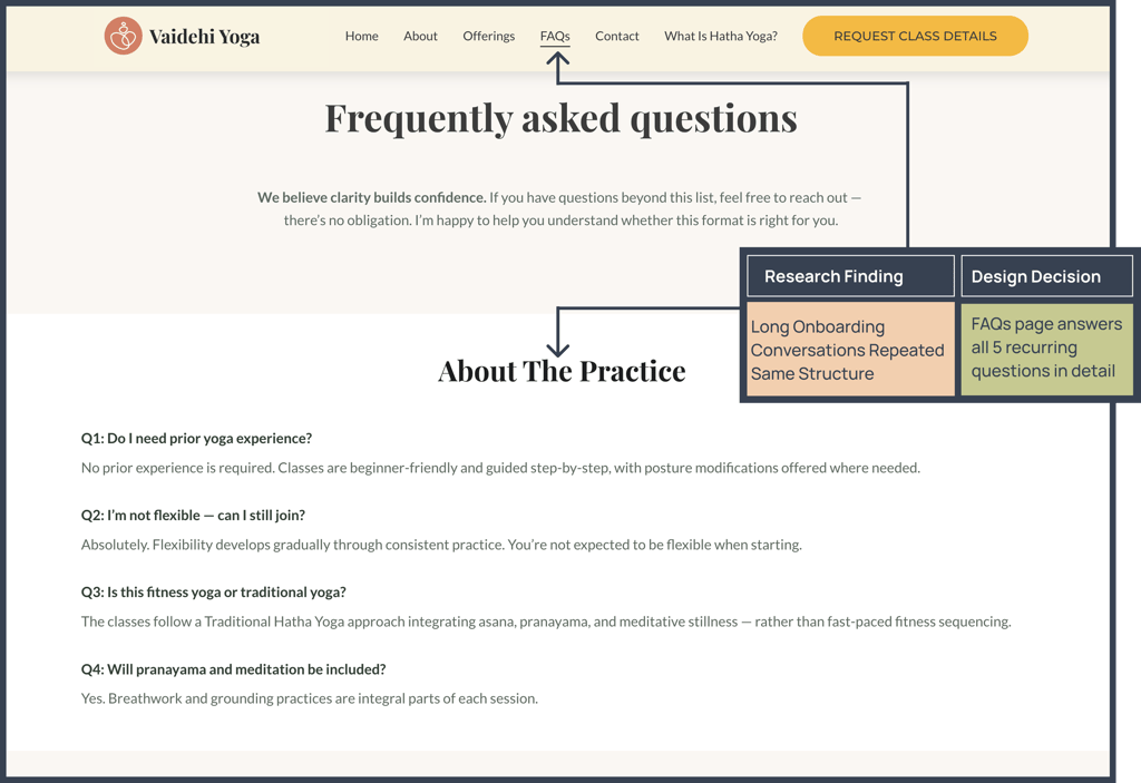
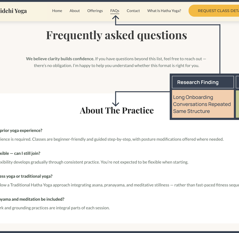
Every inquiry triggered the same 20+ minute explanation loop — structure, philosophy, schedule, expectations, pricing. I answered them individually in every conversation. That's not a relationship issue; it's an information architecture issue.
Expectation Misalignment = Drop-Off
Several students who enrolled in early batches expected something closer to a fitness class — faster, more physical, results-oriented. Hatha Yoga is structured, deliberate, and philosophical. The gap between those two things led to early drop-off. This wasn't a product problem — it was a communication design problem.
Growth Constrained by Bandwidth
Retention was strong — but new student acquisition was completely bottlenecked by how many manual onboarding conversations I could handle per week. There was no leverage in the system. Fixing that required a digital layer that could carry the explanation load so the manual conversation could focus on intent, not information.


What I learned from 30+ onboarding conversations
I didn't run formal user interviews. What I had was better in some ways — I had 30+ real conversations with people actively considering enrollment, spread over six months. I went back through WhatsApp threads and Google Form responses to find the patterns.
Method
I reviewed 30+ inquiry threads and 25+ form responses. I coded them by recurring question type, expectation signal, and drop-off point. It wasn't a research sprint — it was treating data I already had as data, rather than letting it sit unused.
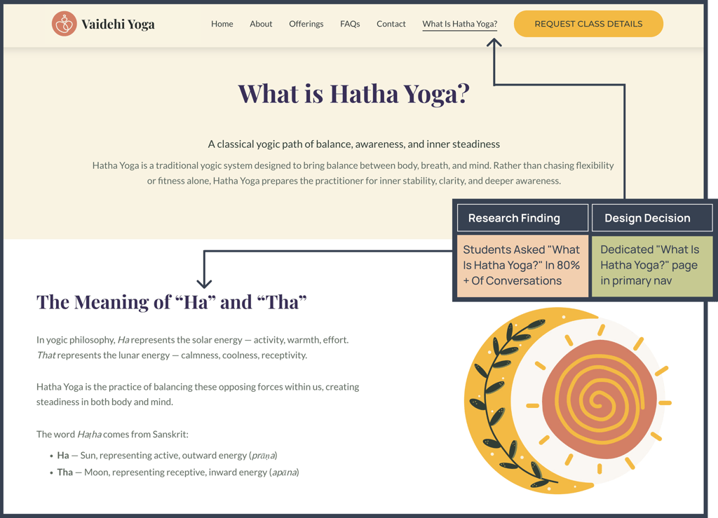
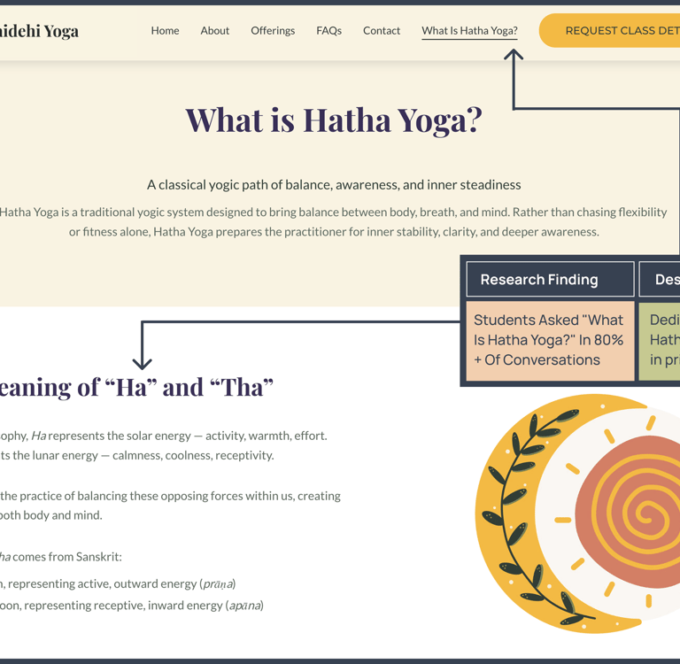
More than 80% of initial inquiries contained the same structural questions:
What is Hatha Yoga?
How often are classes?
What's the commitment?
What equipment do I need?
How much does it cost?
A consistent pattern: students who expected a workout-focused class and encountered a structured, philosophical Hatha Yoga class dropped out within the first month.
The product wasn't wrong — the filtering was. The entry point wasn't setting expectations correctly.
Philosophy vs. Fitness Expectation Gap
Same 5 Questions, Every Time
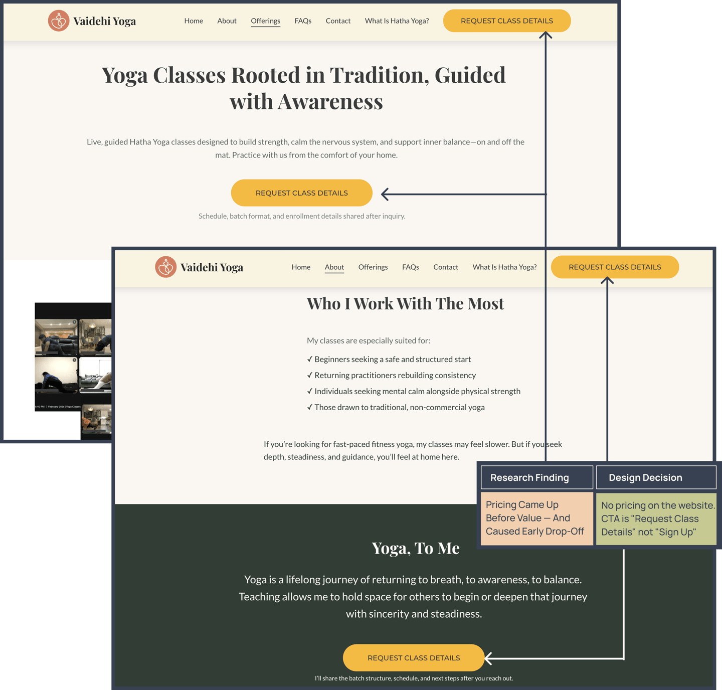
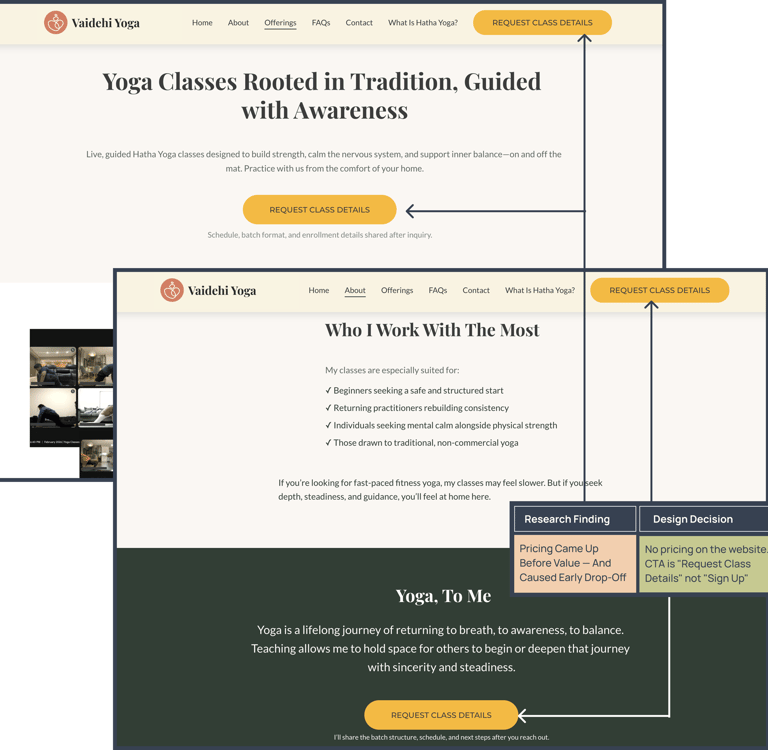
Price came up before value was established
In most conversations, students asked about pricing within the first few messages — before they had a real sense of what they were paying for. In several cases, this led to early drop-off from students who might have enrolled had the value conversation happened first.
The sequence mattered: value before cost, not cost before value.
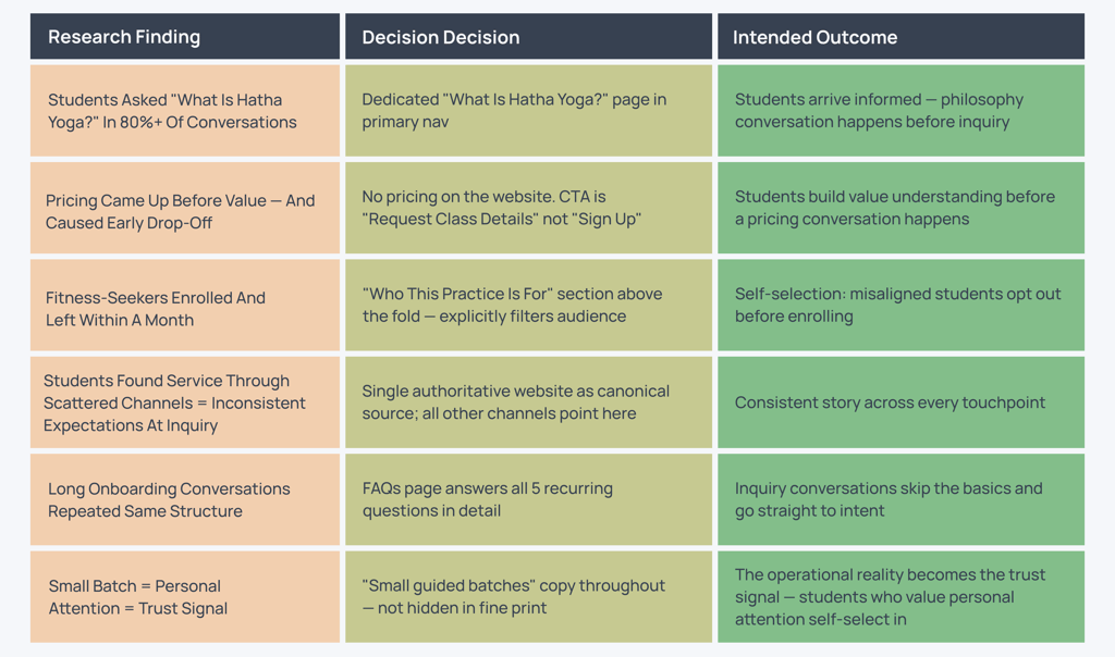
FINDING 01
FINDING 02
FINDING 03
FINDING 04
Discovery Was Scattered and Uncontrolled
Students found the service through flyers shared on WhatsApp, Facebook, and Instagram, and through word-of-mouth — but there was no single authoritative source of information.
Each channel told a slightly different story, leading to inconsistent expectations.
Core Insights:
The problem wasn't the yoga. It was ambiguity — at every stage before a student ever showed up to a class. The design response to ambiguity is clarity.
The brief was "build a website." The actual problem was different.
Pre-Website
Phase 1: Intentional Hybrid Model (Live) :
Phase 2: Planned Scalable Admission System (Future State)
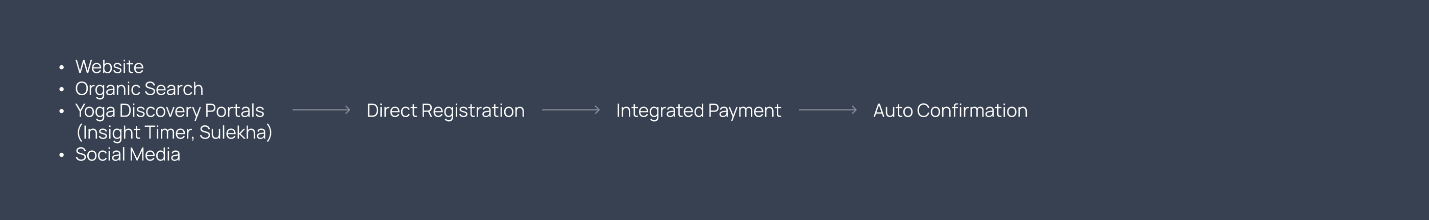
How might we design a clarity-first digital system that filters, aligns, and prepares students before they send an inquiry?
A website built to the surface brief — something that looks good, describes the offering, has a contact button — would have been a brochure. A brochure would have helped a little. It wouldn't have solved the problem.
The research pointed toward a different framing:
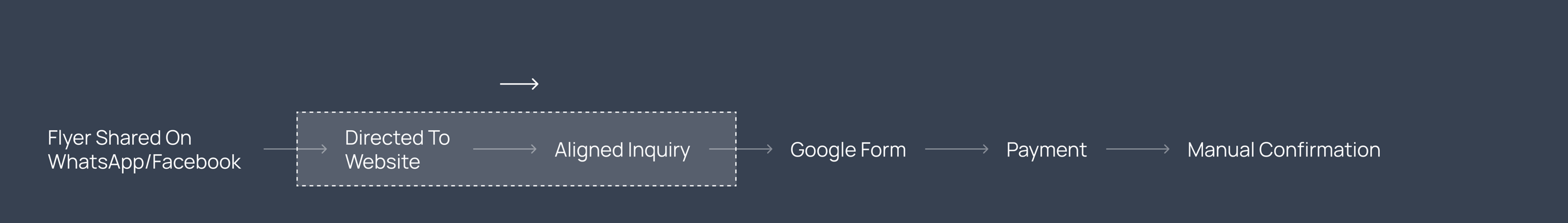
That reframe changed the design criteria. The website wasn't just a marketing asset. It needed to do six distinct jobs simultaneously:
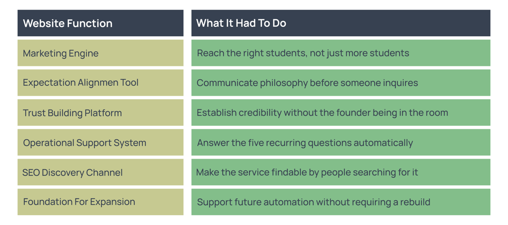
This required thinking beyond pages — and into systems. Every design decision in the section of the website was designed with a specific job to do in the student acquisition funnel.
Website copy handles expectation alignment & Manual conversation confirms seriousness
SEO drives discovery
From insight to decision: How research shaped the design
Every major design decision on vaidehiyoga.com traces back to a specific finding from my onboarding research. Here is that connection made explicit.
How AI was actually used — and where it wasn't
✔ Drafted initial copy for the website — I revised every sentence for tone, accuracy, and alignment with student expectations
✔ Structured the FAQ section — I edited the questions based on what I actually heard in onboarding conversations
✔ Generated onboarding message templates — I refined them through real conversations
✔ Helped structure the IA — I made final decisions on navigation and page hierarchy
What AI Actually Did
What AI Did Not Do
✖ AI did not make a single design decision on this project
✖ AI did not conduct or synthesize the research — I did that from real inquiry data
✖ AI is not embedded in the product — there is no AI feature on the website
✖ AI did not determine the phased rollout strategy — that came from product thinking
Why the UI looks the way it does
The visual decisions on this project weren't aesthetic preferences — they were communication decisions. Here is why each design choice was made — grounded in the service's pedagogy and the user's expectations


Playfair Display (serif)
Playfair Display (serif)
Playfair Display (serif)
Lato (sans-serif)
Lato (sans-serif)
Lato (sans-serif)
Lato (sans-serif)
Lato (sans-serif)
Lato (sans-serif)
Lato (sans-serif)
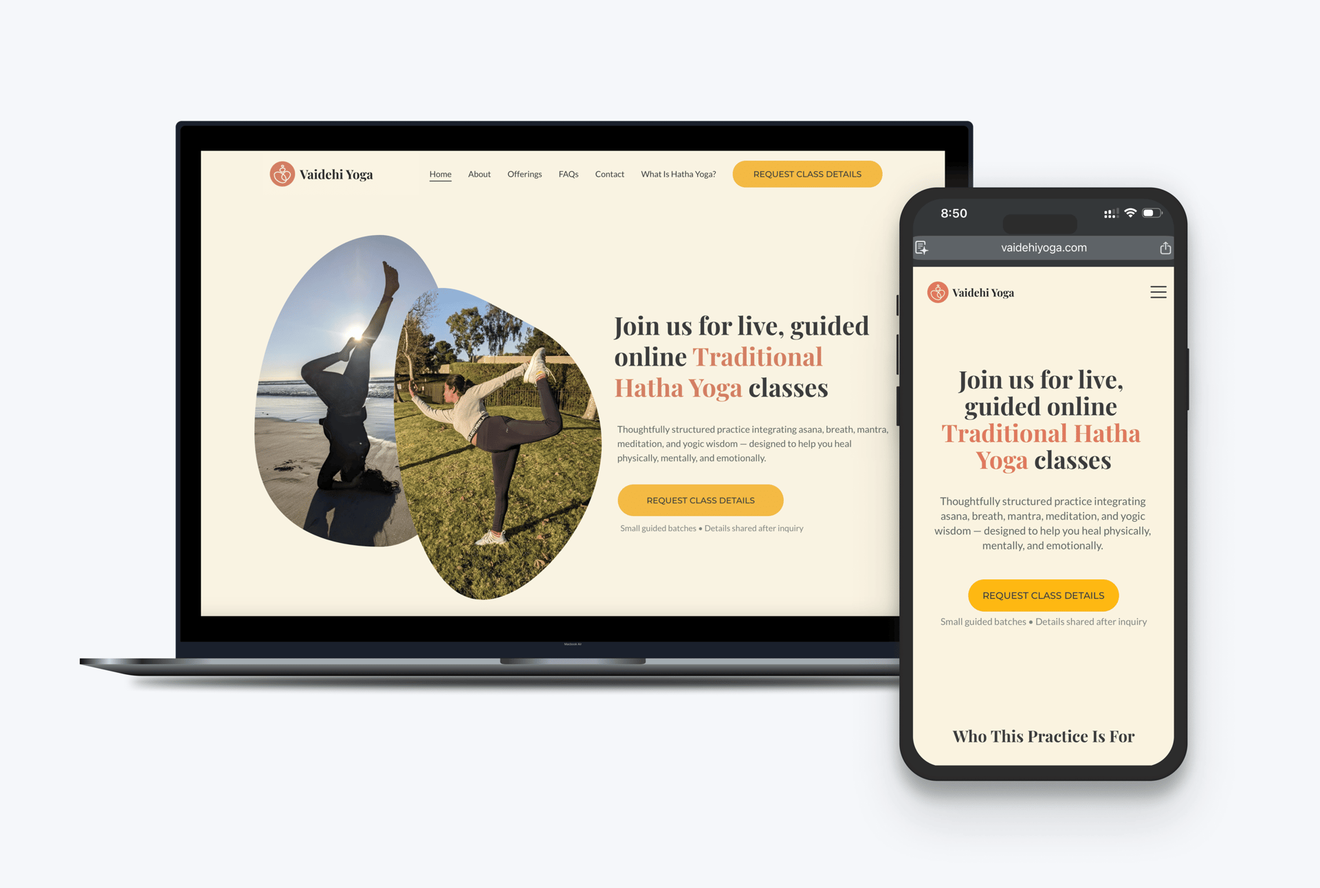
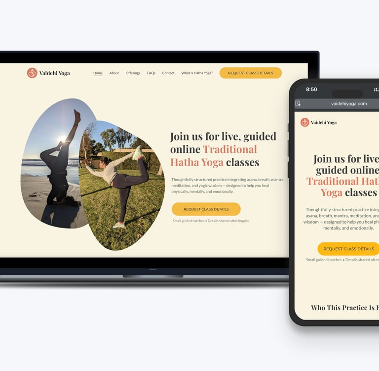
Color system — earthy warmth over clinical white
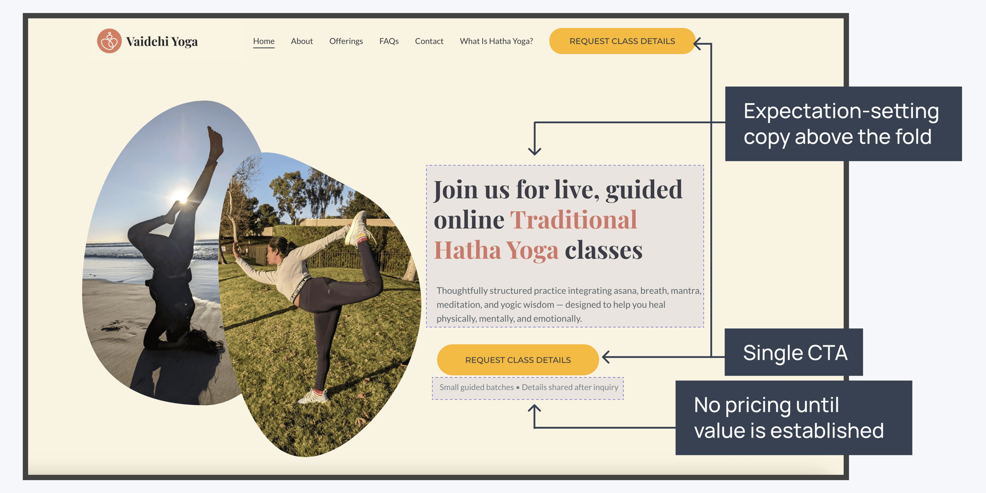
Traditional Hatha Yoga is a practice rooted in nature, breath, and the body — not performance or productivity. A cool, minimal UI palette (white, navy, sans-serif everything) would signal "fitness app." The earthy tones — terracotta, sage, off-white — signal depth, tradition, and care. This primes the user before they read a single word. It's doing the expectation-setting work that the "Who This Is For" copy also does, but visually.
Typography — Playfair Display for headings, Lato for body
Playfair is a classical serif with real presence. It communicates seriousness and tradition without being heavy or academic. Lato provides clean, accessible readability for longer explanatory copy. The pairing reflects the dual nature of the service: rooted in tradition, delivered with modern clarity.
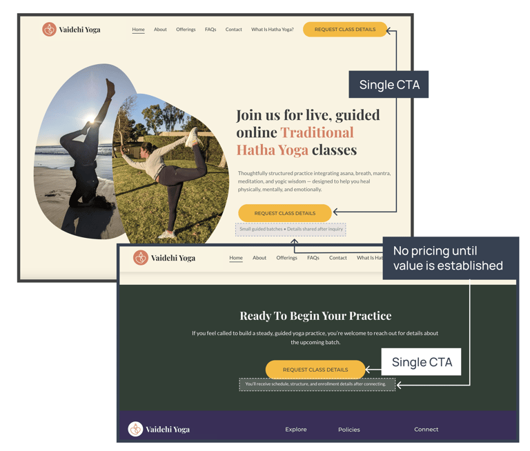
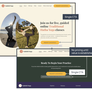
One CTA — "Request Class Details"
There's one primary action on the homepage. Multiple CTAs create friction through choice — and more importantly, the wording "Request Class Details" rather than "Sign Up Now" signals something about the enrollment process: it's considered, not impulsive. That framing filters for students who are serious, which is exactly who this practice is for.
No pricing on the homepage, no urgency copy
Pricing before value creates sticker shock. Urgency copy — "Only 3 spots left!", "Limited time offer" — attracts the kind of decision that doesn't hold up when someone realizes this is a committed, philosophical practice rather than a drop-in fitness class. Both tactics would have undermined the expectation-setting work the rest of the site is doing.
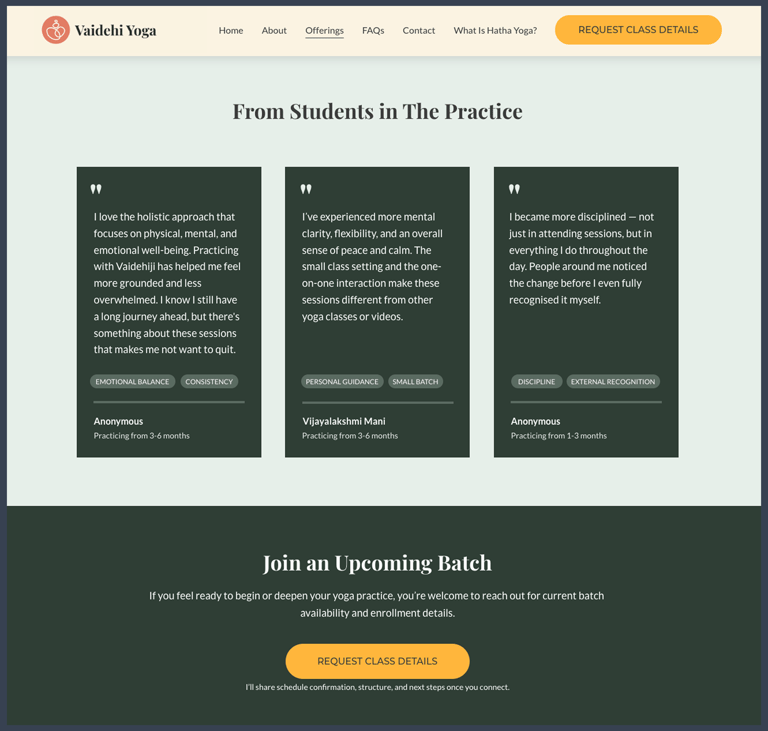
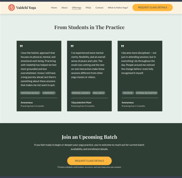
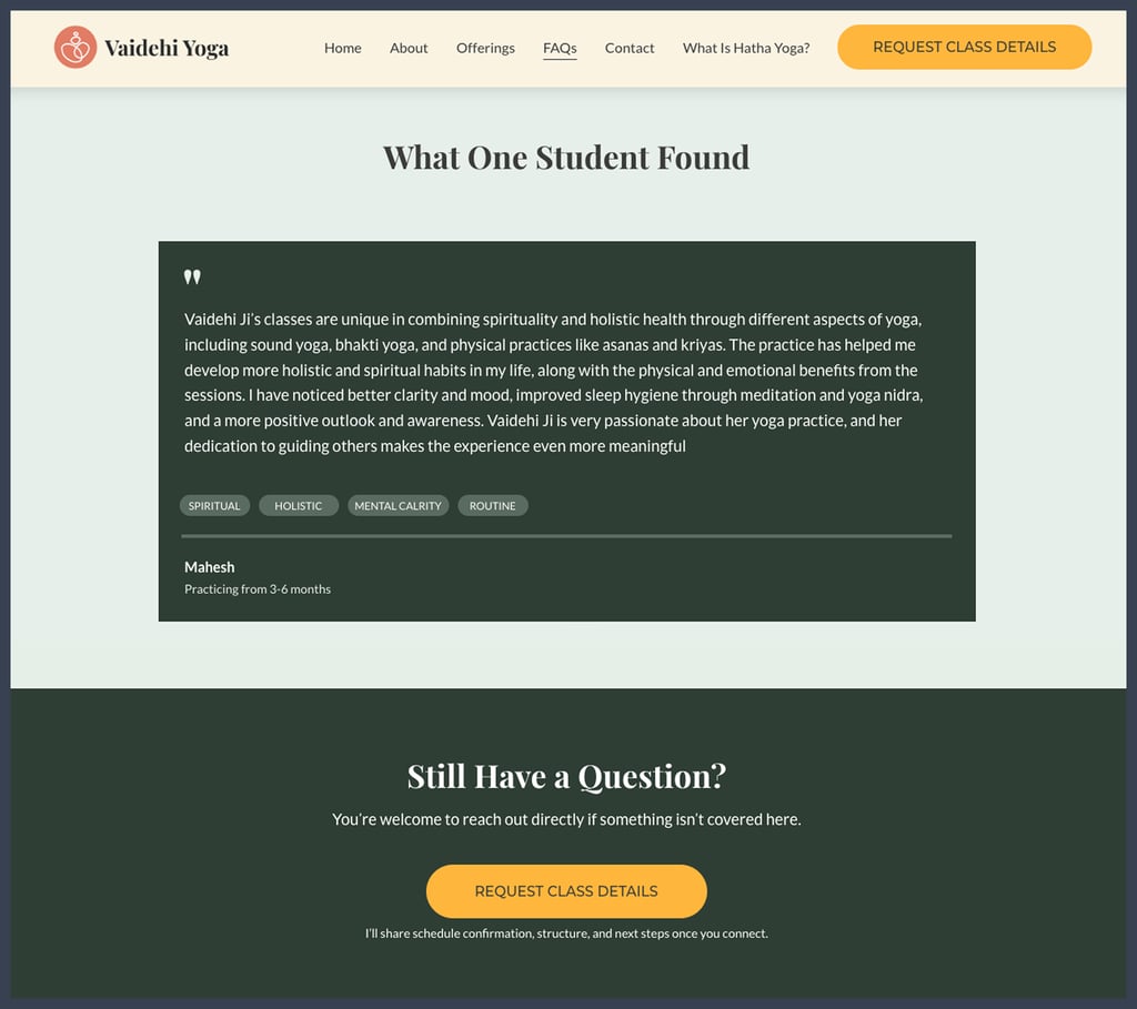
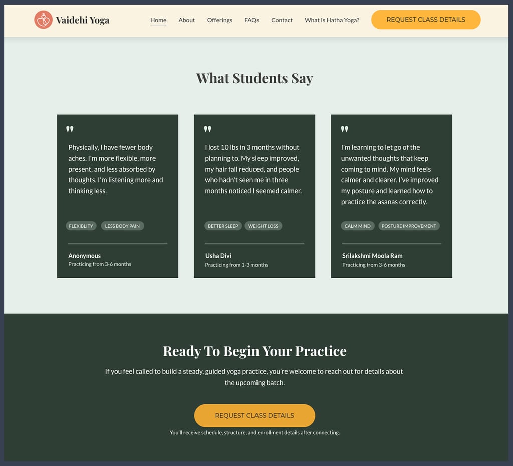
Testimonials before the final CTA
On the homepage, Offerings page, and FAQs page, testimonials are placed immediately before the closing CTA. The placement is deliberate — by the time a visitor reaches that point on any of those three pages, they've already read what the practice is, who it's for, and how it works. The testimonials at that moment aren't introducing the service; they're confirming it. Someone who has read through the offerings and still has questions lands on the FAQs page, works through them, and then sees people with similar hesitations who found the practice valuable. The CTA that follows is effective when trust is already established, not while it's still being established.
Measured outcomes — what actually changed
Honest caveat: Because this is an early-stage live service, I don't have pre/post analytics data with statistical significance. These outcomes are based on observed behavioral patterns and founder-logged inquiry notes. I am building measurement infrastructure now for Phase 2.
What was built, what comes next, and why in this order
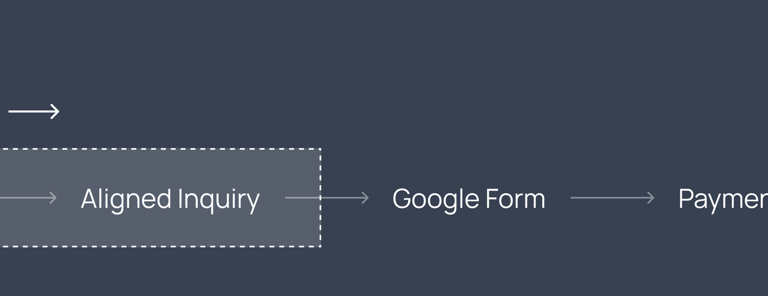
Phase 1 — Trust infrastructure (live)
Goal: Replace manual explanation with a reliable digital source of truth. Keep enrollment human-led while that trust layer is built.
Clarity-first website handling the recurring questions
Manual enrollment is preserved — every student speaks to me before joining
That manual step isn't a compromise; it's intentional at this stage
KPI: Inquiry quality and reduction in onboarding conversation time
The reason not to automate enrollment immediately: in the early months of a practice like this, the founder-to-student conversation does work that a form can't. It filters for seriousness. It catches misalignment early. It builds the kind of initial trust that turns into long retention. Automating it at this stage would have traded short-term convenience for the thing that was making retention work.
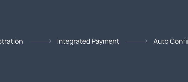
Phase 2 — Payment + Registration Automation (Planned)
Goal: Remove founder from mechanical steps while preserving judgment calls.
Website-based enrollment with payment gateway (Stripe/Razorpay)
Automated confirmation and onboarding email sequence
Structured intake form replaces the current manual conversation
KPI: Enrollment conversion rate and founder time freed
Phase 3 — Community Expansion (Future)
Goal: Serve a larger audience without a proportional increase in founder bandwidth.
Larger batch sizes or a cohort-based model
Student community dashboard or resource library
Potential async content layer alongside live classes
KPI: Revenue per founder-hour and student lifetime value
Four things I'd change if I were starting today
Set up analytics before launch, not after
I launched without proper analytics infrastructure. I have behavioral observations — not data. For Phase 2, I'm adding event tracking on key funnel steps: page visit → FAQ read → CTA click → inquiry submitted.
Test the Inquiry Form Sooner
The current CTA leads to a contact form. I haven't tested whether a more structured intake form (with qualifying questions) would improve inquiry quality further. This is a live experiment for Phase 2.
I set up Google Search Console after launch. Starting with keyword tracking from before Day 1 would have given me a cleaner before/after SEO picture. Lesson learned.
My "research" was real — 30+ conversations, observed patterns, and form data — but I didn't formalize it at the time. If I'd started a simple inquiry log from the first conversation, the insights would be the same; the documentation would be stronger.
Establish an SEO baseline before launch
Document Research More Formally
What this project demonstrates about how I work
The most useful thing about this case study is that the product is real. Not a redesign concept, not a hypothetical — a live service with paying students, a measurable before state, and documented decisions. That means the thinking isn't aspirational; it's observable.
I designed this as the sole UX practitioner and as the founder. That combination meant every design decision had direct consequences — if the expectation-setting copy didn't work, I saw it in the drop-off data. If the FAQs didn't cover the right questions, I heard about it in the next WhatsApp conversation. That feedback loop made the work sharper.
What the documentation above shows: research that came from real inquiry data, design decisions that traced back to specific findings, a phased approach built around what the service actually needed at each stage, and honest accounting of what I'd measure differently.