
DESIGN SYSTEM
Building and scaling a design system
Conducted research and presented findings to key stakeholders; ensured alignment with project timelines and milestones. Maintained detailed component documentation, ensuring accessibility, implementation compliance, and quality standards.
PROBLEM STATEMENT
How can we build a design system that is simple, scalable, and understandable by both designers and developers to facilitate the creation of unified digital products?
The Solution
Defining design system and language
Creating a strategy to serve multiple platforms
Unifying existing patterns
Creating a template for documentation
Defining guidelines for reusable components
Building technical documentation in Storybook
Project Overview
T-Mobile lacked a formalized design system. They had multiple internal design systems that operated separately for different products, with individual teams creating their own standards for UI elements, components, or modules. This fragmentation in the design process among product teams led to a lack of cohesive brand identity.
Team Structure
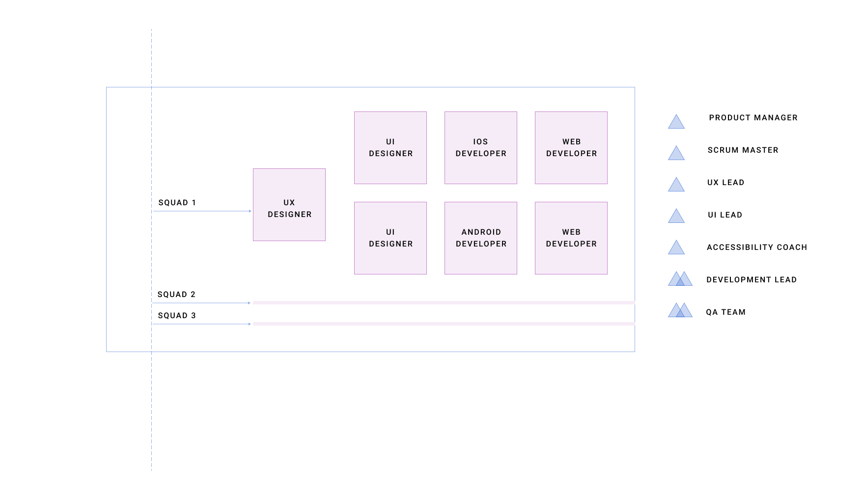
Fragmented design system = disconnected user experience and lack of a brand identity
My Responsibilities
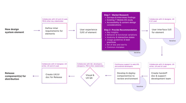
The UX design process starts with selecting a new element to be included in our design system. After establishing the initial requirements, I delve into research. This step involves conducting surveys and interviews, observing how team members use existing design systems at T-Mobile, and studying existing design systems in the market. Additionally, I research how this element functions across different platforms, such as web, iOS, and Android. I also dive deep into the Accessibility recommendations for each component.
The end result of this research is then documented in detail which includes important discoveries, different ways the design could act or look, details on how the piece should work, tips on how to use it the best way, and a list of things to do and things to avoid so we don’t make common mistakes.
UI designers use these recommendations of elements to create simple and scalable component designs that adhere to brand identity. Once this is done, I work closely with UI designers to write detailed instructions for the development teams.
We keep tweaking and improving it until we’re ready for the final version. We prepare detailed instructions on how to use the design when it’s released. Once the components have undergone rigorous review and testing and are polished to satisfaction, they are officially released for distribution and ready to be integrated into various projects.

Tools Used

UX PROCESS
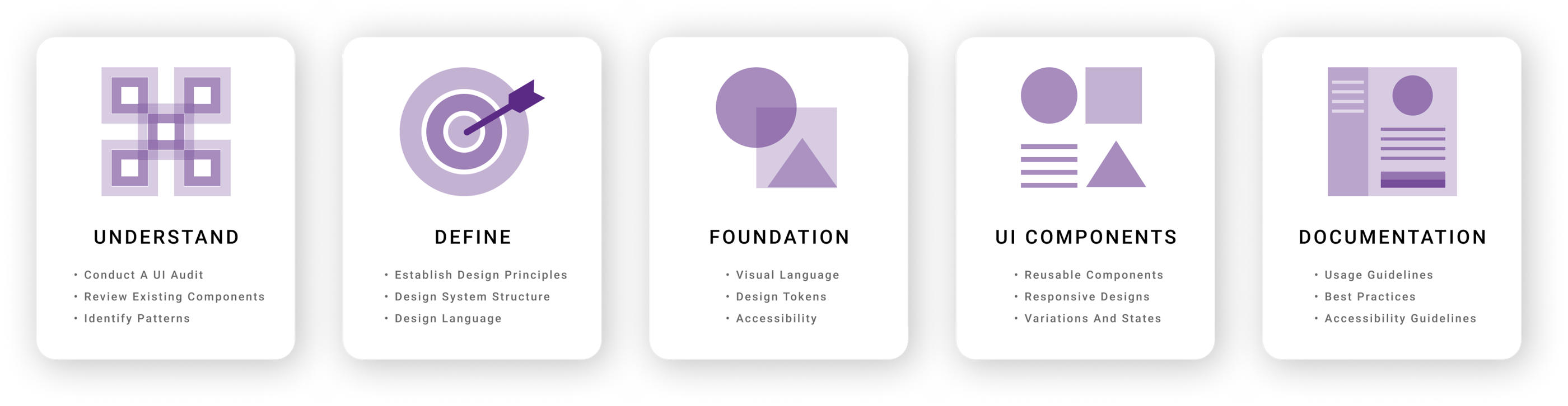
UNDERSTAND
At T-Mobile, the design infrastructure is built upon three foundational design systems: Phoenix, DW3, and Scale. These systems are the keystones of current user interface (UI) architecture, each offering unique features and applications.
We initiated a comprehensive UI audit to deepen our understanding of these existing design frameworks and their components. This audit entailed an in-depth examination of each UI element across the design systems.
The process started with consolidating legacy system sticker sheets (DW3, Phoenix, & Scale) into a single Figma file to facilitate unified access. Following this, we evaluated each element for design consistency, accessibility, and technical implementation, aiming to pinpoint discrepancies and areas for enhancement.
This process uncovered missing elements that could significantly improve the user experience or streamline the design and development workflows. Also, the backlog of UI components is generated to serve as a roadmap for implementation.
Key Insights
Conflicting guidelines and direction.
Duplication of common components.
Inconsistencies across market websites and microsites.
Siloed teams working with disjointed communication.
Design System Structure
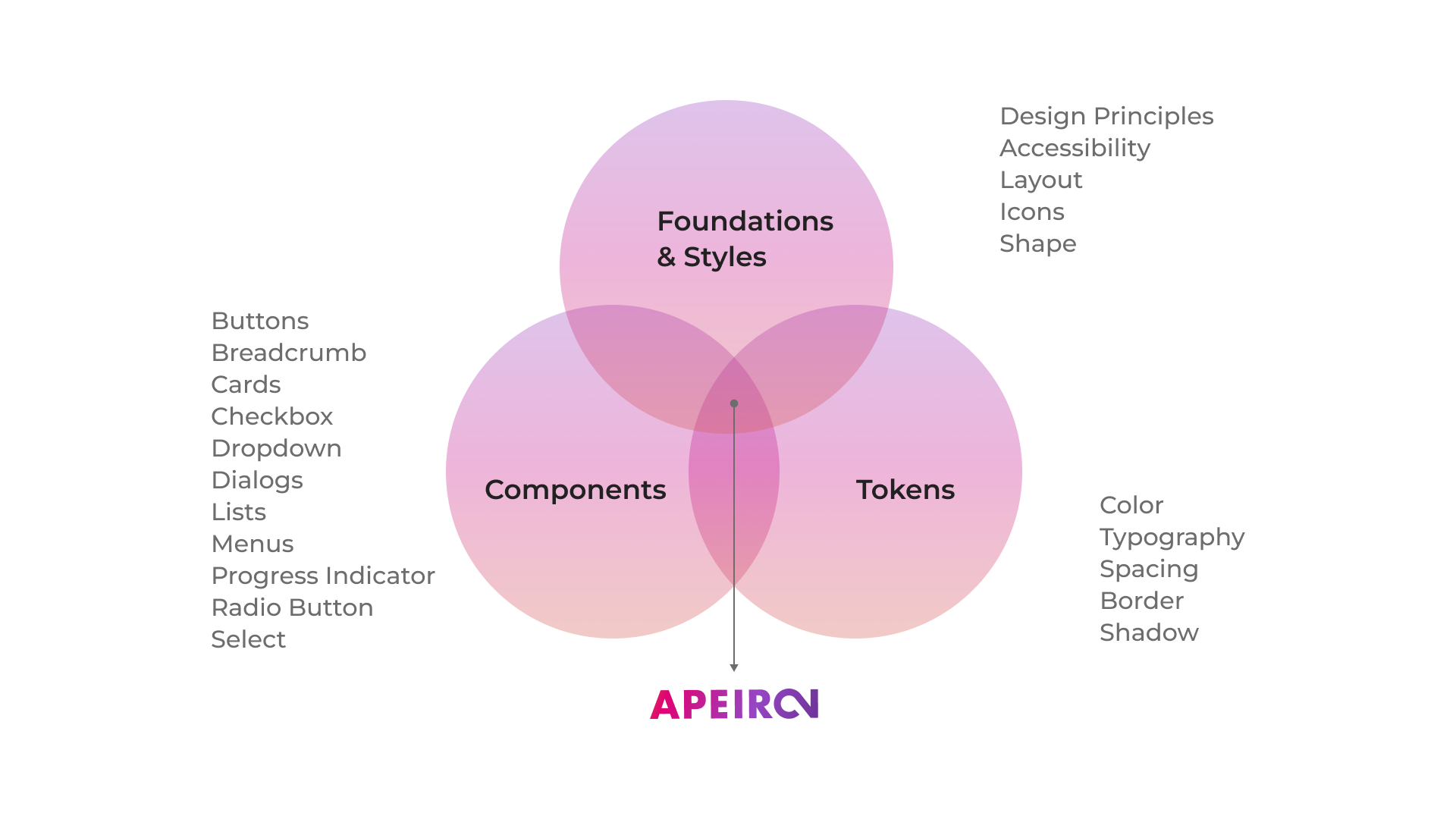
Foundations & Styles: These core principles and guidelines define the design system's overall aesthetic and functional framework. This includes global styles, design principles, accessibility standards, and how various layouts and icons should be used to ensure consistency across all designs.
Components:
These are the building blocks of the design system. Components are pre-designed and coded elements such as buttons, cards, dropdowns, lists, and menus that designers and developers can reuse across different parts of a project to maintain a consistent look and feel.
Tokens:
Tokens are the variables that define the visual attributes of a design system. They represent the design decisions in a way that can be applied and reused in different contexts. This includes color schemes, typography choices, spacing scales, border styles, and shadows that can be consistently applied to components.
DEFINE
After identifying issues in the existing design system, we developed a new design structure of foundations, components, and tokens to offer a unified framework for T-Mobile's products and platforms, addressing the shortcomings of the old design system.
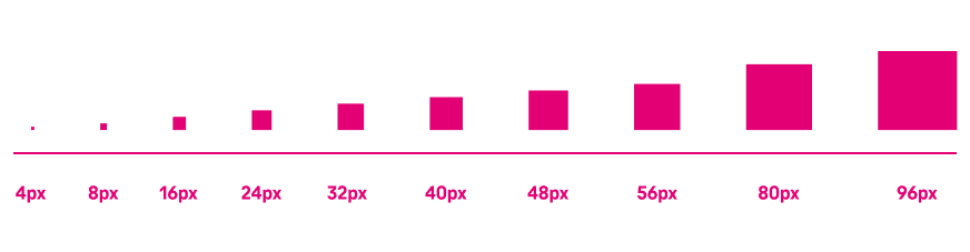
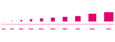
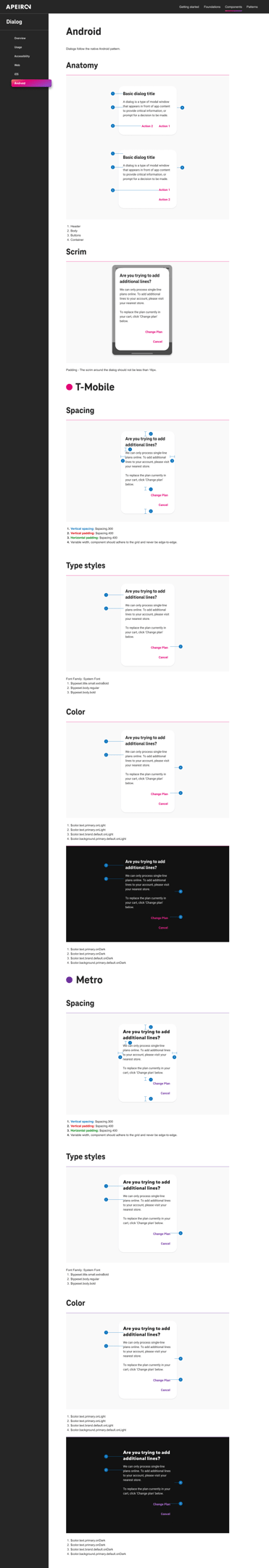
8px Grid
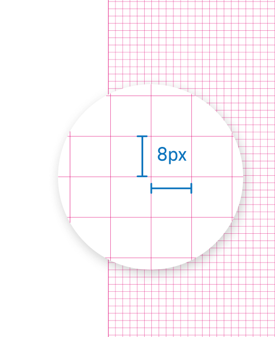

Apeiron is built on an 8-pixel grid. This provides a consistent system for sizing, spacing, and laying out components relative to one another. According to this system, any spacing, typography, padding, margin, or component height values are always a multiple of 8.
An 8-pixel grid can respond to screen size, platform, and screen orientation, creating:
- A more consistent interface
- Better scaling across platforms
- Less distortion within a browser
FOUNDATION
A key to any successful design system depends heavily on the fundamental foundations on which every component, page template, and prototype is built. Our foundations supported our grid systems, spacing scale, typography scales, color systems, accessibility, and Tokens.
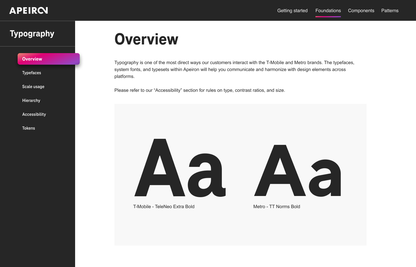
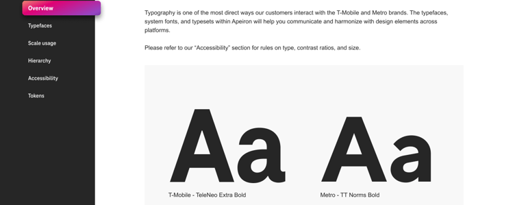
Typography
Typography is one of the most direct ways our customers interact with the T-Mobile and Metro brands. The typefaces, system fonts, and typesets within Apeiron will help you communicate and harmonize with design elements across platforms. TeleNeo is our primary typeface for T-Mobile. TT Norms is the primary typeface for Metro. Use it for all text except Subtitle, Body, and Caption typesets.
Spacing
Using spacing or white space in designs helps improve accessibility, reduces distraction, and quickly communicates relationships or separation between components.
The Apeiron spacing scale is based on our 8-pixel grid. Using the 8-pixel grid to space the height of our elements into consistent patterns helps with vertical rhythm. Our spacing scale includes the following increments to link related elements and separate unrelated ones. These spacing increments are applied to all Apeiron components.
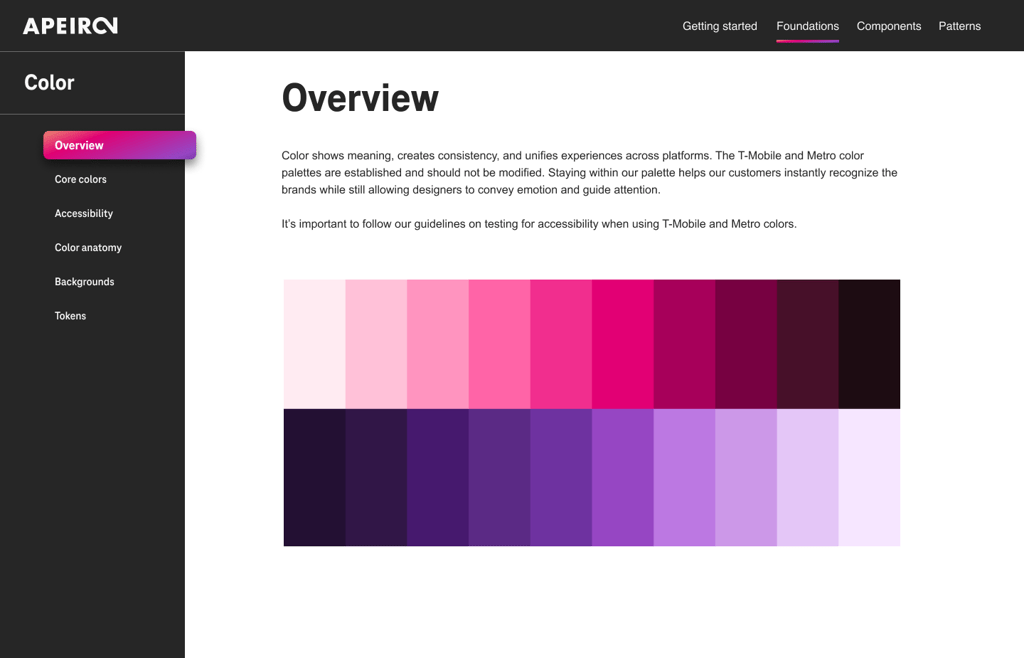
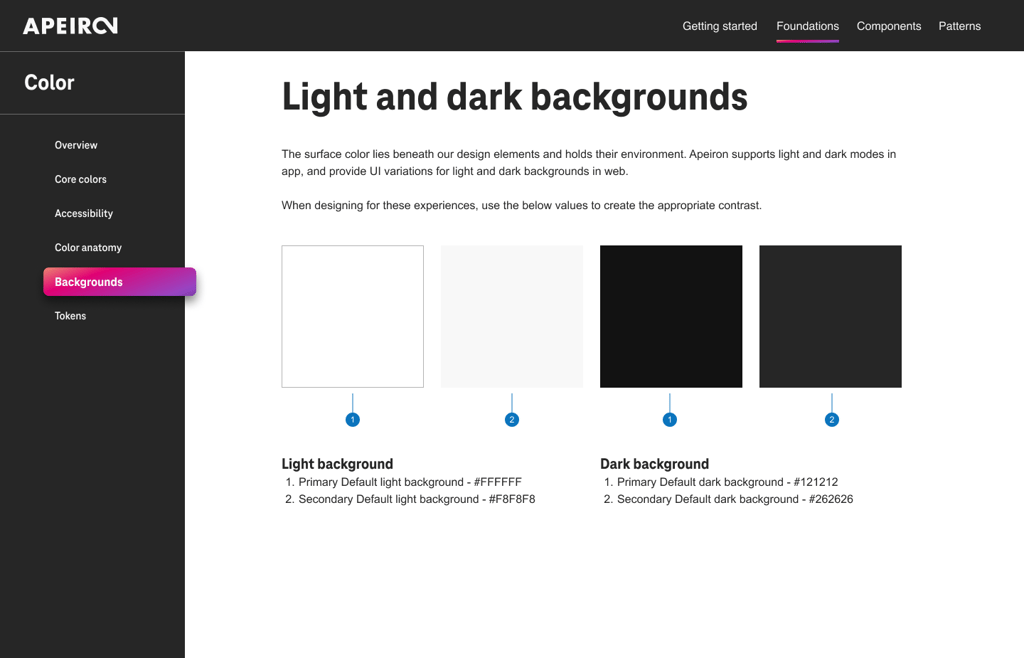
Colors
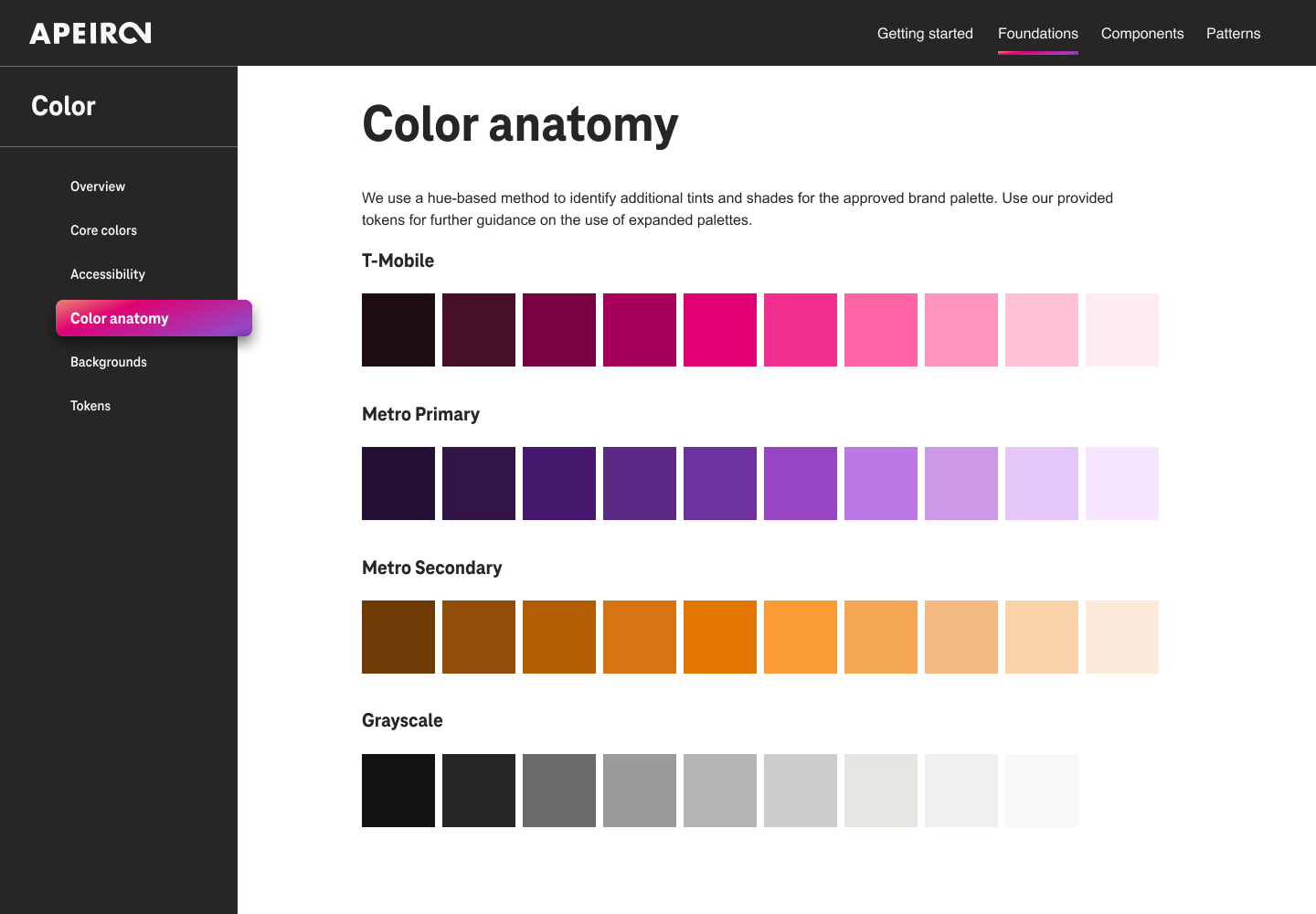
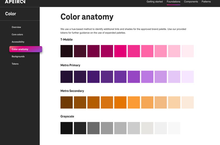
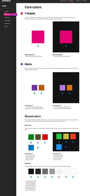
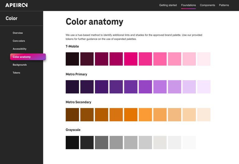
The color shows the meaning, creates consistency, and unifies platform experiences. The primary T-Mobile color is magenta. You can combine it with white, black, and gray. The neutral gray family is dominant in default themes, with subtle value shifts to organize content into sections. Metro uses purple as a primary color and gold as a secondary color. When creating schemes, use the same white, black, and gray colors as T-Mobile. We use a hue-based method to identify additional tints and shades for the approved brand palette.
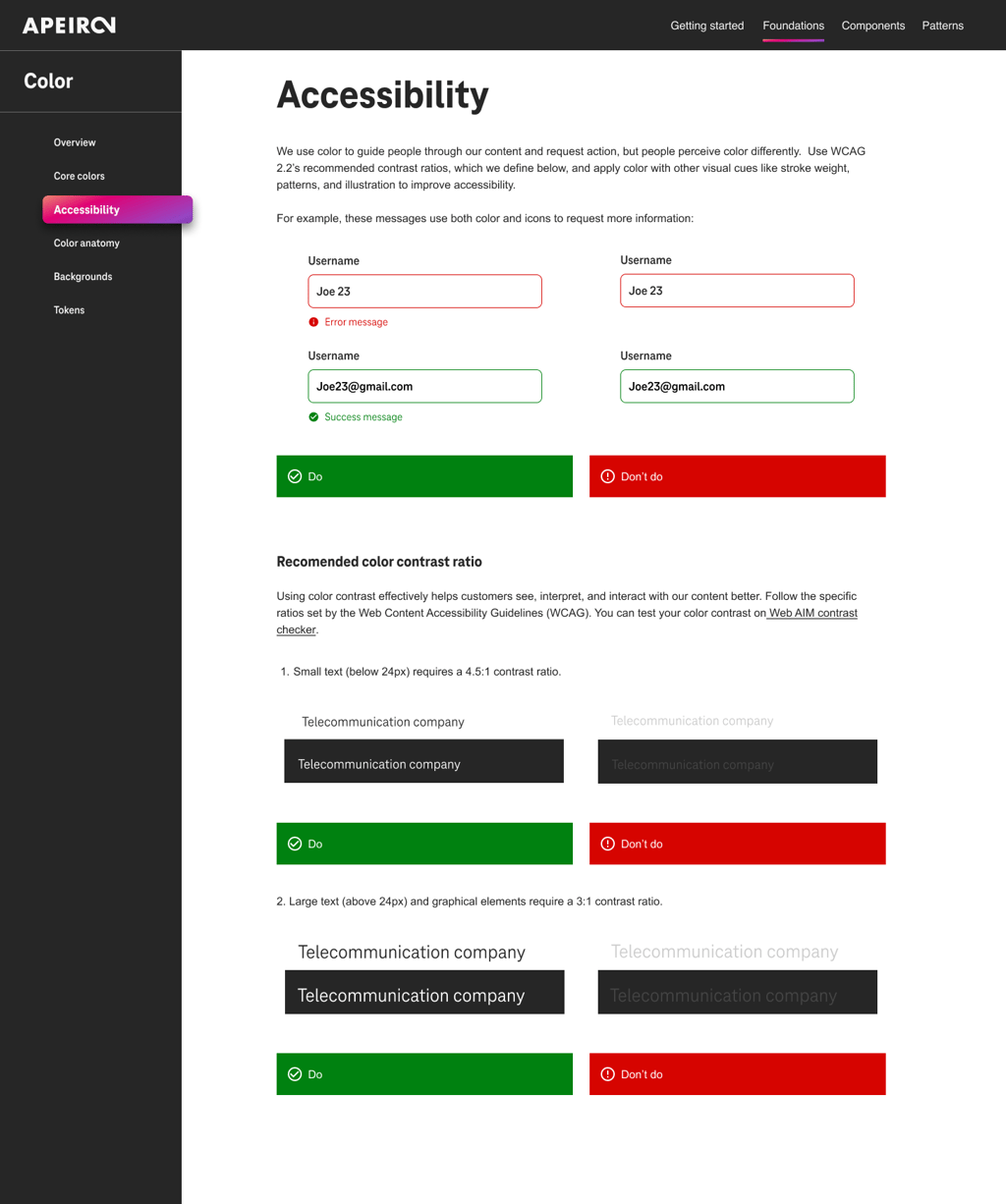
Accessibility
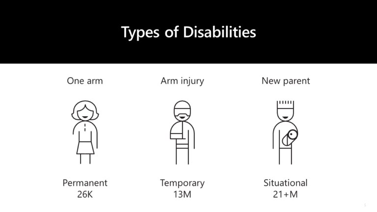
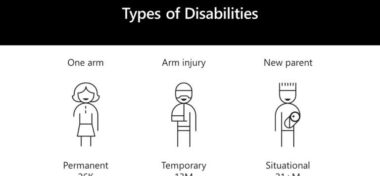
We aim to think about accessibility as early as possible in a project. It can prevent accessibility issues from happening in the first place. All text, elements, and components must meet accessibility standards. This is more than a business rule. It’s the law.
People with disabilities are one of the largest minority groups on the web. To provide web and app designs that are accessible, we follow the Web Content Accessibility Guidelines (WCAG) 2.2.
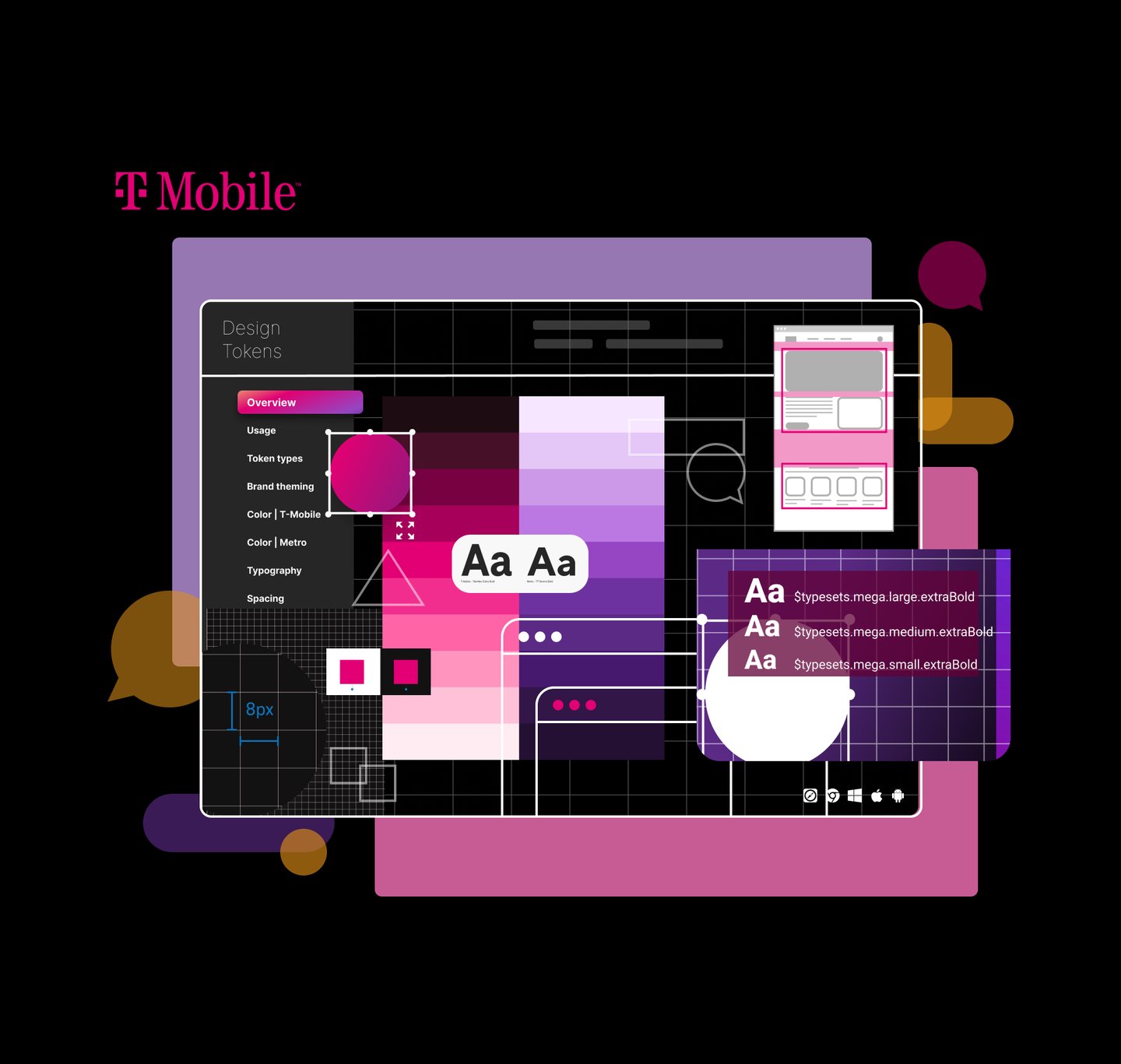
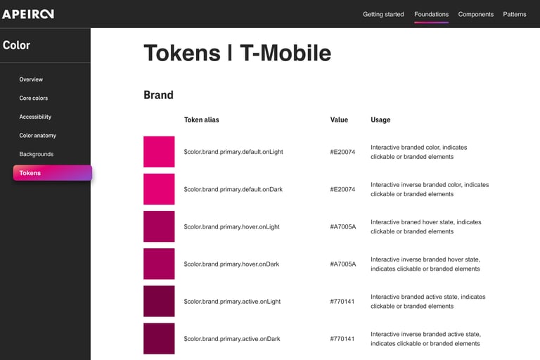
Design Tokens
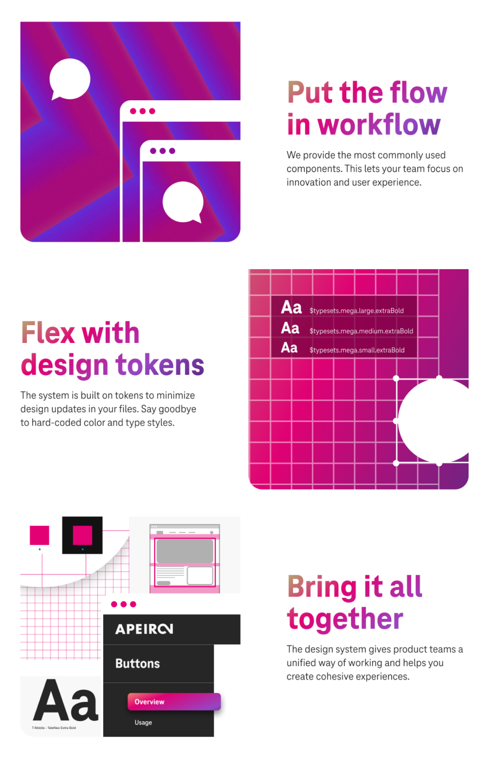
Design tokens translate our Apeiron design decisions into data. Choices such as color, typography, and spacing are no longer hard-coded. Instead, one change to the foundational value of the token will cascade into every relevant component. Design tokens help us keep the design system unified while streamlining updates for our team.
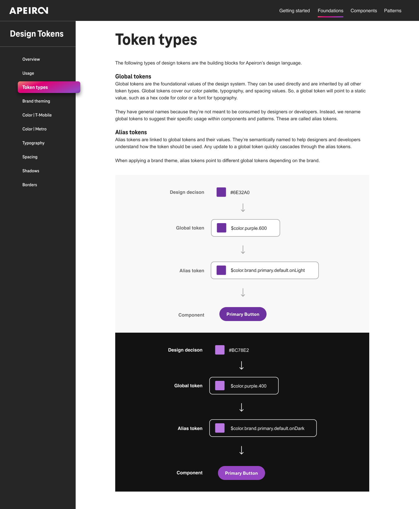
What are design tokens?
Design tokens are the source of truth for the foundational decisions in the Apeiron Design System. Tokens translate into readable styles for all digital platforms. We use tokens in place of hard-coded values, such as hex values for color or pixel values for spacing. A design token only needs to be changed in one place to see the effect system-wide.
How do design tokens work?
We use “variables” for any stylistic decisions that could change over time. Design tokens take these “variables” and abstract them from the values they represent. We give the design token a semantic name and then assign a value.
For example, rather than simply using the hex value #6E32A0, we named the design token $color.purple.600, which maps to the value #6E32A0 in the design system.
Design tokens are mapped and connected to the design system and are the single source of truth for their associated values.
In the future, when a value needs to change, the design system team can update the value. It will change everywhere that token is used throughout the ecosystem, as long as it’s connected to Apeiron.
Since designers and developers utilize the same set of design tokens, we can maintain consistency across disciplines and products. Design tokens are easy to maintain and update. If we change a token, it will be pushed out in the next release of Apeiron. When you update to the latest version of the library, you’ll automatically receive the changed tokens. They are scalable; for example, If we have a high-impact update that affects things like typography, color, or iconography, it can be pushed to the web, iOS, and Android platforms at the same time.
Brand Theming
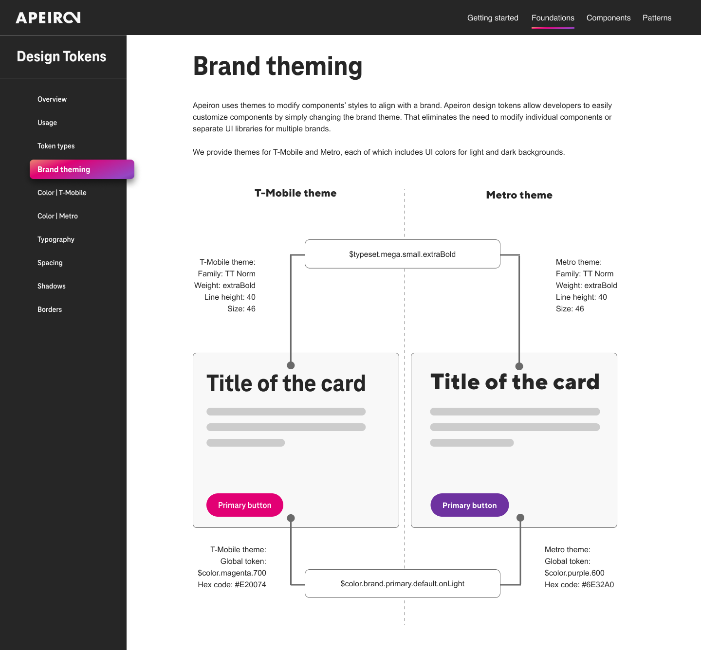
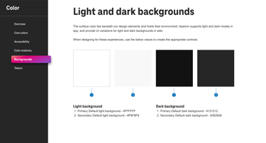
Apeiron uses themes to modify components’ styles to align with a brand. Apeiron design tokens allow developers to customize components easily by changing the brand theme. That eliminates the need to modify individual components or separate UI libraries for multiple brands. We provide themes for T-Mobile and Metro, including UI colors for light and dark backgrounds.

Upon establishing a visual direction that aligned with and enhanced the company's brand identity, I worked with UX copywriters to meticulously document all foundational design elements within Figma. This digital design tool served as a centralized repository, enabling team members from various workstreams—such as design, development, and product management—to access and review the design components in real-time.
These elements were precisely defined, providing clear guidelines and references for anyone involved in the product development cycle. This approach not only improved the efficiency and consistency of the design process but also enhanced the overall quality of the product, ensuring that the final outcome was a true reflection of the company's brand and values.
Example of documentation for Colors:
UI COMPONENTS
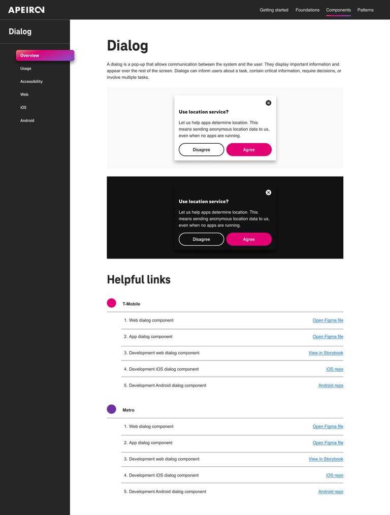
Design systems encompass a vast array of complexities, and my experience with the components developed for T-Mobile has only touched on a fraction of them. To provide a more comprehensive view, I'd like to showcase a Dialog component I've been involved with. In terms of design, we prioritized ensuring that each component is accessible, intuitive, and aesthetically pleasing.
DIALOGS
I started with the purpose identification of the Dialogs within the design system. It's crucial first to identify the specific purpose of the UI element, including its primary functions and how it is typically utilized within the system. This foundational step ensures that the design and development efforts align with the element's intended use cases and overall system objectives, providing a clear direction for subsequent research and design process stages.
Step 1: Research & Analysis
Key Insights:
A dialog is a “conversation” between the system and the user.
It is prompted when the system needs input from the user or to give the user urgent information concerning their current workflow.
To emphasize the dialog, the system dims background content with a temporary overlay, disabling all other app functionalities until the dialog is addressed.
Next, I collected screenshots of the UI element from top design systems to understand their approaches and compiled a list of its common variations and functionalities. This process offered insights into industry best practices and diverse application possibilities for Dialogs, guiding our design strategy.
Key Insights:
Dialogs are purposefully interruptive, so they should be used sparingly
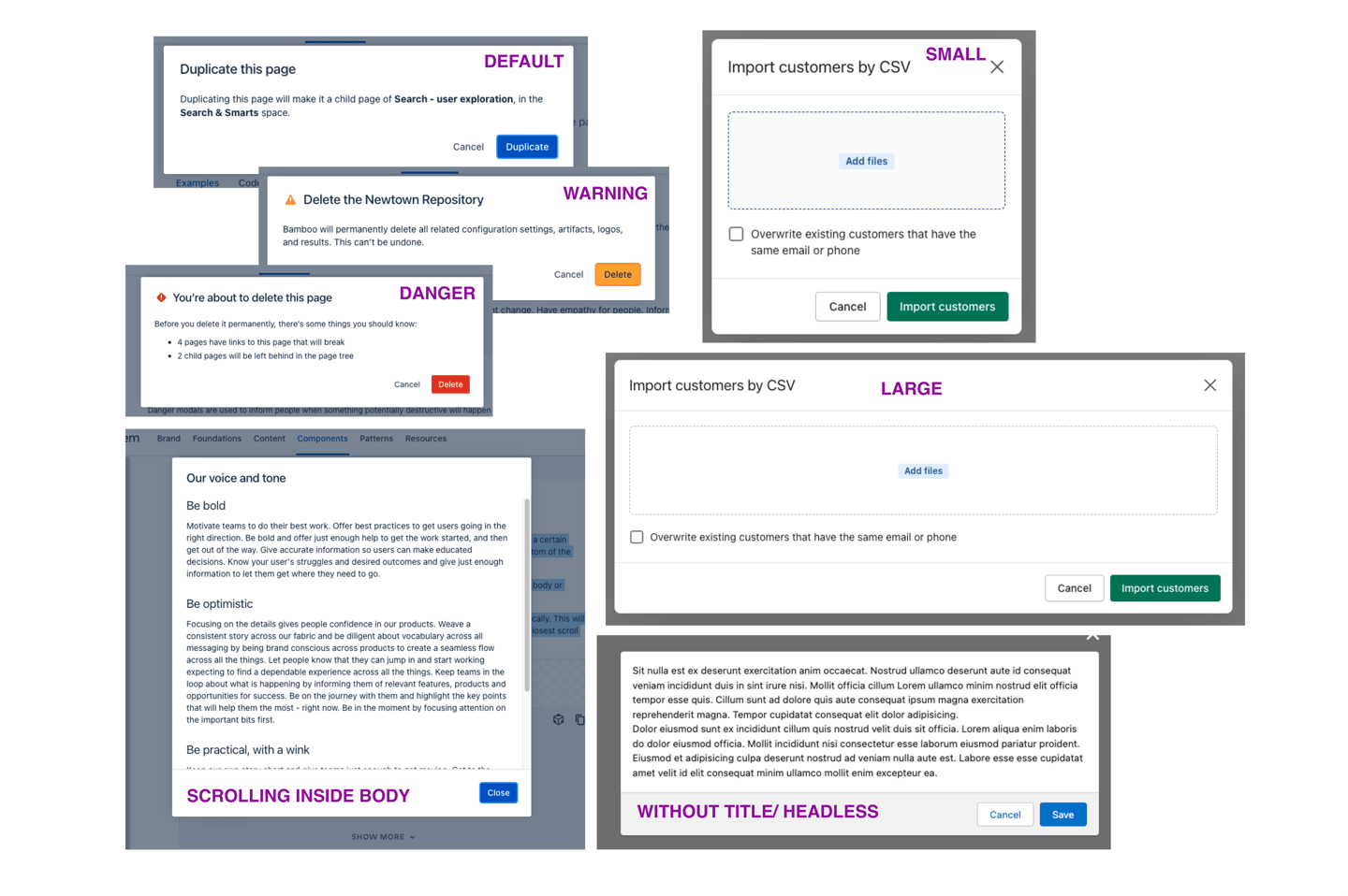
Dialog Sizes - small, medium, large
Dialog Types - Headless, footless, directional, scrolling inside the dialog box
Dialog Buttons - side-by-side, stacked at full width
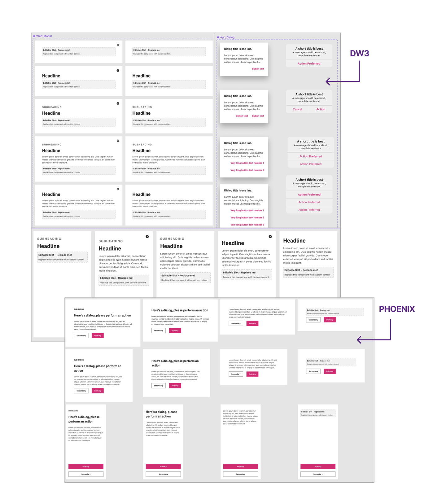
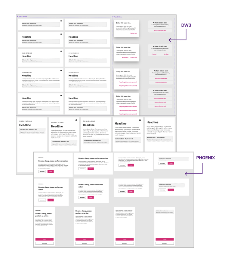
Once the market research of the Design system for the UI element was done, I started by capturing screenshots of the UI element from T-Mobile's existing design systems, including DW3, Phoenix, and Scale, and documented how it's currently utilized within the company. Following this, I engaged with relevant feature teams, conducting interviews where necessary to obtain in-depth insights. This thorough method helped me grasp the element's practical uses and its integration into T-Mobile's distinct ecosystem.
Key Insights:
DW3 Design System:
It includes clearly defined headlines and subheadings.
The design uses lines to divide sections of content within the dialogs, contributing to a clean and organized look.
Phoenix Design System:
There is a greater use of whitespace, which can make the dialogs appear less dense and potentially easier to read.
The action buttons are more prominently colored, often in T-Mobile's brand magenta, drawing attention to the primary actions.
Drawbacks of Multiple Design Systems:
While each design system has its merits, the differences between DW3 and Phoenix create a fragmented user experience where the user has to re-learn interactions and visual cues when moving between systems.
This could lead to inefficiencies and a decrease in user satisfaction, potentially impacting the overall user experience with the T-Mobile brand.
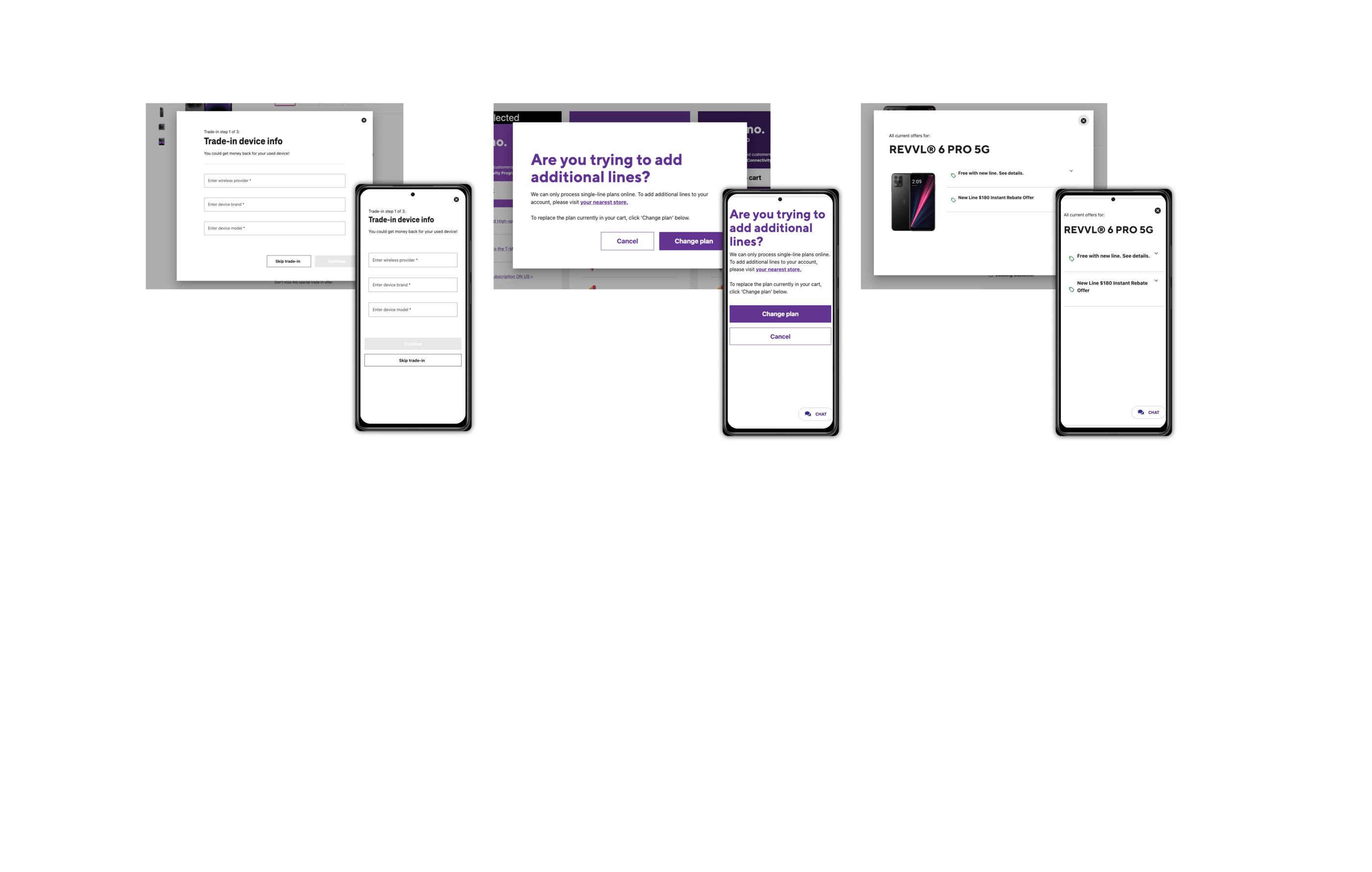
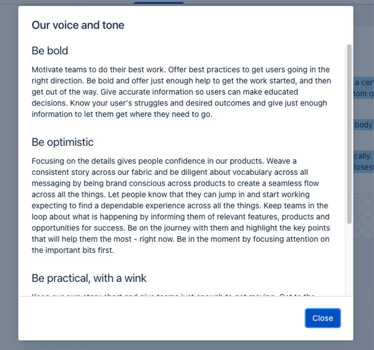
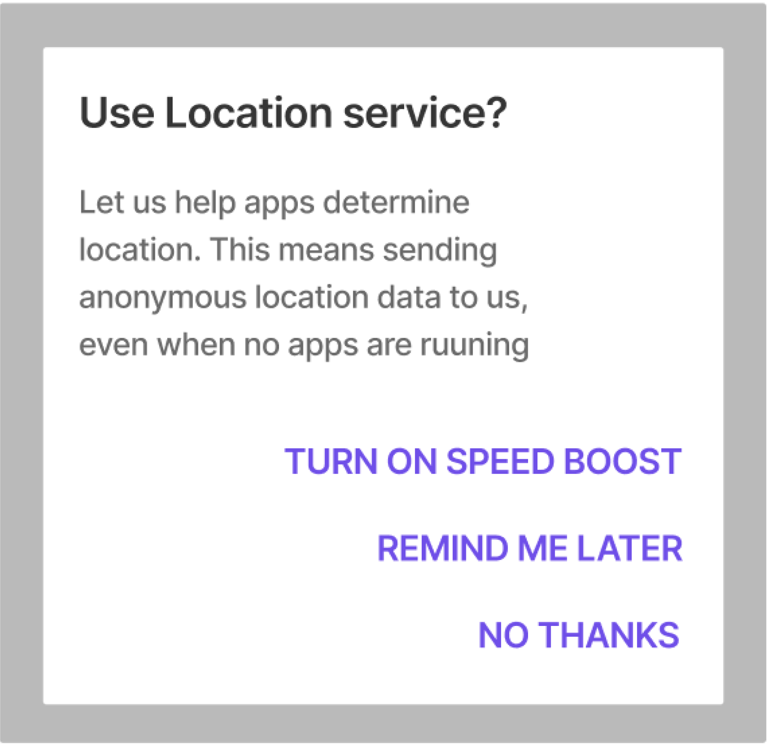
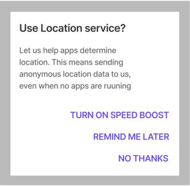
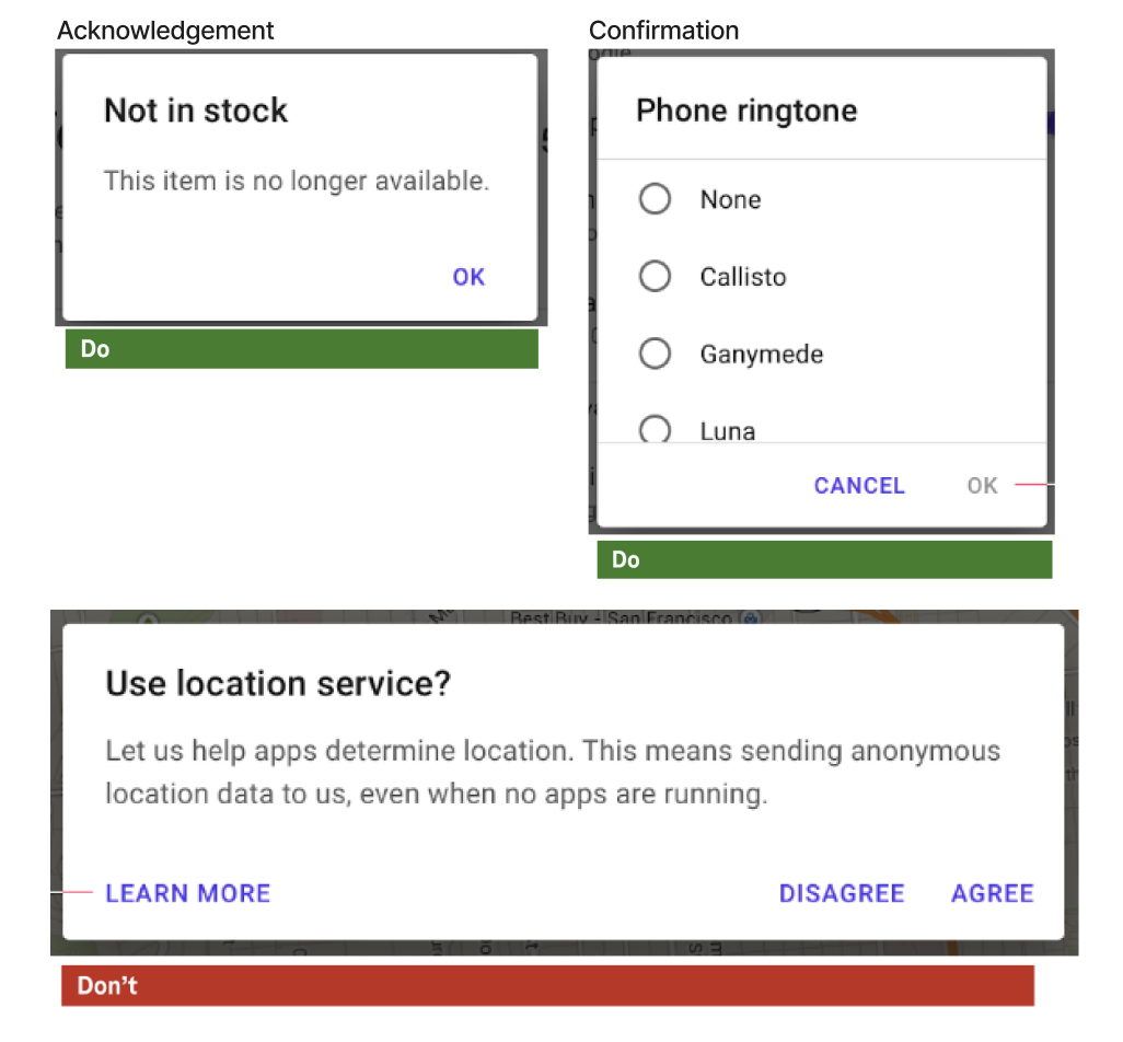
Next, I conducted a thorough analysis of T-Mobile's websites and apps to understand their use of dialogs. I captured a few screenshots of examples of existing T-Mobile use cases for these interactive elements.
Key Insights:
When a dialog is opened on a mobile device, it captures the full screen, creating a focus on the content and choices provided by the dialog.
This design pattern helps prevent accidental taps outside the dialog that could dismiss it without the user completing the necessary action.
The full-screen borderless modal on mobile doesn't look like a modal. When those are open, customers don't know they're in a modal. When they swipe to go back, it leads to confusion.
Step 2: Recommendations
Based on the initial research and analysis (step 1), I've provided recommendations for the Dialog component's design and functionality that apply to a range of platforms and screen sizes. I have also clearly explained this UI element, its typical use, and sometimes a list of dos and don'ts for additional context and clarification. Visual examples are included to ensure a clear understanding of the discussion. Additionally, there are rules specifying when and how to use the component.
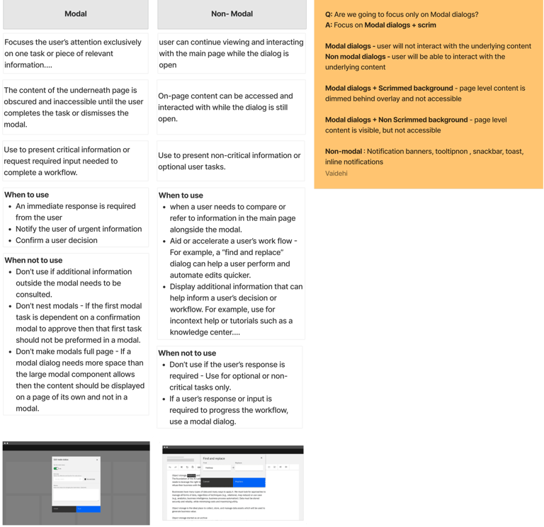
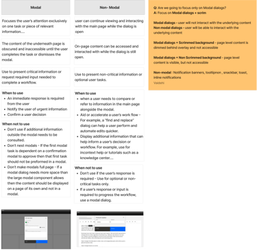
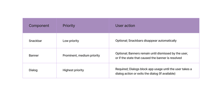
Use dialogs for prompts that block normal operation and critical information requiring a specific user task, decision, or acknowledgment. Dialogs are purposefully interruptive, so they should be used sparingly, as not every choice or setting warrants interruption.
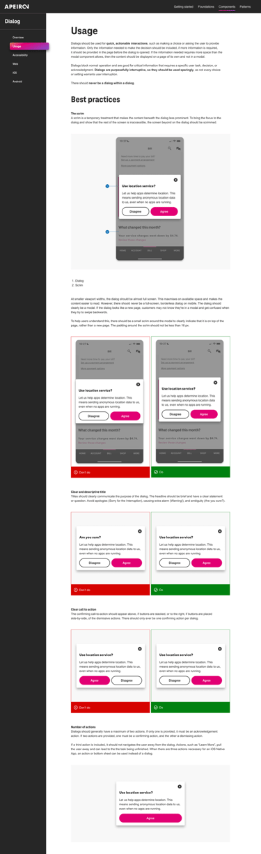
Usage
When to use
Prompt the user for an immediate response.
Notify urgent information or warnings to prevent critical errors.
Request essential information for process continuation.
Simplify complex workflows into easier steps.
Ask for information that reduces user effort significantly.
When not to use
Avoid using models for referencing external information.
Don't prompt for unrelated tasks or data within a modal.
Avoid opening a modal over another active modal.
Don't collect data that's irrelevant to the current user action in modals.
If the content exceeds modal space, use a dedicated page instead.
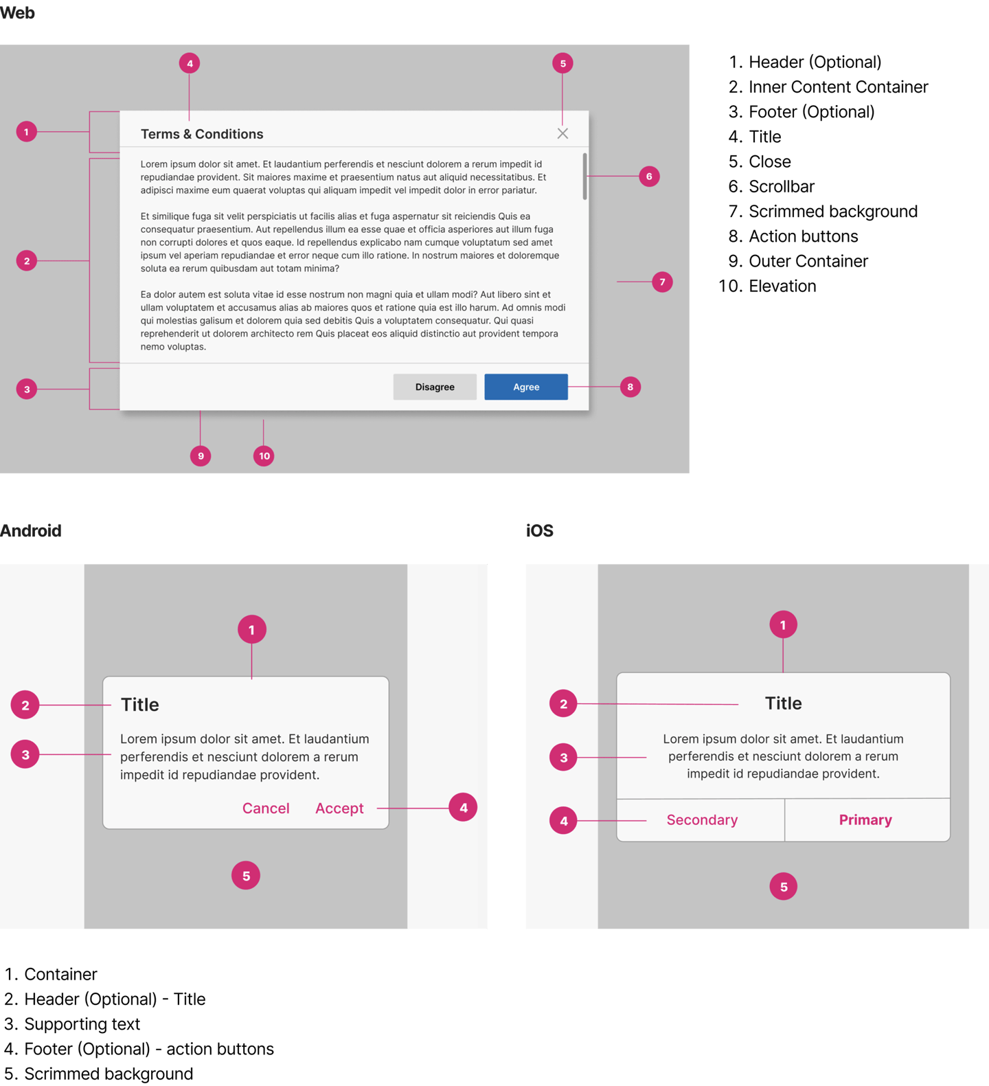
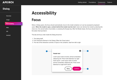
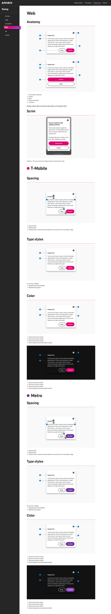
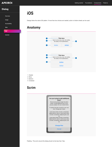
Basic Anatomy
The modal is composed of three distinct zones: A header, the body, and a footer.

Behaviour
Trigger
Dialogs are triggered as a result of a user’s action and are not system generated.
Common components that can trigger a dialog include, button, link, or icon.
Focus
The focus should be trapped inside the dialog container and must not move outside the modal until it is closed.
Appearing
Dialogs appear without warning, requiring users to stop their current task.
Dialogs use an enter and exit transition pattern to appear on screen.
Position
Dialogs appear at the center of the screen
They shouldn’t be obscured by other elements or appear partially on screen, with the exception of full-screen dialogs.
Scrolling
Most dialog content should avoid scrolling.
Even when scrolling is required, the dialog title is pinned at the top, with buttons pinned at the bottom. This ensures that selected content remains visible alongside the title and buttons, even upon scroll.
Dialogs don’t scroll with elements outside of the dialog, such as the background.
Appearance/styling of the scroll will follow whatever browser the user is in.
Dismissing Dialogs
Clicking the primary action will complete the task and automatically close the modal.
If the user’s ability to dismiss a dialog is disabled, the user must choose a dialog action to proceed.
The actions below will close the model without submitting any data and return the user to its previous context.
Clicking the close X icon in the upper right
Clicking outside the passive modal area will automatically close the modal (web)
Tapping the scrim (Android, iOS)
Pressing ESC on the keyboard
Tapping a "cancel" button if one is shown
Cross Platform Adaptations
WEB (DESKTOP AND MOBILE)
On the web, this UI component should be referred to as "Dialogs."
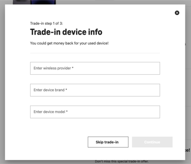
Desktop:
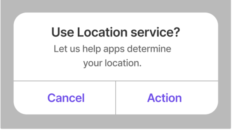
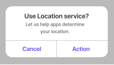
The dialog is shown with a clean and traditional design, featuring a clear header, input fields, and action buttons at the bottom. It's placed within the context of the interface, suggesting it's a modal that overlays the main content.
Mobile:
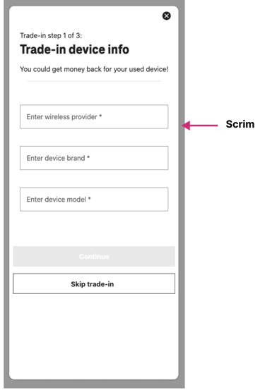
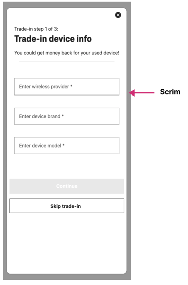
The mobile version addresses a problem: avoiding full-screen, borderless models that can be mistaken for a new page. To combat user confusion and make it clear that it's a modal dialog, a solution is presented — the mobile dialog should have a visible margin or "scrim" around it.
This scrim indicates the dialog is an overlay on top of the existing page rather than a new page, helping to distinguish it from the rest of the content and maintain the modal dialog context. The design suggests that users should perceive it as an interruptive element that demands interaction before returning to the main content, which is consistent with how modals should function on mobile devices.

APP (ANDROID AND iOS)
Android:
The recommended name for this UI component is "Dialogs."
For two action buttons, they should be positioned side by side; for three, they should be stacked.
iOS:
The recommended names for this UI component are "Alerts" and "Action Sheets."
In the case of two action buttons, it’s recommended to use Alerts that fit the text labels horizontally.
For scenarios where there are three action buttons, it's suggested to use iOS action sheets or bottom sheets. These provide a list of options to the user in a different format from the standard dialog.

Three Actions Buttons
Two Actions Buttons
Use Alerts for Two Actions Buttons
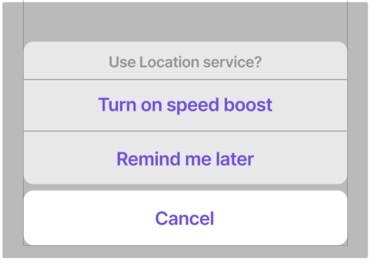
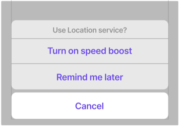
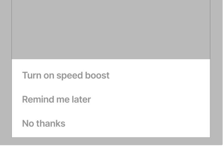
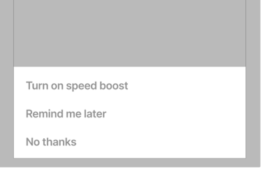
Use Action sheets or bottom sheets for three Actions Buttons in iOS
Best Practices
Clear and descriptive title
A dialog’s purpose should be communicated by its headline, buttons, or actionable items.
Headlines should:
Contain a brief and clear statement or question
Avoid apologies (Sorry for the interruption), extra alarm (Warning!), or ambiguity (Are you sure?)
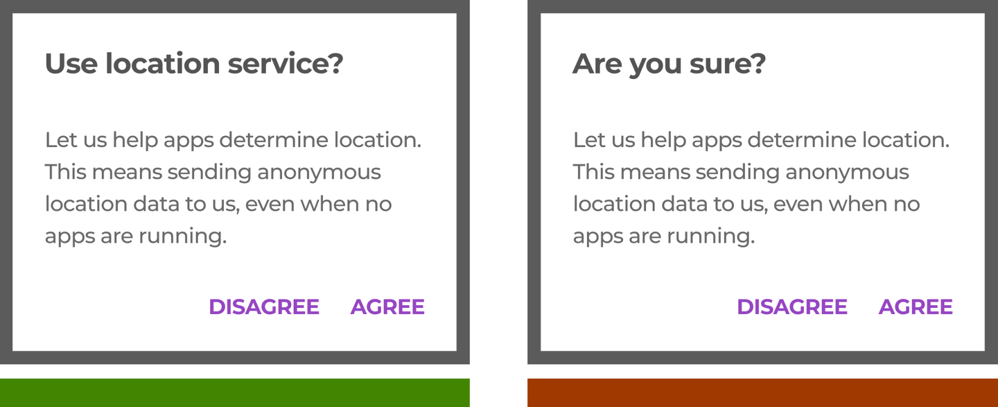
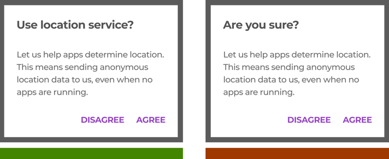
Clear calls to action
When placing buttons, the dismissive action is always the left button option, and the primary action is always the right button. There should only ever be one primary action per dialog.
Dialogs can have buttons side-by-side, and stacked in full width.
Side-by-side buttons (Recommended) display two text buttons next to one another.
Stacked full-width buttons accommodate longer button text. Confirming actions appear above dismissive actions.
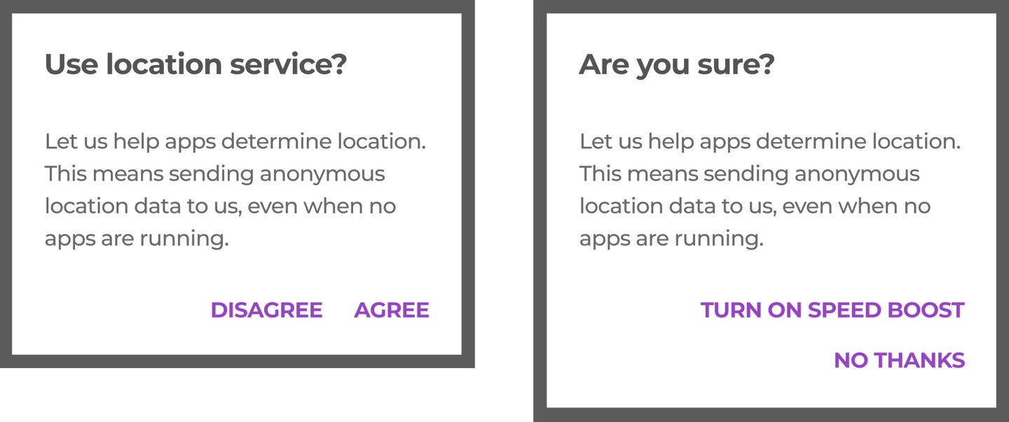
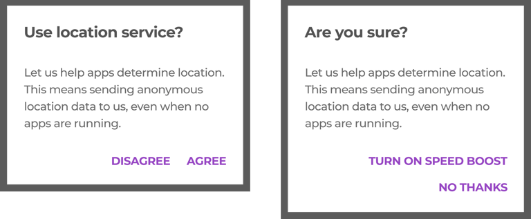
Number of actions
Dialogs should contain a maximum of two actions.
If a single action is provided, it must be an acknowledgment action.
If two actions are provided, one must be a confirming action and the other a dismissing action. Disable confirming actions until a choice is made. Dismissive actions are never disabled.
Providing a third action, such as “Learn more,” is not recommended as it navigates the user away from the dialog, leaving the dialog task unfinished.
Rather than adding a third action, an inline expansion can display more information. If more extensive information is needed, provide it prior to entering the dialog.
A detailed research, analysis, and recommendations I have provided for dialogs can be viewed here.
DOCUMENTATION
After the recommendations were finalized, I worked with UI designers to develop component designs that were both simple and scalable, ensuring alignment with T-Mobile's brand identity.
Upon completion of the element design by the UI designers, I collaborated with them to draft a detailed hand-off document for the development teams. This document, which was regularly updated to reflect the latest design decisions for the UI components, serves as the definitive guide for other critical stakeholders on the team as well.


List of other UI components I have worked on to provide recommendations and then create final documentation...
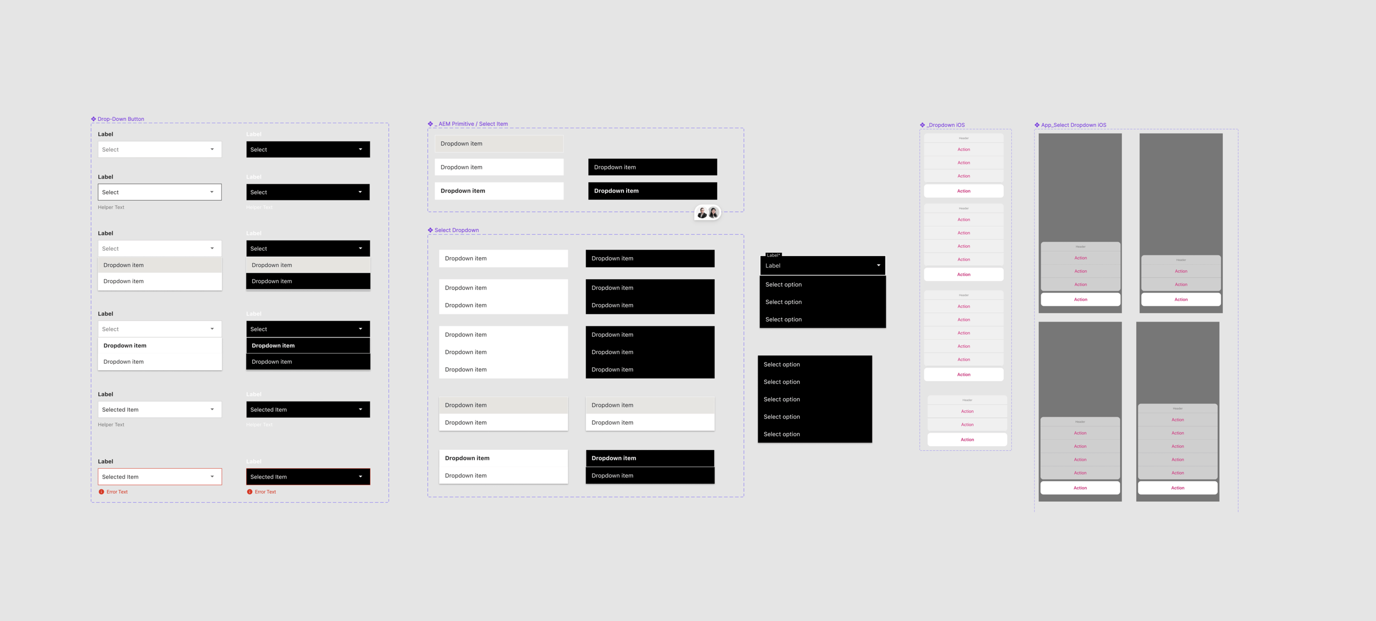
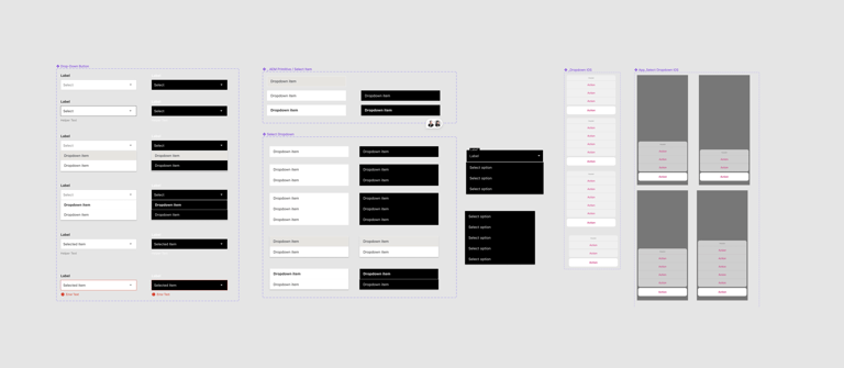
Dropdown
Breadcrumbs
Links & Action Button
Ordered/Unordered list
Progress indicators
Toggle
RESULTS
Design Systems are like living organisms in that they are complex and ever-evolving. I showed here just a section of what goes into a complete system. A complete design system contains the following:
Documentation - A shared space where you say when and how to use the design system
Visual language - Guide to what the brand feels like
Pattern library - Also called "component library"
Brand guidelines - Include principles, tone and voice, writing style, and more
CSS framework - Front-end code that developers use to build a product.
APEIRON is a work in progress, but that's how it's supposed to be.