Digital Banking: Unlocking access for customers who were already there
Existing bank customers, accounts open, trust established, money deposited, couldn't use digital banking because the login and signup experience was too complicated to complete. I redesigned both flows, from information architecture to final UI.
ROLE
TIMELINE
SCOPE
HEADLINE OUTCOME
Product Designer, Tata Consultancy Services
During 2018–2021 · Banking client engagement
70% faster flows · 110% digital traffic growth
Login & signup flows · Information architecture · UI design
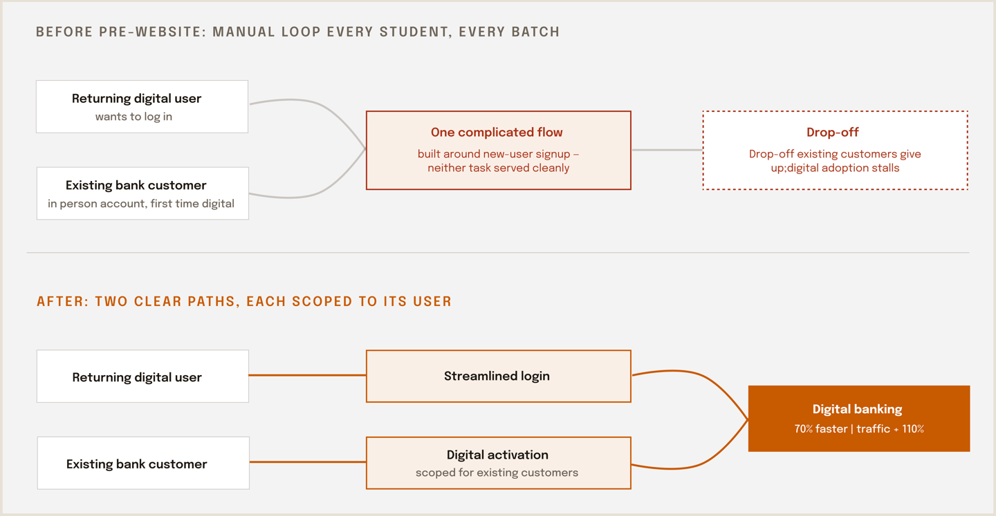

The structural fix, at the concept level. Recreated and simplified for portfolio use. The original files are under NDA, and the bank has since redesigned them. The core problem and fix are exactly this: one complicated flow serving two fundamentally different tasks, replaced by two clearly separated paths.
Not a trust problem. An interface problem.
01 THE PROBLEM
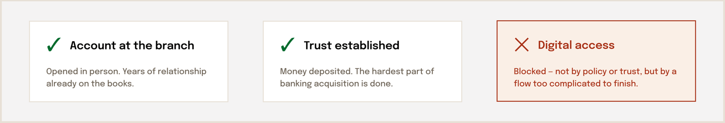
This was a different kind of digital adoption challenge. The bank's customers already had accounts opened in person with a long-established trust. The failure wasn't winning them; it was letting them in.
Customers who tried to start using the bank's digital services found the login and sign-up experience too complicated to complete. People with full banking relationships were abandoning at the front door. The result was zero digital engagement from the easiest-to-convert segment they had, customers who'd already chosen the bank, and branch workload for tasks that should have been self-serve.
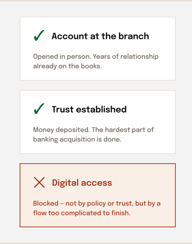
The most expensive interface in the product was the one standing between existing customers and their own accounts.
The customer's state when they hit the login page. Everything hard was already done. The only thing standing between an established customer and digital banking was the interface itself.
Structure first, screens second
02 The REDESIGN
Shorten the path to done

LAYER 1 INFORMATION ARCHITECTURE
LAYER 2 FLOWS
LAYER 3 UI
I redesigned the login and signup experience end to end. The work had three layers, in order:
Separate the two jobs
Make the right action obvious
Redesigned screens with clear labels for which path applies to whom, plain-language instructions, and an interface that a first-time digital user, often less digitally confident, could complete without calling the branch.
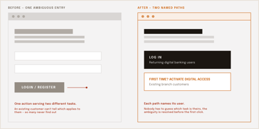
Logging in and activating digital access for the first time are distinct tasks depending on the user's state. The information architecture was restructured so each task had its own clear, appropriately scoped path instead of one complicated flow built around new-user signup that served neither task cleanly.
Each flow was rebuilt around the minimum its user actually needed to provide, in the order that made sense, cutting the steps, ambiguity, and back-and-forth that were causing existing customers to abandon.
The entry point, before and after. One ambiguous action serving two different tasks, replaced by two paths that each name their user. Everything else in the redesign flowed from this split.
Existing customers, finally online
03 outcomes
faster onboarding flows after the restructure, the path from arriving to banking digitally was cut to less than a third of its original time.
70%
110%
growth in traffic to the digital experience, previously stalled customers are completing activation and coming back.
Artifacts recreated and simplified from memory for portfolio use. Original Figma files remain under TCS/client NDA; the bank has since shipped a further redesign of its own.
04 What this project proves
When the interface is the business problem
On collaboration: this redesign meant aligning with product owners on which fields were truly required, and with the engineering team on what the existing authentication system could support without a backend rebuild. The two-path structure was as much a negotiation as a design decision.
This is the cleanest example in my work of a pure interface failure producing a measurable business loss — and a pure interface fix reversing it. No marketing changed; no product was added. It's also where my pattern was set: diagnose the structure before touching the screens. The visual redesign mattered, but the 70% came from the architecture: recognizing that one flow was doing two jobs and refusing to style my way around a structural problem.
This is a deliberately short case study. It predates my habit of documenting process as I go, and the working files are under NDA, so rather than padding it with reconstructed detail, I've kept it to what I can fully stand behind: the problem, the structural decision, and the measured result. I'm happy to talk through the project in depth in conversation.
Next case study →
© 2026 Vaidehi Yelkawar