Vaidehi Yoga: Designing a service system for a live practice
A real business with real retention. As the founder and sole designer, I designed the entire customer journey from first discovery to long-term retention, leading the research, design, and iteration on a live service.
ROLE
TIMELINE
SCOPE
HEADLINE OUTCOME
Founder · UX & Service Designer · Operator
Jan 2024 (discovery) – present · Live since May 2025
Onboarding friction cut 50–60% · 5–6 month avg. retention
Research · Service blueprint · Onboarding · Communication · Pricing · Operations
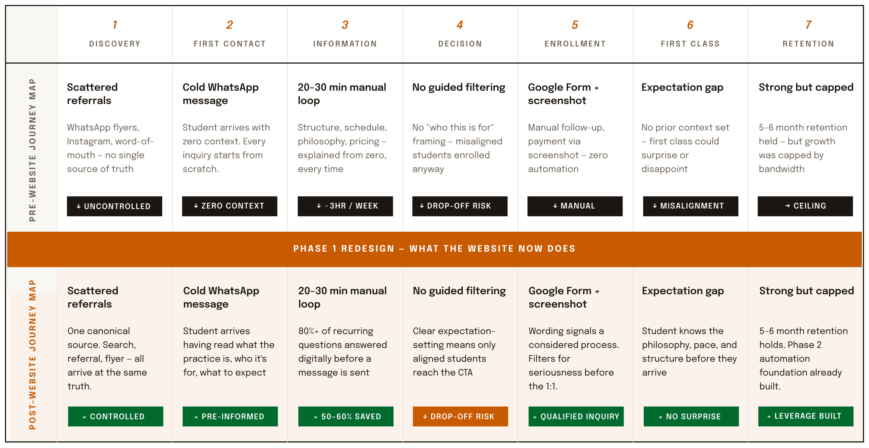
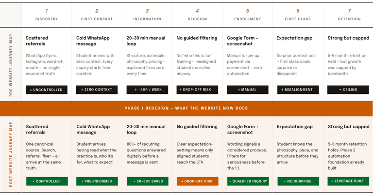
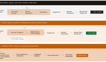
The complete service arc, before and after Phase 1. Same seven stages, redesigned system: the ~3 hr/week manual explanation loop became digital self-service, cold inquiries became pre-informed, and 50–60% of onboarding time was eliminated, stage by stage, with the friction named at each step.
Complete Service Arc: Before & After Phase 1
A teacher with a practice. No system around it.
01 Context
I'm a 500-hour certified Hatha Yoga teacher. The work began in 2024, not with a product but with a question: could a personal, small-batch online practice hold its own against high-volume wellness marketplaces? I spent that year on research. By May 2025, I had a real product (live online classes), real users (students), and the chance to run real product discovery on a live service, then live with the results.
What I didn't have was a service. Inquiries arrived through scattered channels with the same questions every time. Onboarding happened over long back-and-forth message threads. Scheduling, payment, and class communication were all manual. Each new student cost hours, and each hour came out of teaching.
This case study is about turning a practice into a designed service system. Because I was both designer and operator, every decision here was tested against reality within weeks.
The interface was fine. The seams were broken.
02 The problem
Success had to be measured on both sides of the service blueprint: frontstage (students feel informed, welcomed, and committed) and backstage (my time per student drops enough that the service can grow).
How does a one-person service deliver a many-person experience, without breaking the one person?
The classes themselves were good; retention proved that later. The friction lived between touchpoints: between a social media post and an inquiry, between an inquiry and a first class, between a free trial and a payment. Framed as a design problem:
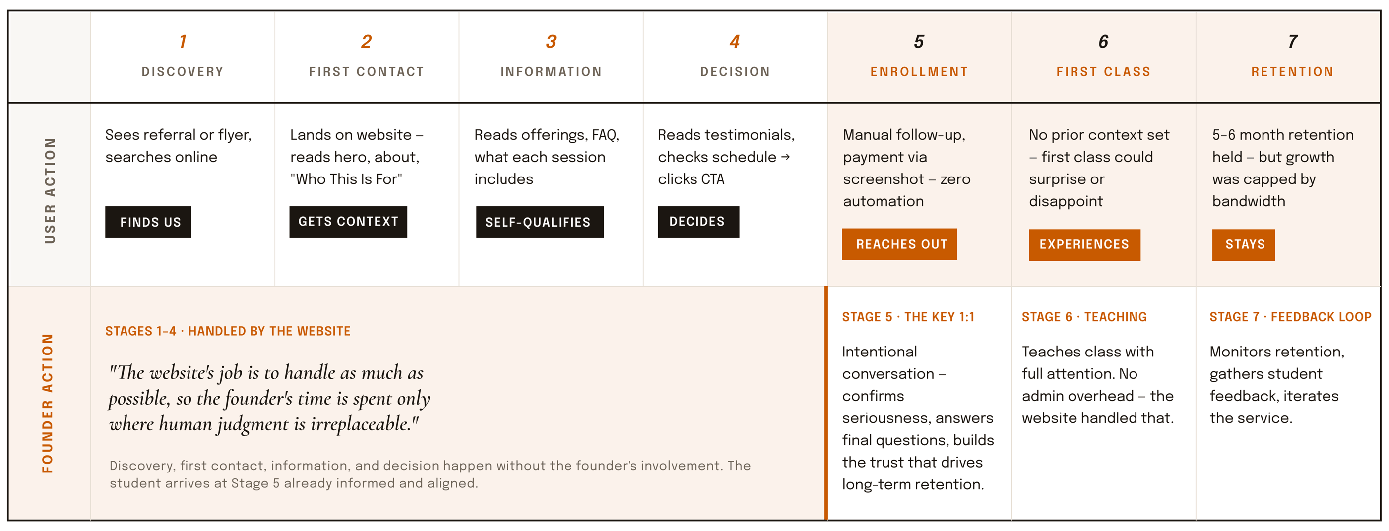

The blueprint's core principle is that the website handles stages 1–4, so the founder's time is concentrated only on stages 5–7, where human judgment is irreplaceable.
Who Does What At Each Stage
The blueprint's one rule: The website absorbs every frontstage and backstage task that doesn't need the founder's presence or judgment, so the founder's time concentrates where it's irreplaceable: the enrollment conversation, the teaching, and retention.
Fifteen competitors, real conversations, and one uncomfortable pattern
Finding
Decision
Result
Every inquiry asked the same 6–8 questions (schedule, level, language, fees, equipment, trial). The information existed, but it wasn't structured anywhere findable.
Restructure the entire pre-enrollment journey around answering questions before they're asked: rebuilt information architecture, a single registration flow with Terms & Conditions built in.
Inquiries now arrive pre-informed. Onboarding conversation time cut 50–60%.
Finding
Decision
Result
Competitors split into two camps: high-volume marketplaces competing on price, and personal teachers competing on trust. The middle was empty, and the marketplaces' own reviews showed students missing personal attention.
Position deliberately as small-batch and personal: limited cohort sizes, a single intentional evening batch instead of scattered slots, premium-of-one pricing, raised for new students, honored for existing ones.
Free pilot participants converted to paying customers within 2 months of launch. Average retention reached 5–6 months in a market where month-to-month churn is the norm.
Finding
Decision
Result
Drop-off risk was concentrated at the start of each class, and in the gaps between classes, students arrived in a rush, and the silence between sessions read as indifference.
Design the ritual layer: a consistent class-opening protocol (students settle in Shavasana before class begins) and a warm, brief, predictable communication cadence between sessions.
The experience became recognizable and calm, the qualities students cited when they stayed. Retention is where those qualities show up.
I ran product discovery the way I would for any client: competitive analysis across 15+ yoga and wellness services, conversations with current and prospective students, and a full audit of my own inquiry threads, the rawest research data a designer can get, because people ask exactly what confuses them.
Three findings shaped everything that followed:
03 RESEARCH
Designing the full arc, not just the screens
04 The system
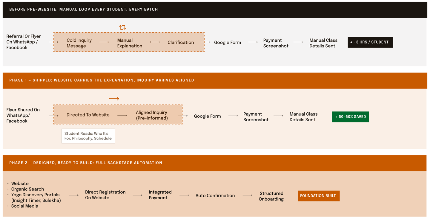
The enrollment flows across three system states. Pre-website: every inquiry triggered a manual explain-and-clarify loop. Phase 1 (shipped): the website carries that conversation, so inquiries arrive aligned. Phase 2 (designed, ready to build): direct registration, integrated payment, automated confirmation, the backstage fully systematized.
I launched assuming more schedule options meant more value, multiple batches, and maximum flexibility. The service data said otherwise: scattered slots fragmented the cohort, diluted the group energy that makes a live class worth showing up for, and multiplied my operational load without adding students. I consolidated to one intentional evening batch. It felt like shrinking the product; it was actually the product decision that made retention possible. Flexibility is a feature only when users value it more than what it costs them.
A wrong assumption I had to unwind
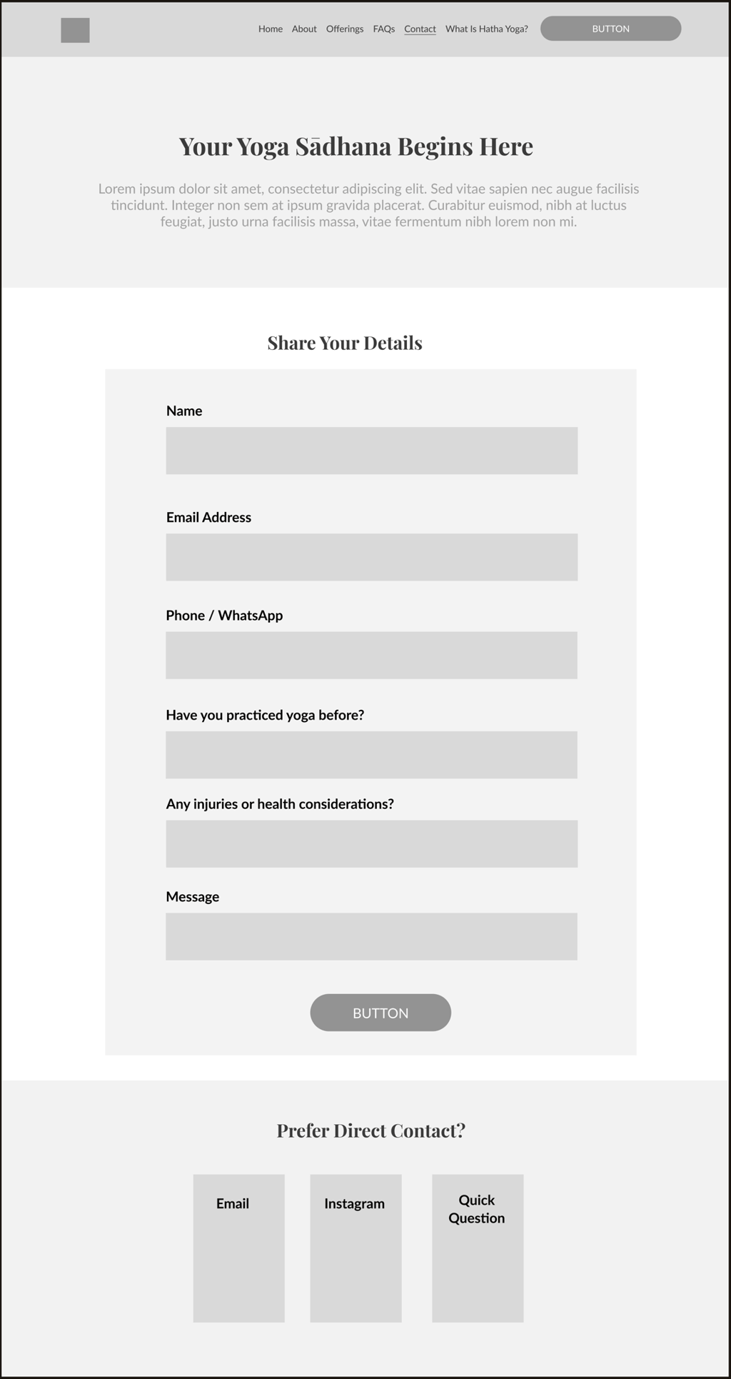
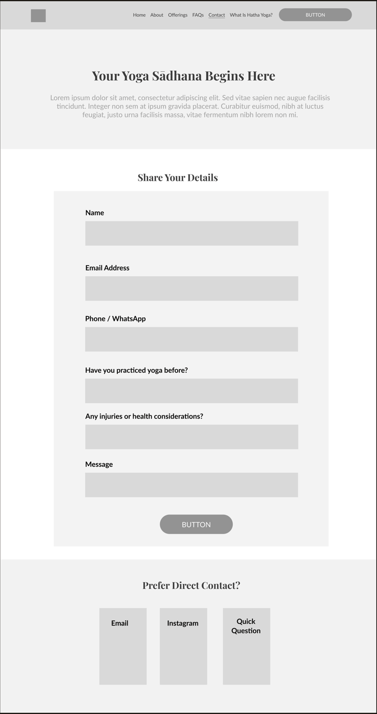
Contact page Qualifying questions (practice background, any injuries) built into the very first touchpoint, so students self-select before the 1:1 begins.
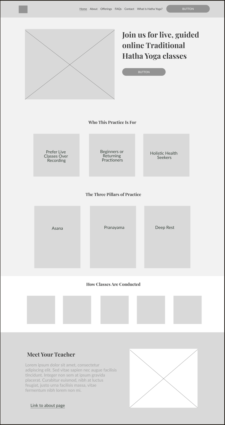
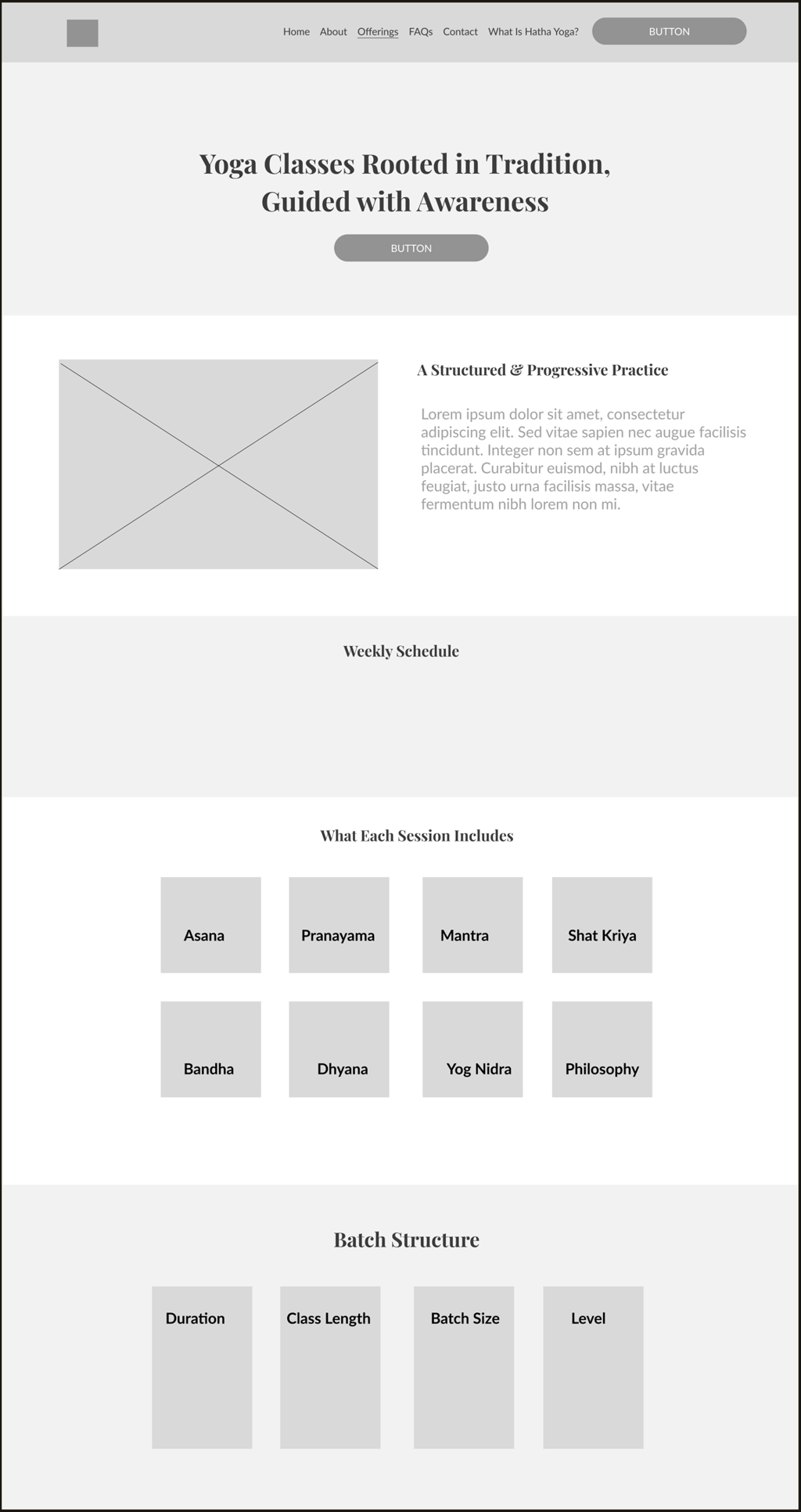
Homepage wireframe. "Who This Practice Is For" sits directly under the hero, serving as expectation-setting in the information architecture. Filtering happens on the page, before the first message is ever sent.
Offerings page. Every session element named before enrollment: Asana, Pranayama, Mantra, Shat Kriya, Yog Nidra. Batch structure and duration visible upfront. No surprises on day one.


All service design artifacts shown in this case study, including the service arc, blueprint, task flows, and wireframes are available in the Figma working file ↗
The deliverable wasn't a UI. It was a service blueprint. The seven-stage customer arc shown earlier groups into five service-design stages, each pairing a frontstage moment the student experiences with a backstage operation that delivers it:
Discovery
content strategy across Instagram, Facebook, and YouTube Shorts built around a clear teaching identity, plus SEO discoverability built from zero, so the service could be found, not just followed.
Inquiry → Enrollment
one structured registration flow (form, expectations, terms, payment) replacing open-ended message threads. Expectation management designed in: level, language, equipment, and class protocol stated upfront.
Retention & Renewal
Feedback loops informing iterative service improvements, batch consolidation when data showed scattered slots diluted the experience, and special sessions were offered only when genuinely warranted.
First Class
A designed first-session experience, because the first class is the product's onboarding screen. Protocol, preparation, and welcome communication are all standardized.
Ongoing Practice
Scheduling, payment, and group communication systematized into repeatable workflows; a monthly thematic structure (an "asana of the month") giving the service a content rhythm students can feel.
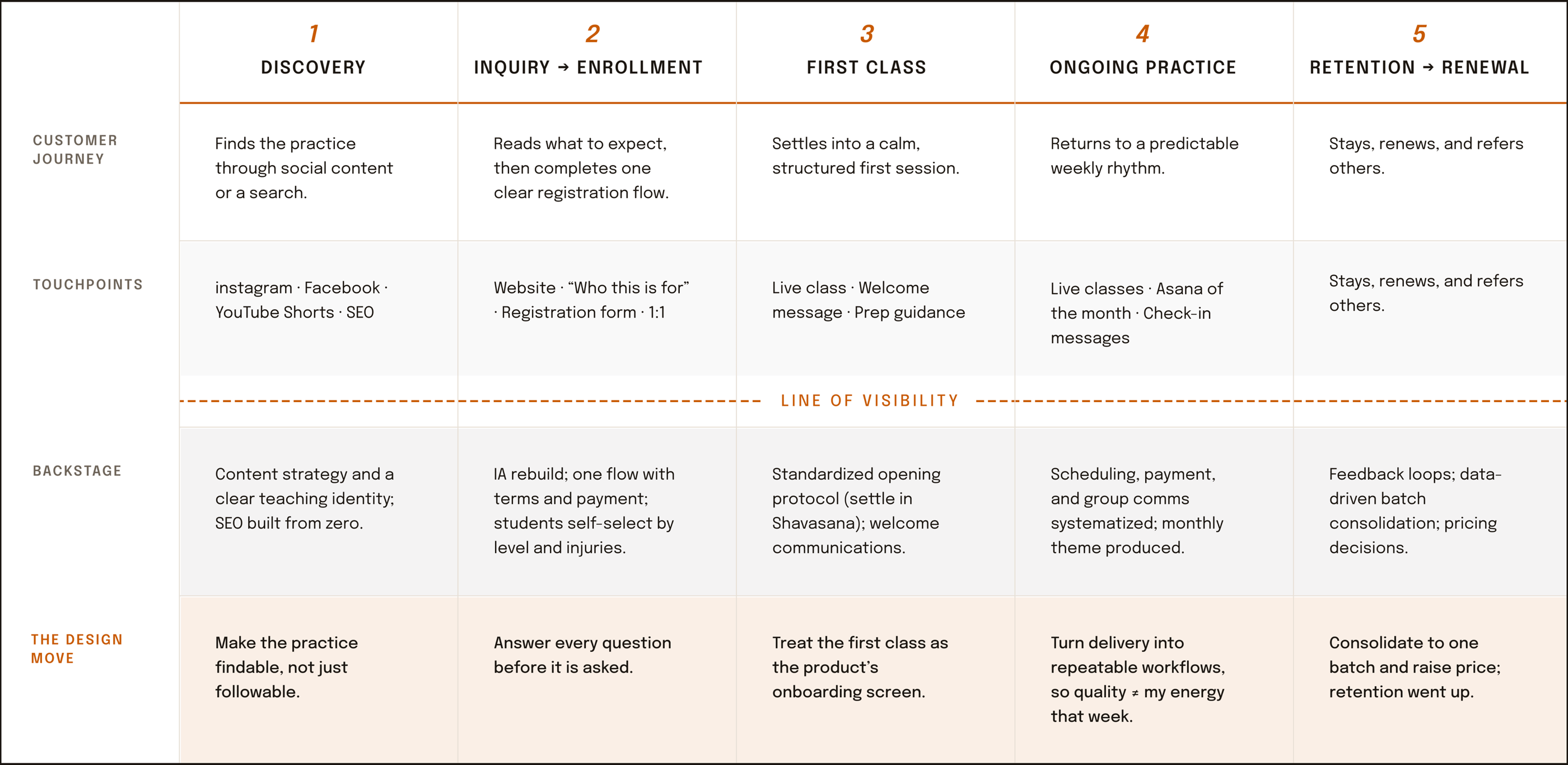
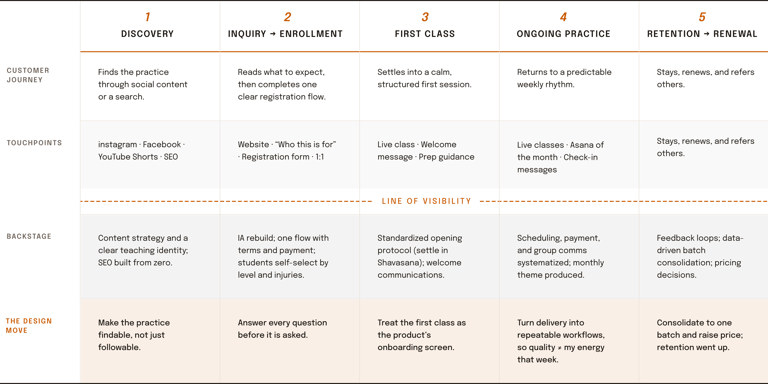
The service blueprint, five stages deep. Each stage pairs a frontstage moment the student experiences with a backstage operation that delivers it, split by the line of visibility. The bottom lane names the design decision at each stage.
Where AI made this faster and where it didn't get a vote
Building the product surface: AI helped rapidly build the website itself, the expectation-setting layer (who the practice is for, how classes run, what each session includes) that turned manual explaining into self-serve onboarding.
Content production: first drafts of class content (Yoga Nidra scripts, sequences, opening and closing scripts), class communications, social content, and service copy, all rewritten to my voice and standard.
Competitive scans: first-pass landscape mapping across 15+ yoga and wellness services before I went deep manually.
Synthesis: clustering inquiry threads, student feedback, and competitor notes into candidate themes, hours instead of days.
Repeatability: reusable prompt workflows for recurring analysis, so rigor didn't depend on my energy that week.
05 The AI-augmented workflow
AI ACCELERATEd
I DECIDED
AI synthesis surfaced "price sensitivity" as a dominant theme and nudged toward discount-led growth. The source data said something subtler: people questioned price before understanding the service, and stopped questioning it after a structured trial experience. I killed the discounting direction and invested in expectation-setting instead, then raised prices. Retention went up, not down. That's the difference between AI output and design judgment, and it's why the ~40% acceleration figure refers to speed of synthesis and production, never to decision-making.
A theme I killed, and why it matters
This project is where my AI-augmented process became a documented system rather than an experiment. The honest accounting:
The positioning call: small-batch premium over volume, a strategy decision AI can argue both sides of, which is exactly why it can't make it.
The framing: that this was a service-system problem, not a marketing problem.
The voice: every student-facing word. Warm, brief, and mine.
Verification: every AI-assisted output checked against the source data before it informed a decision.
Measured on a living practice
06 Outcomes
50–60%
2 months
5–6 mo.
reduction in onboarding friction. Structured flows replaced open-ended message threads; inquiries arrive pre-informed.
from launch to converting free pilot participants into paying customers, validating product-market fit on real money.
average student retention through iterative, feedback-driven service improvements.
From zero
~3 hr/wk → 0
faster research synthesis and content production via the documented AI-augmented workflow.
SEO discoverability and a three-platform content system (Instagram, Facebook, YouTube Shorts) built from nothing.
the weekly manual explanation loop eliminated; the website now carries the pre-enrollment conversation.
Everything described above is currently running on vaidehiyoga.com.
~40%
07 What this project proves
Why a living practice belongs in a product portfolio
Because nothing here was hypothetical. Every persona was a person who paid me or didn't. Every flow was tested by someone who could simply leave.
What I'd do next: Phase 2 automates the backstage, enrollment confirmations, payment reminders, and scheduling, while keeping every human touchpoint human.
Next case study →
© 2026 Vaidehi Yelkawar