Apeiron Design System: Component architecture for enterprise scale
T-Mobile's first unified cross-platform design system, consolidating three legacy systems into one. My work: the research and documentation layer that turns a component library into something teams actually adopt.
ROLE
TIMELINE
SCOPE
HEADLINE OUTCOME
UX Designer II ( Research & documentation)
Jul 2022 – Jan 2023 (concurrent with MBA)
85% of designers building consistently across platforms
Design tokens · Core components · WCAG 2.2 specs · Web, iOS & Android
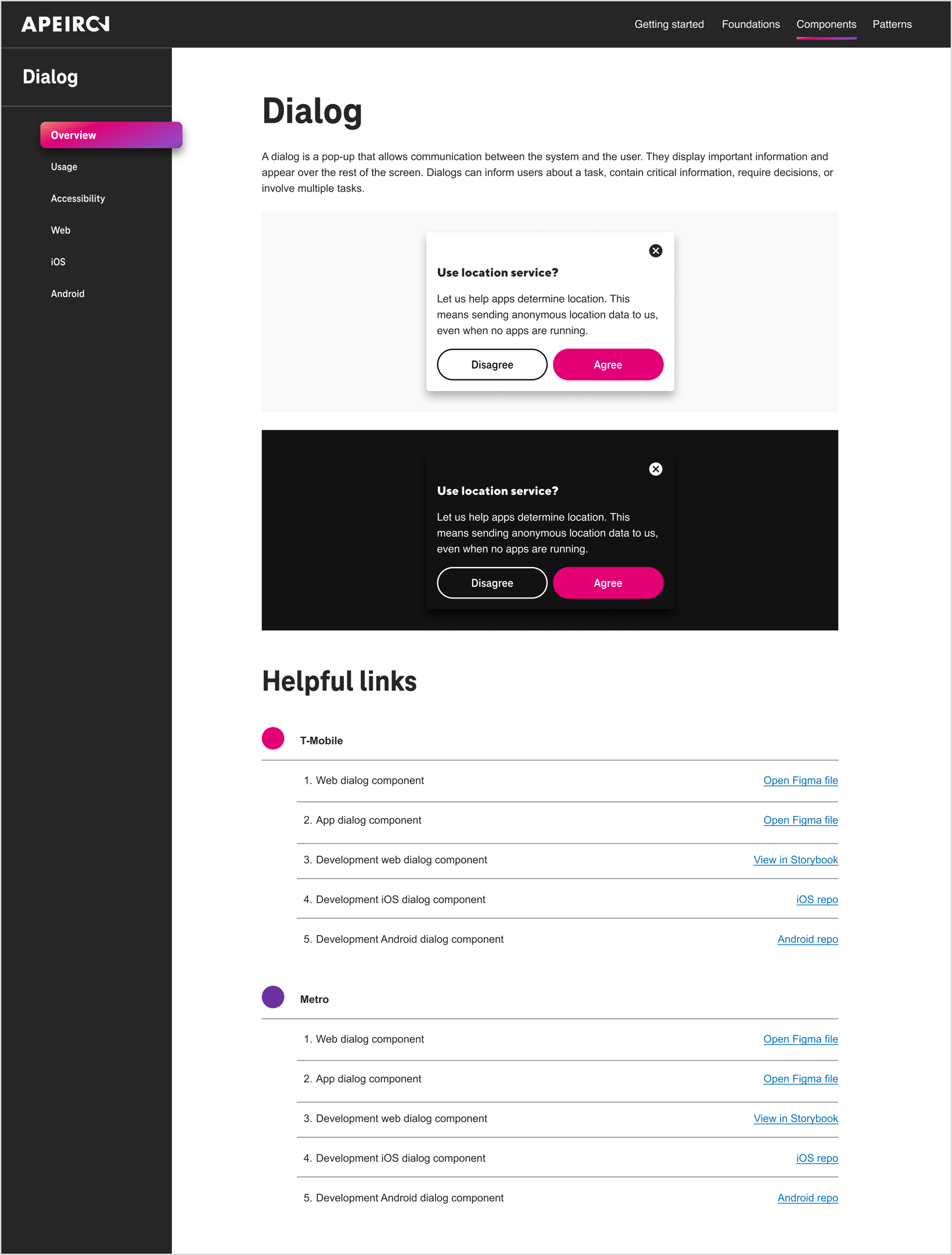
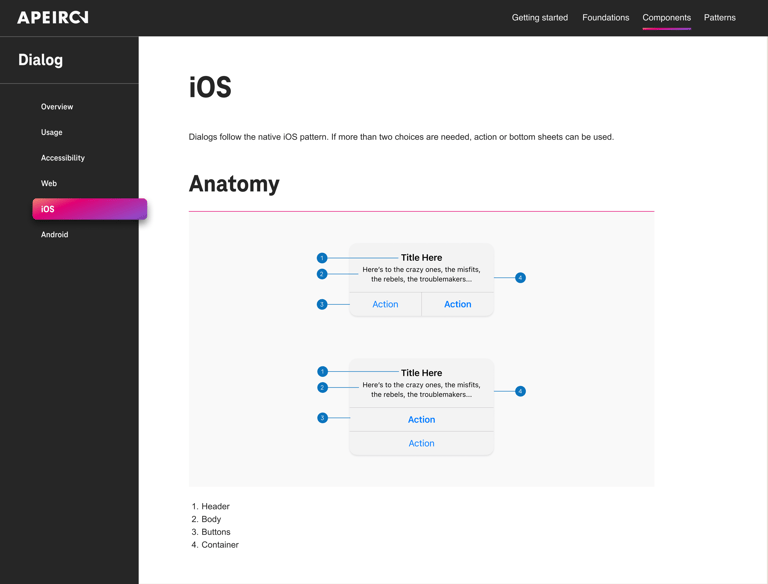
The shipped documentation. The Dialog overview page in Apeiron's documentation site, with components shown in light and dark themes, and direct links to Figma files, Storybook, and platform repos for both T-Mobile and Metro. Documentation as a product, with its own navigation, audience, and handoff paths.

Three design systems. One company. Zero shared language.
01 Context
T-Mobile's product surface spans web, iOS, and Android, built by teams who had inherited three separate legacy design systems. Same brand, three different buttons.
The cost wasn't aesthetic; it was operational. Designers re-decided solved problems. Developers rebuilt components that existed elsewhere under a different name. Accessibility was re-litigated per team. Apeiron was the answer: one unified, token-based system to replace all three.
My role sat at the layer where design systems succeed or quietly die: research and documentation. A component library without adoption is a Figma file; documentation is what turns it into infrastructure.
Documentation that works without a designer in the room
02 The problem
That test drove three requirements: consistency of structure (every component documented the same way), platform honesty (where Web, iOS, and Android genuinely differ), and accessibility as specification, not suggestion.
The test for every page I wrote: can a developer who has never met me build this correctly, on their platform, the first time?
Enterprise scale changes what documentation has to do. At a startup, a developer can walk over and ask. At T-Mobile's scale, the documentation is the conversation — across teams, time zones, and platforms.
What was mine on a team effort
03 MY CONTRIBUTIONS
Authored the Dialog documentation end-to-end
Design systems are inherently collaborative, so let me be precise about ownership. On Apeiron, I personally:
✓
focus order, scrim behavior, dismissal patterns, and AT expectations as verifiable requirements
✓
Audited legacy inconsistencies
mapped how three systems defined the same components and where conflicts caused downstream rework
Documented the token architecture
Wrote WCAG accessibility specifications
research & audit → recommendation → final handoff docs across Web, iOS, and Android
design decision → global token → alias token → component, the system's single source of truth
✓
✓
Led component research
✓
handoff delivered through Figma and Storybook, linked directly from every component's documentation
✓
Defined the documentation framework
the four-layer structure (purpose, anatomy, platform specs, accessibility) applied across components
Documented brand theming
Partnered with engineering and product
Buttons, Toggle, and Progress Indicators audited and documented through the same pipeline
one alias-token layer serving both T-Mobile and Metro, light and dark, without separate UI libraries
✓
✓
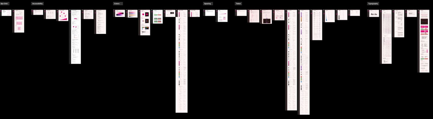
Foundation scope, zoomed out. The component work sat on top of a full foundation layer — Grid, Colors, Spacing, Tokens, Typography, and Accessibility all documented through the same structured pipeline. My contributions spanned both layers.
Everything else on this page, the system's overall architecture, visual language, and engineering implementation, was the work of a talented cross-functional team I'm glad to have built alongside.
Studying how three systems disagreed
04 research
The working file's structure is the process. Research & Audit → Research Recommendation → Final Handoff Documentation. Every component moved through the same pipeline, visible in the file's own page list. Rigor you can see in the sidebar.
Before writing a word of documentation, I researched the consolidation itself: auditing how the three legacy systems handled the same components, where definitions conflicted, and which inconsistencies were causing real downstream rework for product teams.
I worked with product, engineering, and design stakeholders to understand how each audience actually consumed documentation — designers needed usage guidance and decision support ("when to use Select vs. Dropdown"); developers needed specs, states, and tokens; both needed accessibility requirements they could verify, not interpret.
That research shaped a component strategy built for scale: shared anatomy and behavior defined once, platform-specific specifications layered on top, and design tokens as the single source of truth underneath everything.
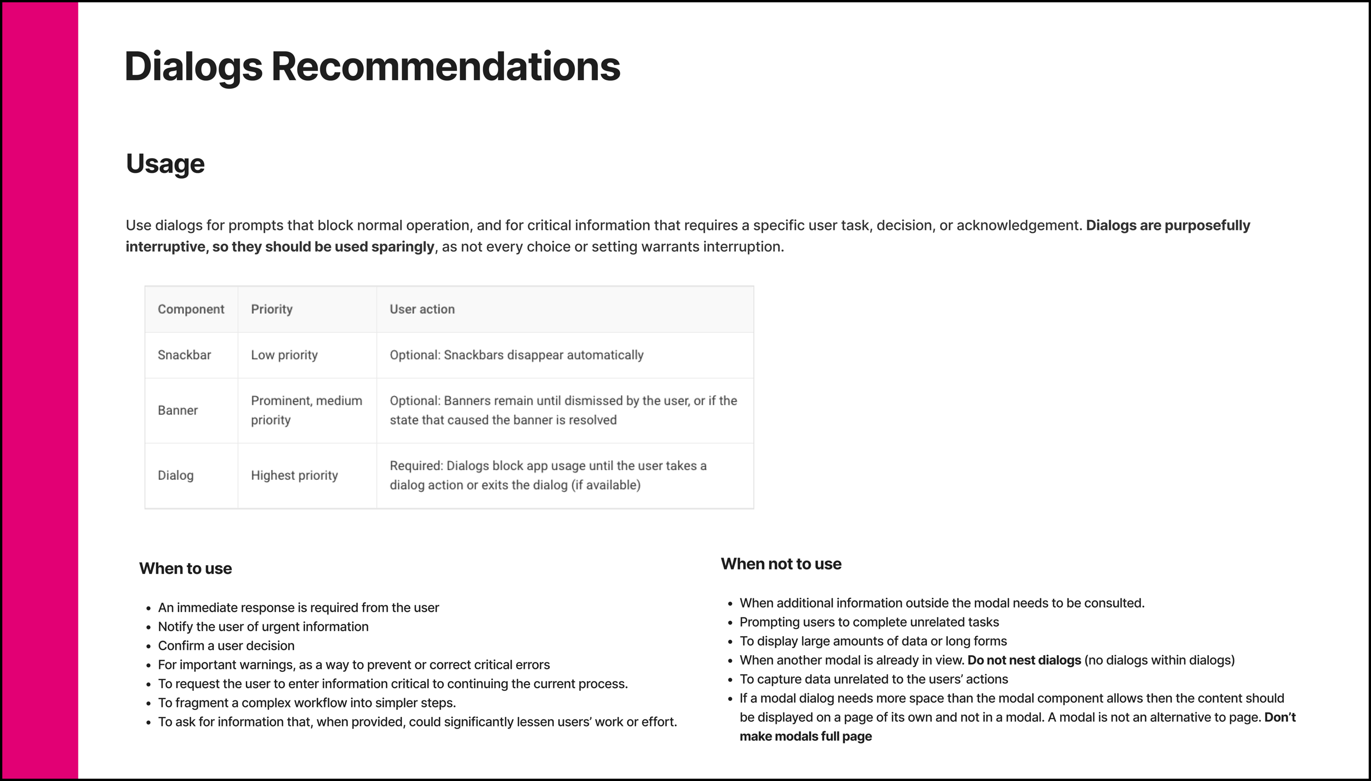
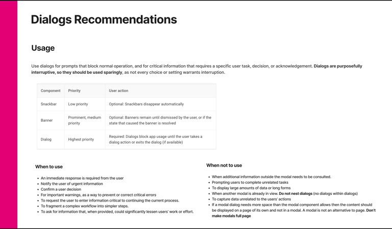
The research recommendation that preceded the documentation. Component priority relative to snackbars and banners, when-to-use and when-not-to-use criteria, annotated anatomy per platform, behavior rules, and dos & don'ts, the evidence base every documentation decision traces back to.
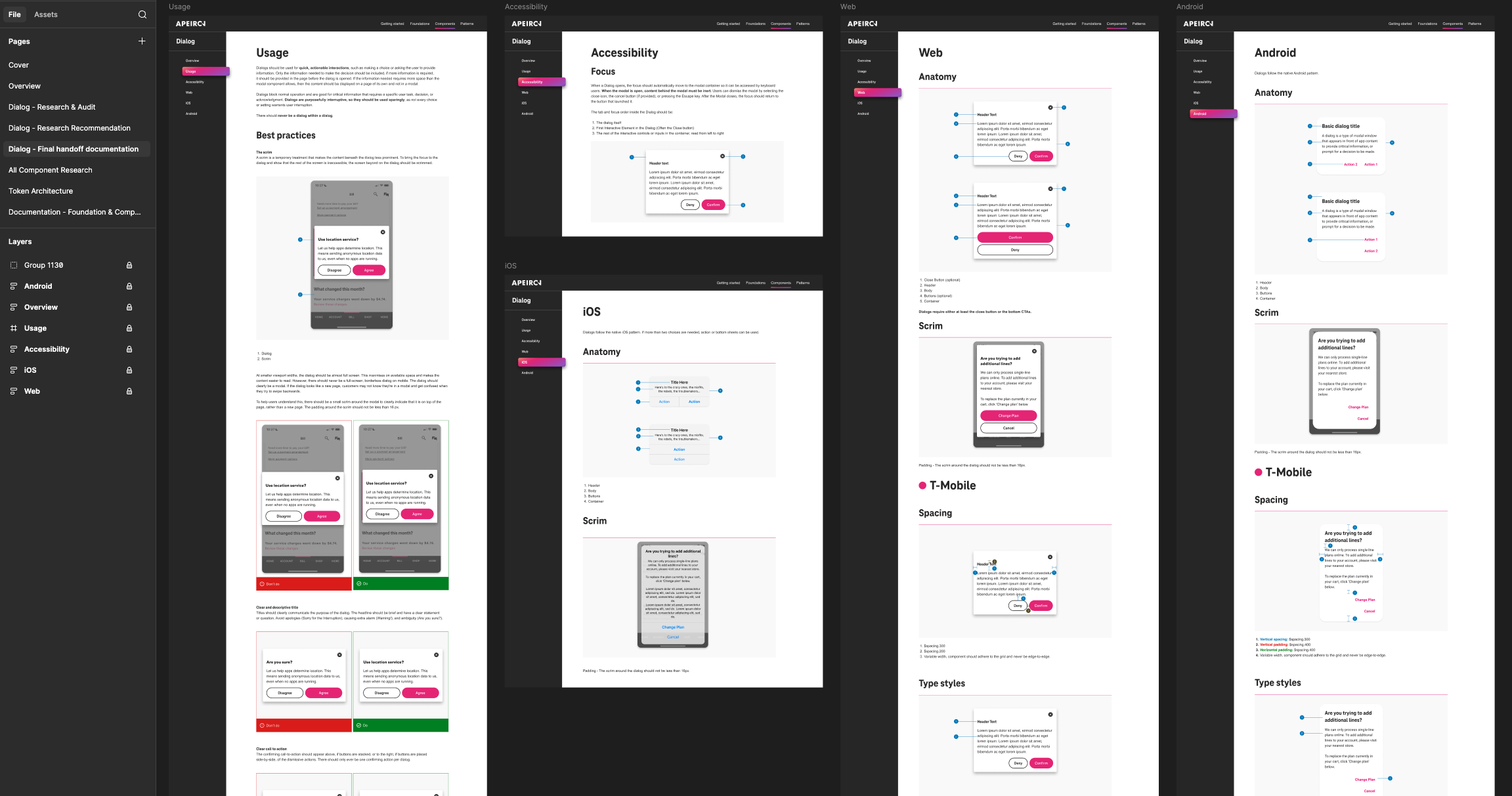
Every component, four layers deep
I defined and documented components through a consistent four-layer structure — shown end-to-end below for Dialog, and applied across Buttons, Toggle, and Progress Indicators — delivered in Figma and Storybook for direct developer handoff:
05 The documentation framework
Layer 1
What the component is for, when to use it, and just as important, when not to. Decision support that ends the "Select or Dropdown?" debate before it starts.
Purpose & usage
Layer 3
Explicit specifications for Web, iOS, and Android. Where platforms genuinely differ, the documentation says so: honesty over false uniformity.
Cross-platform specs
Layer 2
States, variants, interaction patterns, and content rules are defined once at the system level, so behavior is identical wherever the component appears.
Anatomy & behavior
Layer 4
Contrast, focus behavior, touch targets, and assistive technology expectations written as verifiable specs. Accessibility as a requirement with a checklist, not a value statement.
Accessibility WCAG 2.2

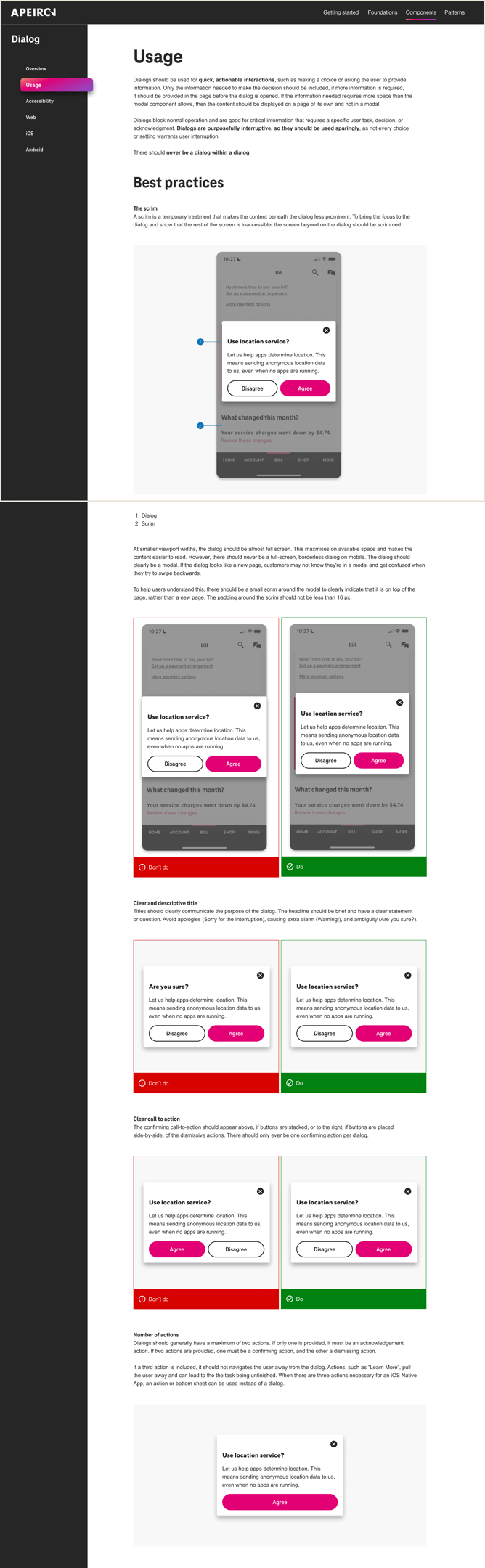
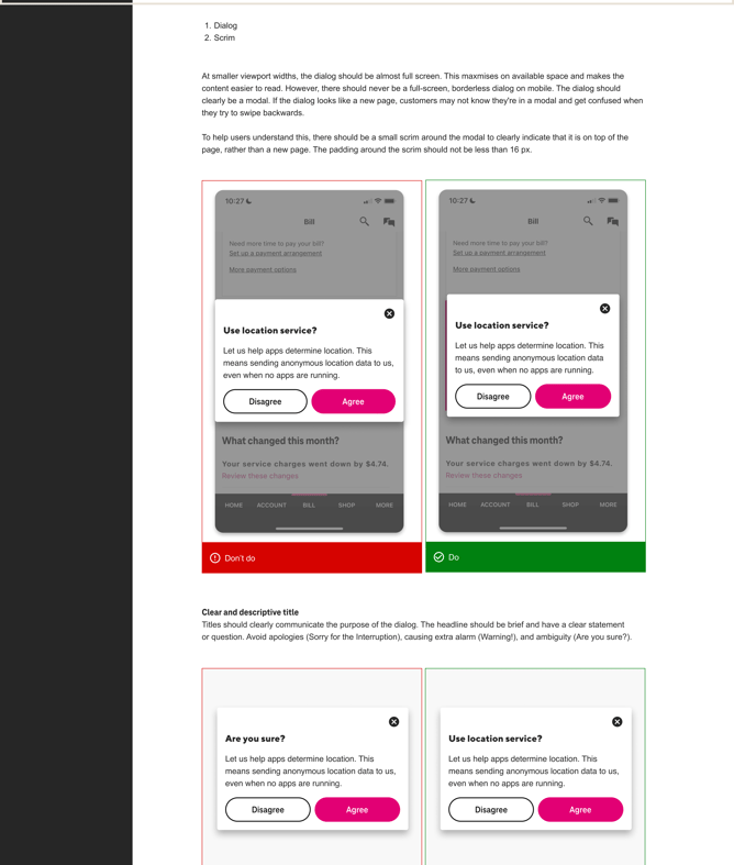
Layer 1, shipped: the Usage page. Do/don't pairs for every contested decision, scrim treatment, title writing, CTA placement, action count, so designers stop re-litigating solved problems.
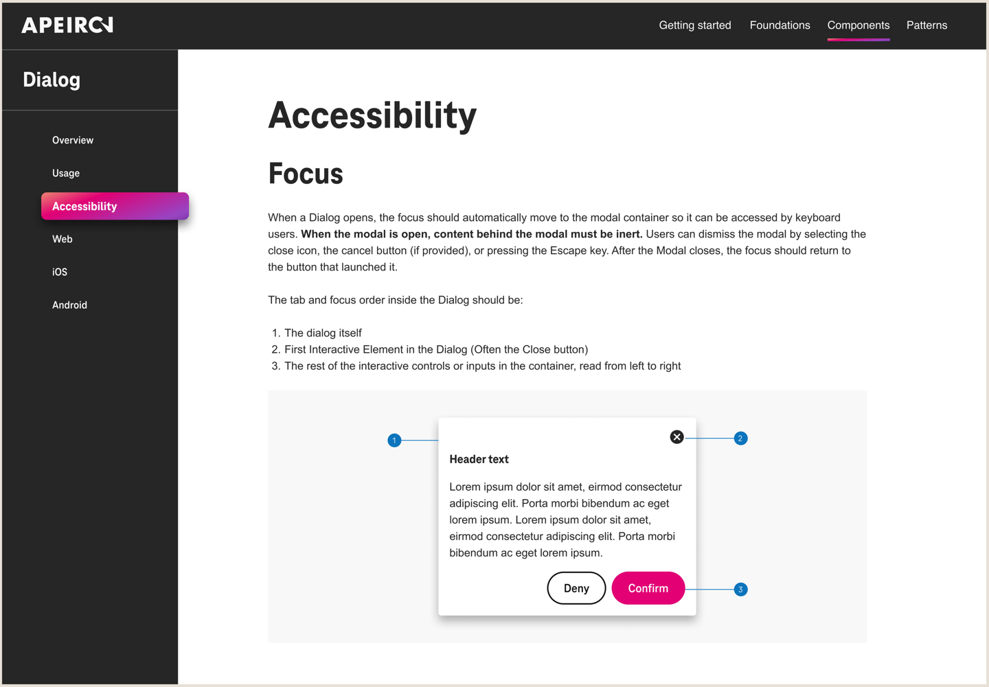
Layer 4, shipped: the Accessibility page. Focus trapping, inert background content, dismissal paths, and exact tab order are written so a developer can verify compliance, not interpret intent.
The system under the system
Design tokens were the architectural decision that made consolidation durable. Color, type, spacing, and radius decisions live in one source; platforms consume them natively. When a brand value changes, it changes once and propagates system-wide.
Documenting tokens meant writing for two audiences at once: designers, who needed to know which token to reach for, and developers, who needed naming conventions stable enough to build pipelines on. The token documentation became the shared vocabulary that the three legacy systems never had.
06 design tokens
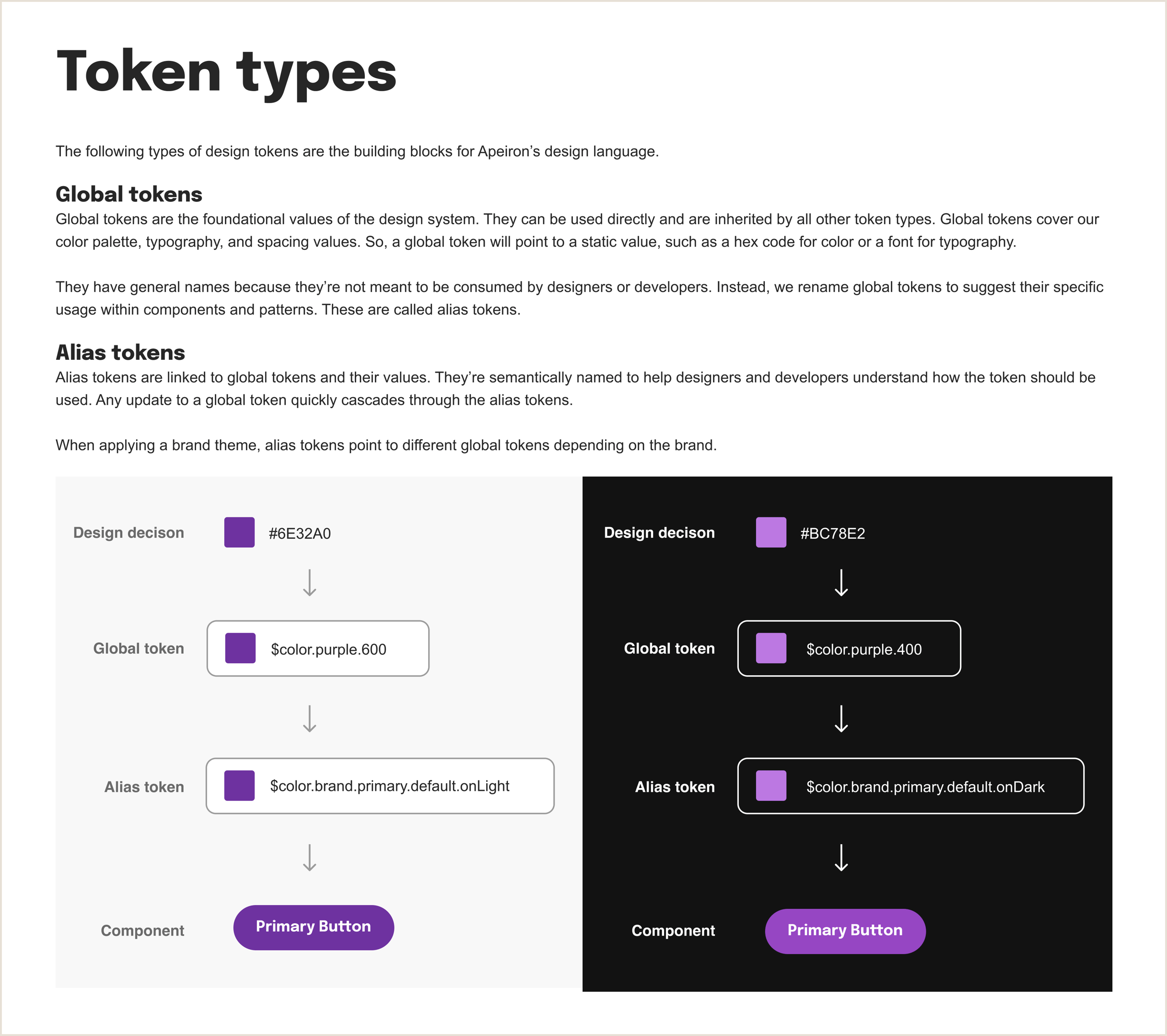

How tokens cascade: design decision to component. One color decision at the top propagates through two layers, global token, then alias token, before reaching any component. Swap the alias token's pointer, and every component using it updates across all themes simultaneously.

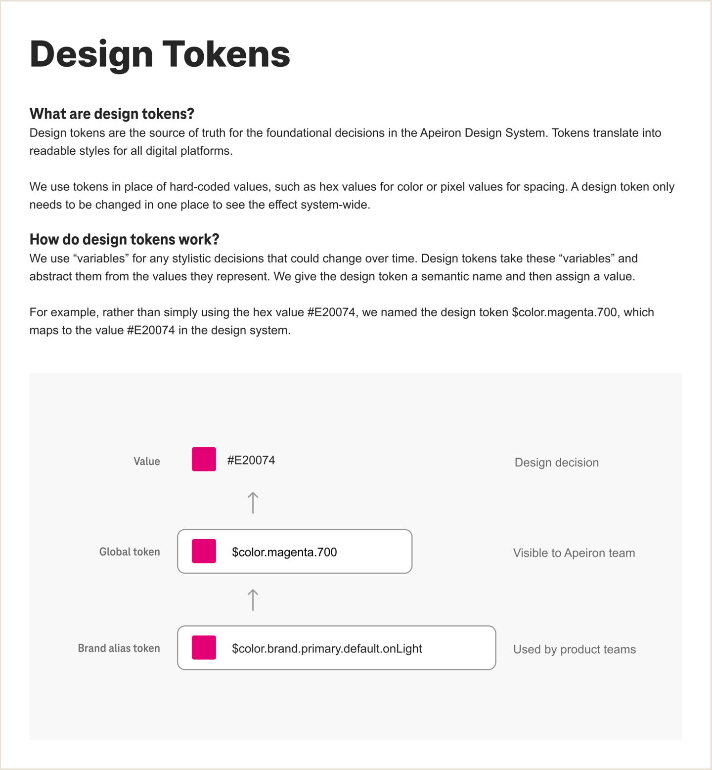
The token architecture is documented. Design decision → global token → brand alias token, with the audience for each layer named. Change a value once; it propagates everywhere the token is consumed.
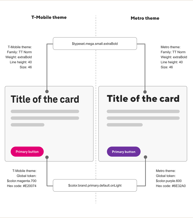
Why the architecture matters: brand theming. The same alias token resolves to magenta for T-Mobile and purple for Metro, two brands, light and dark themes, one component library, zero forked UI code.
web
ios
android
Material-aware specs with explicit notes where Apeiron deliberately diverges, documenting divergence instead of silent inconsistency.
Token-driven CSS architecture; component specs aligned to responsive behavior and keyboard interaction standards.
Specifications mapped to native platform conventions, honoring Apple's interaction patterns while keeping Apeiron's visual language intact.
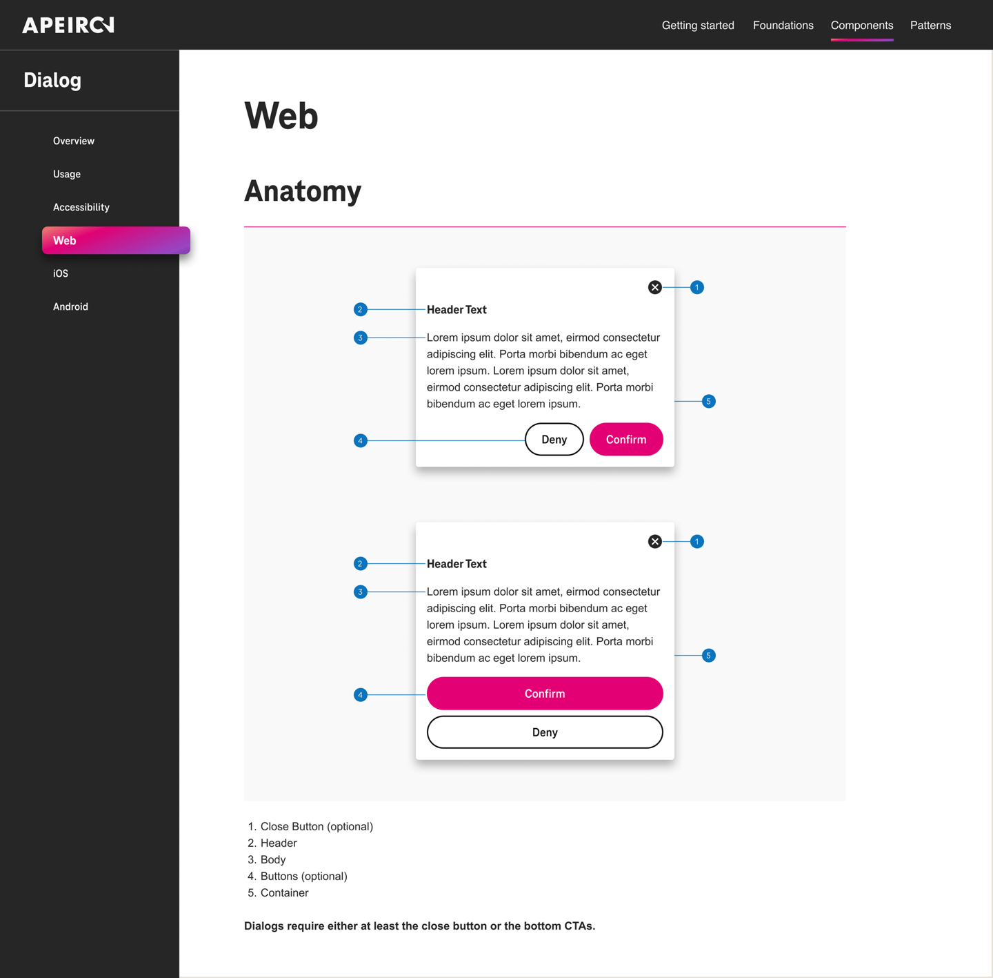
Web platform documentation. Anatomy, scrim specs, and separate T-Mobile and Metro specifications for spacing, type, and color — each defined for the web platform's specific behavior and rendering environment.

iOS platform documentation. Where iOS conventions diverge from Web (action sheets for more than two choices), the documentation says so explicitly — platform honesty over false uniformity.
Adoption is the only metric that matters for a design system
07 outcomes
of designers building consistent experiences across platforms using the unified system.
Handoff-ready
developer documentation shipped in Figma and Storybook for direct developer handoff.
85%
3 → 1
legacy systems consolidated into a single token-based source of truth.
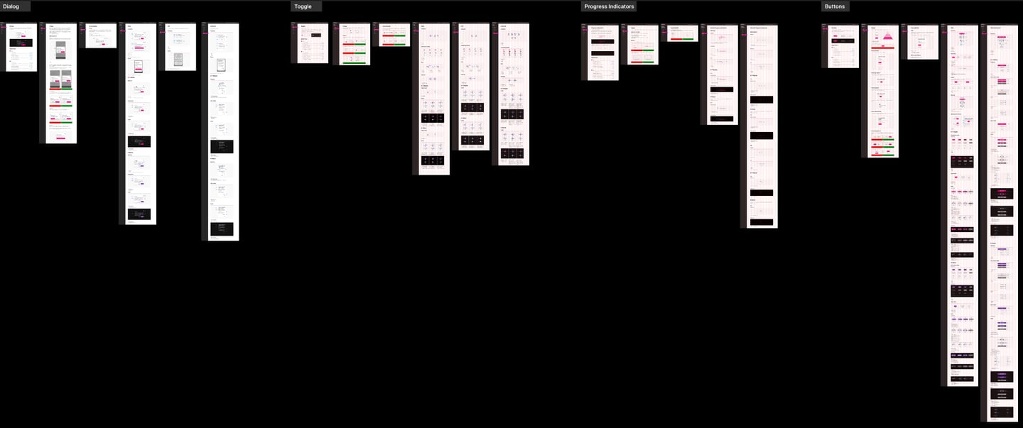
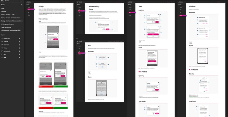
The full set, zoomed out. Dialog, Toggle, Progress Indicators, and Buttons, every component carrying the same six-page structure (Overview, Usage, Accessibility, Web, iOS, Android) across both brand themes. Consistency isn't a value statement here; it's visible at canvas scale.
The full documentation, research, recommendations, and final handoff pages are available to review in the Figma file ↗.
Design systems work is systems thinking with a deadline: every definition you write today either scales or becomes someone's migration project in two years. Apeiron taught me to design for the future state by default, the instinct I now bring to every IA, every service blueprint, every component decision.
It's also where I learned that documentation is a designed product with its own users, its own UX, and its own adoption curve. That lens, treating internal infrastructure as a product, is one of the most transferable things I own.
What I’d do differently: My first Dialog specification was written from a designer’s perspective. It explained the rationale well, but lacked the state-by-state implementation details engineers needed. An engineer pointed out that he could not determine the dismissal behavior from the documentation alone. In response, I restructured every spec to lead with implementation requirements and moved design rationale to a secondary section. The documentation became shorter, clearer, and more widely adopted. It reinforced an important lesson: documentation should be optimized for the people building from it, not for the people who wrote it.
08 What this project proves
Systems thinking, applied literally
© 2026 Vaidehi Yelkawar