Unified T-Mobile's 3 fragmented design systems into one.
As a UX Designer on the Apeiron Design System team, I led component research, token taxonomy, cross-platform documentation, and dev handoff that became the source of truth for product teams across T-Mobile and Metro.
Apeiron
3→1
SYSTEMS CONSOLIDATED
12+
COMPONENTS DOCUMENTED
2
ROLE
UX Designer · Design Systems
YEAR
2022 -2023
BRANDS SERVED · T-MOBILE + METRO
The Overview
THE PROBLEM
T-Mobile maintained three separate design systems — DW3, Phoenix, and Scale — each owned by a different team. The result: conflicting component guidelines, duplicated effort, inconsistent brand across surfaces, and developers who had to choose which system to follow. The cost wasn't aesthetic. It was operational.
3 siloed design systems. No shared standard.
MY ROLE
Research, decisions, documentation.
I drove the UX Design process for each component — market analysis, internal audit of existing systems, stakeholder interviews with product teams, and accessibility review. My output was the recommendation layer: what the component should do, how it should behave, and why — across Web, iOS, and Android.
THE OUTCOME
Apeiron — one unified design system
85% of T-Mobile designers were able to rapidly build consistent experiences across web, iOS, and Android using Apeiron for both T-Mobile and Metro by T-Mobile.
Designed a unified token system that served both brands from a single source.
The fragmentation was expensive.
Here's what I found.
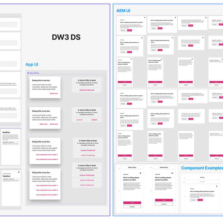
Before defining a single component, I led a comprehensive UI audit across all three legacy systems — consolidating DW3, Phoenix, and Scale sticker sheets into a single Figma file to see the full picture at once. Four patterns surfaced immediately.
FOUR KEY FINDINGS
FINDING 01
DW3 and Phoenix applied the same components differently — different button hierarchies, different dialog behaviours, different colour usage rules. A designer working across both systems had to override their own instincts depending on which product they were in.
Conflicting guidelines across systems
FINDING 02
The same UI patterns — buttons, modals, form inputs — existed in multiple versions across systems with no reconciliation. Every team was solving the same problem independently and then maintaining the solution in isolation.
Duplication of common components
FINDING 03
T-Mobile's web properties and microsites each drew from different systems, or from none at all. The customer-facing brand felt fragmented because the internal tooling was fragmented.
Inconsistency across market surfaces
FINDING 04
No shared communication channel between design system owners. Designers and developers spoke different languages.
Soiled Teams
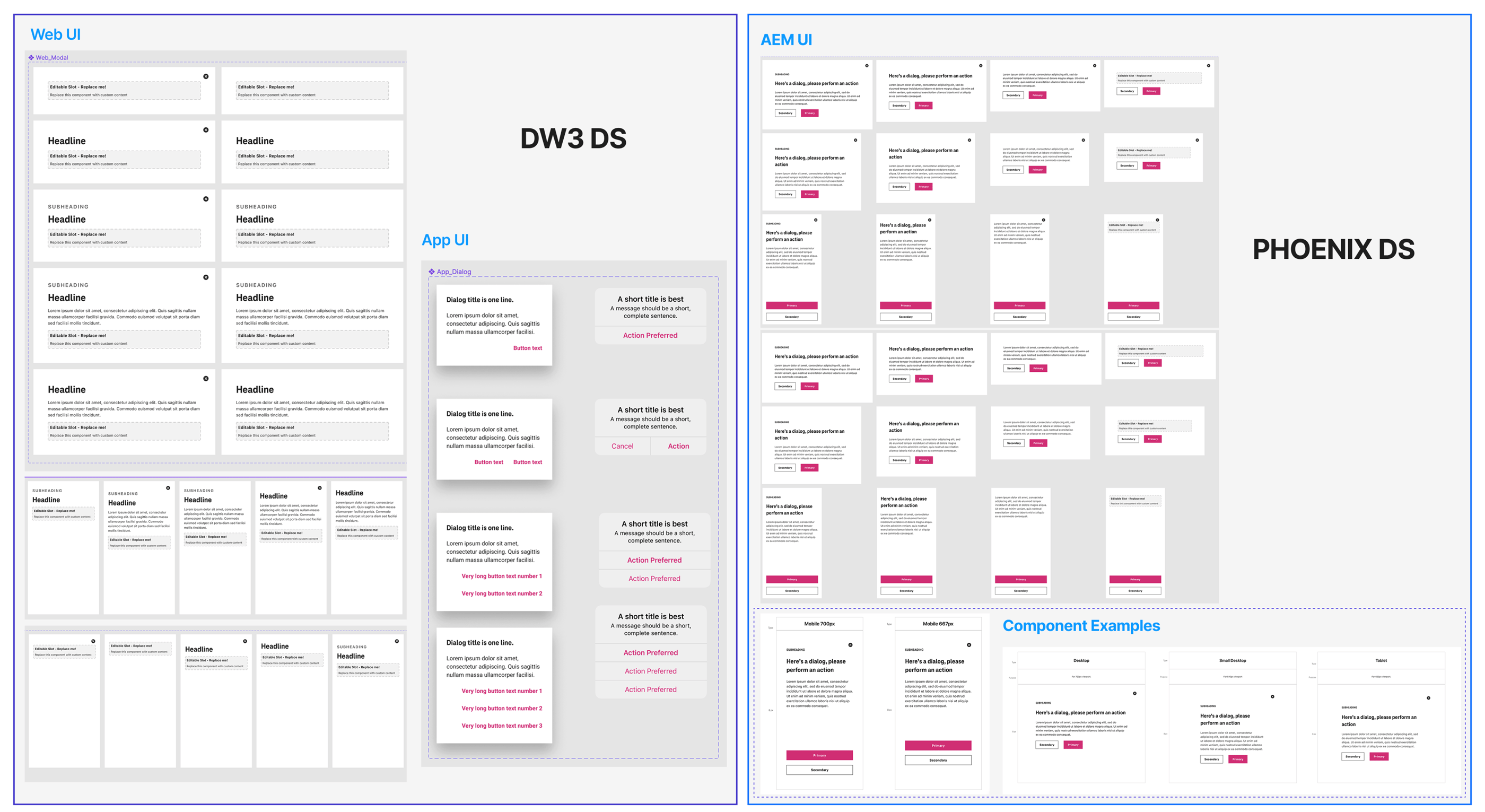
The same Dialog component across T-Mobile's two design systems — different specs, different visual treatment, no shared standard. This fragmentation was consistent across every component we audited.
How do we consolidate three design systems into one — scalable enough for two brands, three platforms, and dozens of product teams — without disrupting work already in progress?
"
— The question that drove the entire project
The Brief.
The Reframe.
THE SURFACE BRIEF
The stated goal was straightforward: consolidate DW3, Phoenix, and Scale into one system. A consolidated component library would have helped. It wouldn't have solved the adoption problem.
"Build a unified design system."
THE ACTUAL REFRAME
A system nobody uses is not a system.
The real challenge wasn't the components — it was the documentation, the handoff layer, and the trust. Designers and developers had to believe the system was more reliable than their existing workarounds. Every decision I made was made with that adoption threshold in mind.
THE DESIGN CRITERIA
Six jobs the system had to do.
Be simpler than what it replaced.
Hold at cross-platform scale.
Give developers implementation confidence without a designer in the room.
Make accessibility non-optional.
Enable brand theming without component rebuilds.
Let a single token change cascade system-wide.
01/SYSTEM THINKING
Every structural decision — token naming, component API, documentation format — was made with the question: what does this cost us when the system needs to scale? Brand theming via tokens instead of component forks was the answer to that question.
If T-Mobile adds a new brand, does this hold?
02/ADOPTION AS DESIGN PROBLEM
The best system is the one people actually use.
I treated adoption friction as a design constraint. Documentation wasn't a post-ship obligation — it was part of the component design itself. If a developer couldn't implement the component correctly from the docs alone, the docs were wrong.
03/RESEARCH BEFORE DECISION
Every recommendation was earned.
Each component went through market research, an audit of T-Mobile's existing implementations, and interviews with feature teams. I didn't guess at what the Dialog should do — I found out what was breaking and designed for that.
Building the
foundation.
Before building any component, we defined the foundational layer on which every decision would stand.
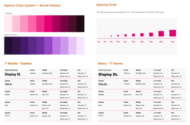
All spacing, padding, and component height values are multiples of 8. Consistent scaling across web, iOS, and Android.
8px Grid
TeleNeo for T-Mobile. TT Norms for Metro. Defined typesets ensure harmonized communication across platforms.
Typography
WCAG 2.2 compliance baked into every component's research phase — not a final checklist item. Keyboard nav, contrast ratios, focus states.
Accessibility

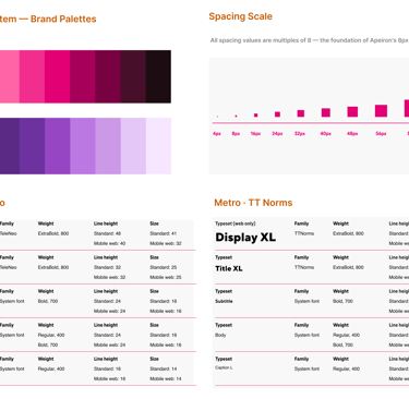
Apeiron foundation layer — color system, spacing scale, and typography defined in a single source of truth. These three elements form the foundation for every component: brand-agnostic color tokens serving T-Mobile and Metro, an 8px grid governing all spacing and layout, and dual-brand typefaces scaled consistently across platforms.
Design Tokens
The first and most constraining architectural decision: every visual attribute — colour, spacing, typography, border, shadow — is stored as a named token, not a hard-coded value.
One token value change cascades system-wide to Web, iOS, and Android simultaneously. Without tokens, a brand colour update requires touching every component individually. With tokens, it's one change.
This was also the foundation for brand theming: T-Mobile and Metro can share components and just swap their token sets. No component rebuilds for each brand.
Before tokens, one brand update meant manually hunting down every hard-coded hex value across every file, every platform, every component. Tokens replaced that fragility with a single source of truth.
"
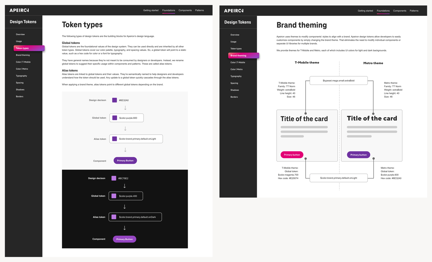
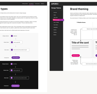
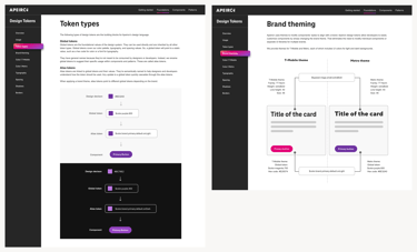
Token type hierarchy — global primitives → alias tokens → component-specific tokens. light and dark variants.
What I Built
Token Naming Convention Guide
Documented naming rules, patterns, and annotated examples for all six token categories. The reference standard for all subsequent token additions.
Figma Token Library
Organized in Figma matching the three-tier taxonomy — enabling designers to apply tokens directly and preview theme switching in real time.
Token names and values referenced in Storybook, connecting the Figma source of truth to the front-end implementation used by engineers.
Storybook References
Token Taxonomy Documentation
Written specs covering the three-tier architecture and how theme switching operates at the alias layer.

Brand theming — same components, different token sets. T-Mobile (magenta) and Metro (purple).
The Hardest Problem: Naming for Two Brands
The instinct was to name tokens after their visual value: $color.magenta, $font-TeleNeo. For one brand, this works fine. For two, it collapses immediately. A Metro developer seeing $color.magenta has no frame of reference. I established a naming convention that fixed this.
Brand-specific names — breaks at scale
Role-based names — works for both brands
Component deep-dive:
Dialogs.
I researched and documented 12+ components for Apeiron. Dialogs are the full story — from the problem I was solving to the platform-specific solution that shipped.
⚠️ T-Mobile's existing mobile dialogs captured the full screen with no visible border or scrim. Users mistook them for new pages — and when they swiped back, they lost their progress.
"
— The specific UX problem my research addressed
Market research → recommendations
1
Based on research, I provided usage rules, anatomy specs, and cross-platform behavior guidance that became the official Apeiron dialog standard.
✓ When to use
→Prompt user for an immediate, required response
→Notify urgent information or warnings
→Simplify complex workflows into focused steps
✗ When NOT to use
→Referencing external information
→Opening a modal over another active modal
→Content that exceeds modal space — use a page
2
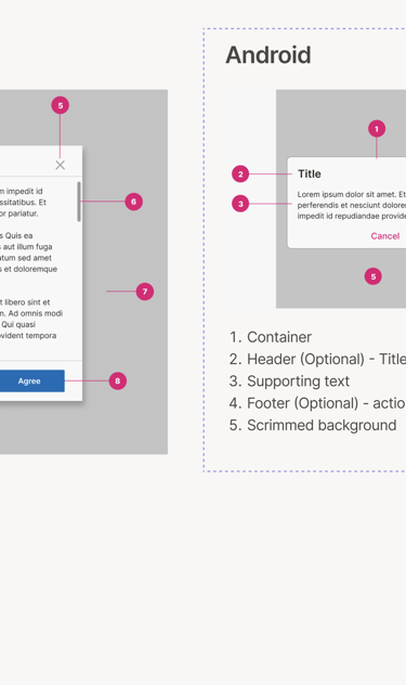
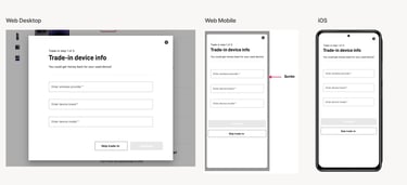
Cross-Platform Adaptations
Each platform required distinct guidance — not just visual adjustments, but behavioral and naming differences that matched native OS conventions.
Web (Desktop)
Web (Mobile) — Key fix
IOS
Traditional dialog with a clear header, inputs, and action buttons. Overlays main content. Dismiss via ESC or click outside.
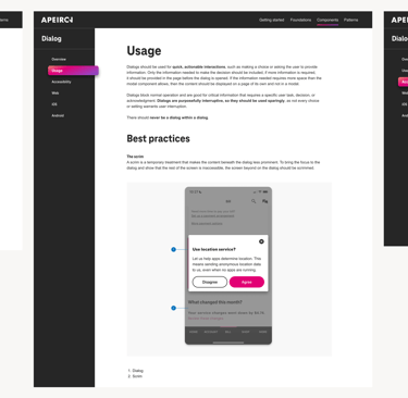
Added visible scrim/margin around the dialog. Signals "overlay, not a new page" — resolving the user confusion identified in the audit.
Named "Alerts" (2 actions) or "Action Sheets" (3 actions). Matches native iOS patterns that designers and users already know.
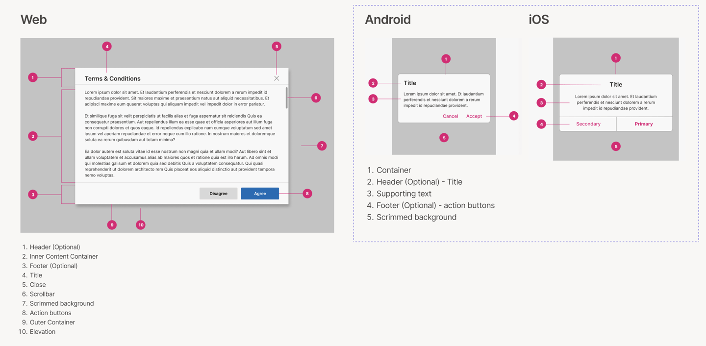
Dialog anatomy — three distinct zones: header (title + close action), body (content area), footer (dismissive action left, primary action right). This structure is consistent across web, iOS, and Android.
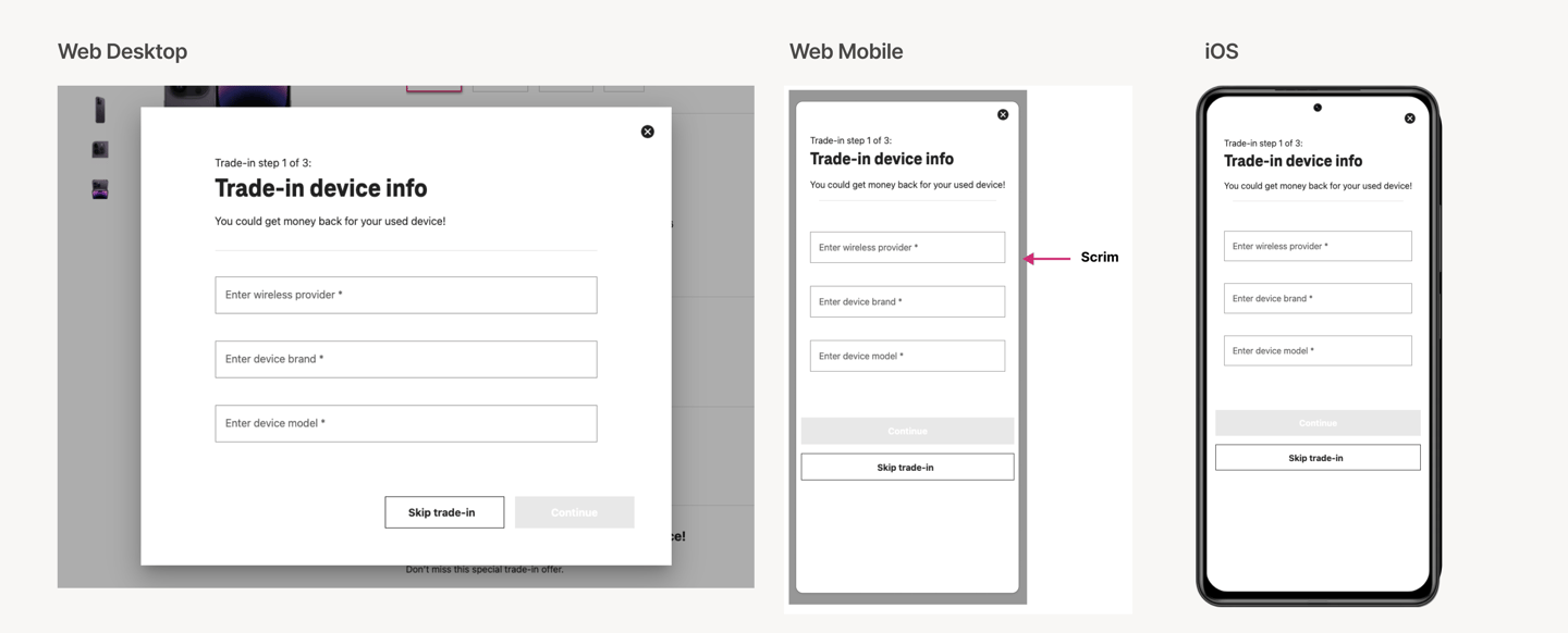
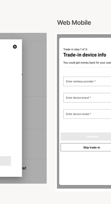
Dialog adaptations across web desktop, web mobile, and iOS. The mobile web solution — adding a visible scrim margin — directly resolved the UX issue where users mistook full-screen borderless modals for new pages.
3
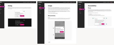
Documentation & Dev Handoff
The handoff document was the product, not a byproduct. Once UI designers translated my recommendations into final designs, I co-authored the technical documentation for every platform.
This format — overview, usage, anatomy, behavior, accessibility, cross-platform specs, token references — became the standard template for all subsequent Apeiron components.
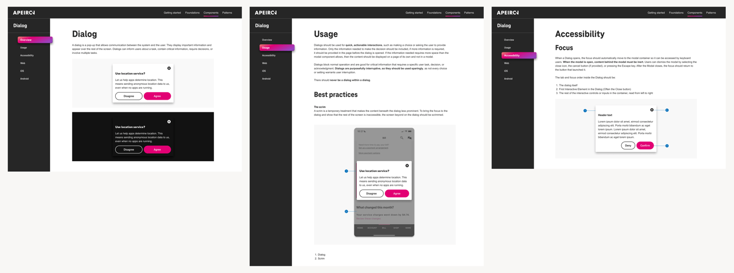
Final Apeiron Dialog documentation in Figma — overview, usage rules, accessibility specs, and platform-specific implementation tabs. This documentation format became the standard template adopted for all subsequent Apeiron components.
Dialogs were
one of many.
Using the same research-to-documentation pipeline, I led UX research and written guidelines for these additional components:
Dropdown
Multi-select behavior, keyboard accessibility, and mobile adaptation
Breadcrumbs
Navigation hierarchy, truncation rules, and responsive behavior
Links & Action Buttons
Inline vs. standalone, visited states, touch target sizing
Ordered / Unordered Lists
Nesting rules, spacing, and semantic HTML alignment
Progress Indicators
Determinate vs. indeterminate, loading states, accessibility
Toggle
On/off labeling, accessibility requirements, and mobile touch targets
Measured Outcomes
3→1
Fragmented systems consolidated into one unified design language
2
Brands served from a single token system — T-Mobile + Metro
3
Platforms — web, iOS, and Android — from one Figma source of truth
12+
Components researched, documented, and shipped with full cross-platform specs
85 %
Designers able to rapidly build consistent experiences
What I'd do differently
Measure adoption per component, not system-wide
IN HINDSIGHT · 01
The 85% figure is design org-wide. I don't have per-component data — which components were used most, which were avoided, which caused the most developer support questions. That granularity would have made the documentation sharper and given us a feedback loop for future components.
Get developer feedback earlier in the research phase
IN HINDSIGHT · 02
My research was thorough on the design side. Developer interviews happened later, and some implementation feedback came back after the recommendation phase. Earlier developer input would have caught cross-platform edge cases before they became handoff problems.
Write the "when not to use" section first
IN HINDSIGHT · 03
I added "when not to use" guidance after writing the usage recommendations. In practice, the constraints on a component are often clearer than the use cases — because the misuse patterns are what the audit surfaces. Starting with anti-patterns would have sharpened the positive guidance.
Document the audit methodology, not just the findings
IN HINDSIGHT · 04
My audit produced the four core findings that shaped the entire system. But I documented the findings, not the process. A repeatable audit methodology — documented — would have given the team a tool they could use for every future component, not just the ones I worked on.
What this project demonstrates about how I work
Design systems work is often presented as component galleries. What it actually requires is a different skill: making decisions that hold when you're not in the room. Every piece of documentation I wrote was written for a developer who would implement the component without being able to ask me a follow-up question.
That constraint — write documentation that stands alone — is what pushed my research deeper than surface-level competitive analysis. If I didn't understand why the focus trap existed, I couldn't write a spec that would convince a developer to implement it correctly on all three platforms.
Research · Competitive analysis · Internal audit · Stakeholder interviews · Component recommendations · Usage guidelines · Dos & don'ts · Cross-platform specs (Web/iOS/Android) · Accessibility documentation · Developer handoff docs
What I owned
What the broader team owned
Component UI design · Figma library builds · Storybook implementation · QA testing · Release management
Cross-functional collaborators
UI designers · Android / iOS / Web devs · QA engineers · Accessibility specialists · Product stakeholders across the T-Mobile ecosystem
ENTERPRISE
DESIGN SYSTEMS
Design TOKENS
CROSS-PLATFORM
STORYBOOK
WCAG
2022-2023
Unified T-Mobile's 3 fragmented design systems into one.
As a UX Designer on the Apeiron Design System team, I led component research, token taxonomy, cross-platform documentation, and dev handoff that became the source of truth for product teams across T-Mobile and Metro.
ROLE
UX Designer · Design Systems
YEAR
2022 -2023
The Overview
THE PROBLEM
T-Mobile maintained three separate design systems — DW3, Phoenix, and Scale — each owned by a different team. The result: conflicting component guidelines, duplicated effort, inconsistent brand across surfaces, and developers who had to choose which system to follow. The cost wasn't aesthetic. It was operational.
3 siloed design systems. No shared standard.
MY ROLE
Research, decisions, documentation.
I drove the UX Design process for each component — market analysis, internal audit of existing systems, stakeholder interviews with product teams, and accessibility review. My output was the recommendation layer: what the component should do, how it should behave, and why — across Web, iOS, and Android.
THE OUTCOME
Apeiron - one unified design system
85% of T-Mobile designers were able to rapidly build consistent experiences across web, iOS, and Android using Apeiron for both T-Mobile and Metro by T-Mobile.
Designed a unified token system that served both brands from a single source.
The fragmentation was expensive. Here's what I found.
Before defining a single component, I led a comprehensive UI audit across all three legacy systems — consolidating DW3, Phoenix, and Scale sticker sheets into a single Figma file to see the full picture at once. Four patterns surfaced immediately.
FINDING 01
DW3 and Phoenix applied the same components differently — different button hierarchies, different dialog behaviours, different colour usage rules. A designer working across both systems had to override their own instincts depending on which product they were in.
Conflicting guidelines across systems
FINDING 02
The same UI patterns — buttons, modals, form inputs — existed in multiple versions across systems with no reconciliation. Every team was solving the same problem independently and then maintaining the solution in isolation.
Duplication of common components
FINDING 03
T-Mobile's web properties and microsites each drew from different systems, or from none at all. The customer-facing brand felt fragmented because the internal tooling was fragmented.
Inconsistency across market surfaces
FINDING 04
No shared communication channel between design system owners. Designers and developers spoke different languages.
Soiled Teams
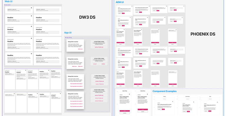
The same Dialog component across T-Mobile's two design systems — different specs, different visual treatment, no shared standard. This fragmentation was consistent across every component we audited.
How do we consolidate three design systems into one — scalable enough for two brands, three platforms, and dozens of product teams — without disrupting work already in progress?
"
— The question that drove the entire project
The Brief.
The Reframe.
THE SURFACE BRIEF
The stated goal was straightforward: consolidate DW3, Phoenix, and Scale into one system. A consolidated component library would have helped. It wouldn't have solved the adoption problem.
"Build a unified design system."
THE ACTUAL REFRAME
A system nobody uses is not a system.
The real challenge wasn't the components — it was the documentation, the handoff layer, and the trust. Designers and developers had to believe the system was more reliable than their existing workarounds. Every decision I made was made with that adoption threshold in mind.
THE DESIGN CRITERIA
Six jobs the system had to do.
Be simpler than what it replaced.
Hold at cross-platform scale.
Give developers implementation confidence without a designer in the room.
Make accessibility non-optional.
Enable brand theming without component rebuilds.
Let a single token change cascade system-wide.
01/SYSTEM THINKING
Every structural decision — token naming, component API, documentation format — was made with the question: what does this cost us when the system needs to scale? Brand theming via tokens instead of component forks was the answer to that question.
If T-Mobile adds a new brand, does this hold?
02/ADOPTION AS DESIGN PROBLEM
The best system is the one people actually use.
I treated adoption friction as a design constraint. Documentation wasn't a post-ship obligation — it was part of the component design itself. If a developer couldn't implement the component correctly from the docs alone, the docs were wrong.
03/RESEARCH BEFORE DECISION
Every recommendation was earned.
Each component went through market research, an audit of T-Mobile's existing implementations, and interviews with feature teams. I didn't guess at what the Dialog should do — I found out what was breaking and designed for that.
Building the
foundation.
Before building any component, we defined the foundational layer on which every decision would stand.
All spacing, padding, and component height values are multiples of 8. Consistent scaling across web, iOS, and Android.
8px Grid
TeleNeo for T-Mobile. TT Norms for Metro. Defined typesets ensure harmonized communication across platforms.
Typography
WCAG 2.2 compliance baked into every component's research phase - not a final checklist item. Keyboard nav, contrast ratios, focus states.
Accessibility
Apeiron foundation layer — color system, spacing scale, and typography defined in a single source of truth. These three elements form the foundation for every component: brand-agnostic color tokens serving T-Mobile and Metro, an 8px grid governing all spacing and layout, and dual-brand typefaces scaled consistently across platforms.
Design Tokens
The first and most constraining architectural decision: every visual attribute — colour, spacing, typography, border, shadow — is stored as a named token, not a hard-coded value.
One token value change cascades system-wide to Web, iOS, and Android simultaneously. Without tokens, a brand colour update requires touching every component individually. With tokens, it's one change.
This was also the foundation for brand theming: T-Mobile and Metro can share components and just swap their token sets. No component rebuilds for each brand.
Before tokens, one brand update meant manually hunting down every hard-coded hex value across every file, every platform, every component. Tokens replaced that fragility with a single source of truth.
"
What I Built
Token Naming Convention Guide
Documented naming rules, patterns, and annotated examples for all six token categories. The reference standard for all subsequent token additions.
Figma Token Library
Organized in Figma matching the three-tier taxonomy — enabling designers to apply tokens directly and preview theme switching in real time.
Token names and values referenced in Storybook, connecting the Figma source of truth to the front-end implementation used by engineers.
Storybook References
Token Taxonomy Documentation
Written specs covering the three-tier architecture and how theme switching operates at the alias layer.
The Hardest Problem: Naming for Two Brands
The instinct was to name tokens after their visual value: $color.magenta, $font-TeleNeo. For one brand, this works fine. For two, it collapses immediately. A Metro developer seeing $color.magenta has no frame of reference. I established a naming convention that fixed this.
Brand-specific names — breaks at scale
Role-based names — works for both brands
Brand theming — same components, different token sets. T-Mobile (magenta) and Metro (purple).
Token type hierarchy — global primitives → alias tokens → component-specific tokens. light and dark variants.
Component deep-dive:
Dialogs.
⚠️ T-Mobile's existing mobile dialogs captured the full screen with no visible border or scrim. Users mistook them for new pages — and when they swiped back, they lost their progress.
"
-The specific UX problem my research addressed
Market research → recommendations
✓ When to use
→Prompt user for an immediate, required response
→Notify urgent information or warnings
→Simplify complex workflows into focused steps
✗ When NOT to use
→Referencing external information
→Opening a modal over another active modal
→Content that exceeds the modal space uses a page
Cross-Platform Adaptations
Dialog adaptations across web desktop, web mobile, and iOS. The mobile web solution — adding a visible scrim margin — directly resolved the UX issue where users mistook full-screen borderless modals for new pages.
Documentation & Dev Handoff
The handoff document was the product, not a byproduct. Once UI designers translated my recommendations into final designs, I co-authored the technical documentation for every platform.
This format — overview, usage, anatomy, behavior, accessibility, cross-platform specs, token references — became the standard template for all subsequent Apeiron components.
Final Apeiron Dialog documentation in Figma — overview, usage rules, accessibility specs, and platform-specific implementation tabs. This documentation format became the standard template adopted for all subsequent Apeiron components.
I researched and documented 12+ components for Apeiron. Dialogs are the full story — from the problem I was solving to the platform-specific solution that shipped.
Based on research, I provided usage rules, anatomy specs, and cross-platform behavior guidance that became the official Apeiron dialog standard.
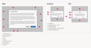
Dialog anatomy — three distinct zones: header (title + close action), body (content area), footer (dismissive action left, primary action right). This structure is consistent across web, iOS, and Android.
Each platform required distinct guidance -not just visual adjustments, but behavioral and naming differences that matched native OS conventions.
3
Web (Desktop)
Traditional dialog with a clear header, inputs, and action buttons. Overlays main content. Dismiss via ESC or click outside.
Web (Mobile) — Key fix
Added visible scrim/margin around the dialog. Signals "overlay, not a new page" - resolving the user confusion identified in the audit.
Named "Alerts" (2 actions) or "Action Sheets" (3 actions). Matches native iOS patterns that designers and users already know.
IOS
2
1
Dialogs were one of many.
Using the same research-to-documentation pipeline, I led UX research and written guidelines for these additional components:
Dropdown
Multi-select behavior, keyboard accessibility, and mobile adaptation
Breadcrumbs
Navigation hierarchy, truncation rules, and responsive behavior
Links & Action Buttons
Inline vs. standalone, visited states, touch target sizing
Ordered / Unordered Lists
Nesting rules, spacing, and semantic HTML alignment
Progress Indicators
Determinate vs. indeterminate, loading states, accessibility
Toggle
On/off labeling, accessibility requirements, and mobile touch targets
Measured Outcomes
3→1
Fragmented systems consolidated into one unified design language
2
Brands served from a single token system for T-Mobile + Metro
3
Platforms - web, iOS, and Android served from one Figma source of truth
12+
Components researched, documented, and shipped with full cross-platform specs
85 %
Designers able to rapidly build consistent experiences
What I'd
do differently
Measure adoption per component, not system-wide
IN HINDSIGHT · 01
The 85% figure is design org-wide. I don't have per-component data — which components were used most, which were avoided, which caused the most developer support questions. That granularity would have made the documentation sharper and given us a feedback loop for future components.
Get developer feedback earlier in the research phase
IN HINDSIGHT · 02
My research was thorough on the design side. Developer interviews happened later, and some implementation feedback came back after the recommendation phase. Earlier developer input would have caught cross-platform edge cases before they became handoff problems.
Write the "when not to use" section first
IN HINDSIGHT · 03
I added "when not to use" guidance after writing the usage recommendations. In practice, the constraints on a component are often clearer than the use cases — because the misuse patterns are what the audit surfaces. Starting with anti-patterns would have sharpened the positive guidance.
Document the audit methodology, not just the findings
IN HINDSIGHT · 04
My audit produced the four core findings that shaped the entire system. But I documented the findings, not the process. A repeatable audit methodology — documented — would have given the team a tool they could use for every future component, not just the ones I worked on.
What this project demonstrates about
how I work
Design systems work is often presented as component galleries. What it actually requires is a different skill: making decisions that hold when you're not in the room. Every piece of documentation I wrote was written for a developer who would implement the component without being able to ask me a follow-up question.
That constraint — write documentation that stands alone — is what pushed my research deeper than surface-level competitive analysis. If I didn't understand why the focus trap existed, I couldn't write a spec that would convince a developer to implement it correctly on all three platforms.
Research · Competitive analysis · Internal audit · Stakeholder interviews · Component recommendations · Usage guidelines · Dos & don'ts · Cross-platform specs (Web/iOS/Android) · Accessibility documentation · Developer handoff docs
What I owned
What the broader team owned
Component UI design · Figma library builds · Storybook implementation · QA testing · Release management
Cross-functional collaborators
UI designers · Android / iOS / Web devs · QA engineers · Accessibility specialists · Product stakeholders across the T-Mobile ecosystem
© 2026 Vaidehi Yelkawar